Shopify? Apps? I Thought It Was an Ecommerce Thingy!
It is. If you want to sell stuff or services online in exchange for money – a business model so crazy that it just might work – Shopify is the best, easiest and most hassle-free way to do it. You can use a store that lives on our hosted service or build a program that calls our API to do the ecommerce stuff: the catalog, the shopping cart, the credit card hoo-hah, and so on.
While Shopify does a lot, it can’t do everything. Perhaps there’s a feature that you wish Shopify had, but it applies only to a small vertical or maybe even only your business. Or there just might be some feature that we haven’t thought of implementing yet.
That’s where apps come in: they’re applications that make use of the Shopify API to:
- Access a shop’s data (with the owner’s permission, of course)
- Programmatically perform just about anything the shop owner can do on their shop’s admin panel
Want to declare a “happy hour” where you drop the price of an item from 5 to 7 p.m. next Thursday? Shopify doesn’t do it out of the box, but an app can! Want to send a Twitter direct message or SMS text to a merchant whenever a customer places a big order, so s/he can make sure it gets handled properly? You can write an app for that. If you can think of a feature to make the experience for customers or shopowners (or both) better, you can make it an app. And you can make money doing it!
You can reach the 15,000 Shopify users – a very focused, dedicated bunch – and sell apps to them through the Shopify App Store. We know a number of developers who are doing quite nicely selling apps and making Shopify showowners productive and happy, and when our customers are happy, so are we.
That’s what this series of articles is all about: selling more Shopify Apps. If you’re a Shopify App developer (or thinking of becoming one), this series will show you how to sell them better. We’ll also be publishing articles about writing apps, from how-tos to ideas for apps that we’d like to see become real.
The Decision-Making Process
Take a look at Shopify’s App Store, and I’ll walk you through the typical customer’s decision making process when they’re looking for apps.
1. They see your app’s icon, its name and the short description on the App Store page.
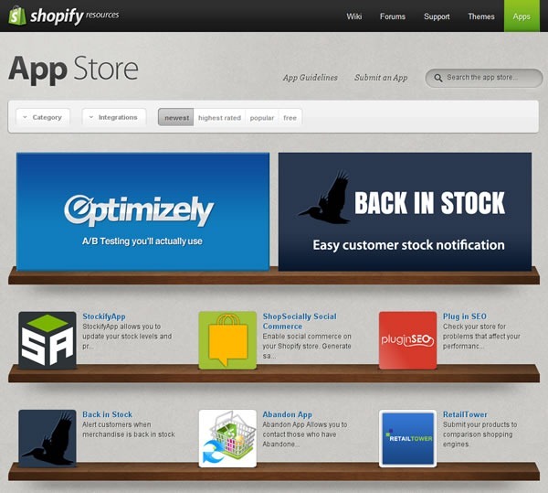
When you visit Shopify’s App Store, you see a page like the one shown above, featuring apps displayed on shelves. Rather than being broken up into pages, the App Store’s main page is an “infinite scroller”; you simply scroll down the page to see all the apps in the Store. For the user, scrolling — especially in the age where most mice have scroll wheels and scrolling-by-flicking is increasingly common thanks to smartphones and tablets — seems faster and more effortless than paging.
Each app is represented by its icon, with its name and a short description (140 characters maximum) to its right. Clicking on the icon, the name or the description will take you to the page for the corresponding app.
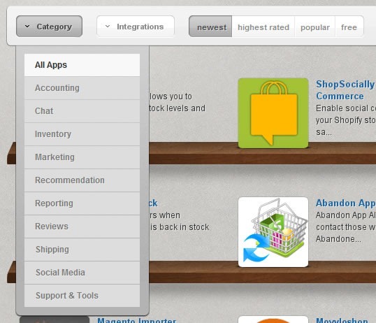
There are a number if ways users can sift through the apps in the store. They can filter the apps by category, as shown below:
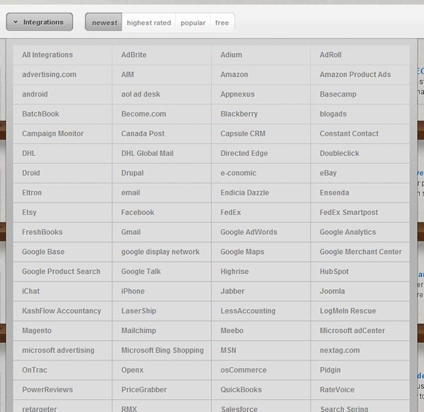
They can also filter apps by which software or services they integrate with:
And they can also change the way the apps are sorted in the store:

The default sort is “from newest to oldest”, and the other three options are:
- From highest-rated to lowest-rated
- From most to least popular
- Whether or not to limit the results to free apps
Ideally, you want your app to be as close to the top of the App Store page as possible – what they used to call “above the fold” in the newspaper world. Being on top of the list puts you in the user’s path of least resistance and makes it more likely that the user will move to the next step on the path to purchasing your app: your app’s page.
Your app will be on top of the list just after you submit your app for the first time, as it will be newest. However, your app won’t remain the newest forever, so your eventual goal will be to make your app the highest rated, the most popular, or preferably both.
You’ll also want to make sure that your app makes a good first impression on the App Store’s main page. The good news (and the bad news, too) is that once the user sees your app on the page, there are only three things that you have at your disposal to catch his/her attention:
- Your app’s icon. Is it visually appealing? Does it hint at what your app does or what its effects will be?
- Your app’s name. Is it catchy or memorable? Does it give the user an idea of what your app does or what its effects will be?
- Your app’s description. Does it clearly state what your app does or why someone would want to use it, all in 140 characters or less?
Get all three right, and you’ll increase the odds that the user will get to the next step in the decision-making process: moving away from the big list of apps and focusing on just yours.
2. They click on your app’s icon, taking them to the App Store page for your app
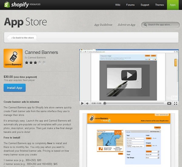
If your app has piqued the user’s interest on the App Store’s main page, s/he’ll click on it and be taken to your app’s page, which displays a lot of information about it, namely:
- The app’s icon
- The name of the app
- The app’s publisher
- The app’s rating
- How much the app costs
- Any additional software required by the app
- The “Install App” button
- The full description of the app
- A list of the services that the app can integrate with
- One or more screenshots of the app
- [Optional] One or more videos of the app
- User reviews and responses from the publisher
Each of these items affects the user’s decision-making process, and in this series of articles, we’ll look at what you can do with them to make it more likely that the user will buy it.
Based on experience with app stores of all sorts, from Shopify’s to shareware to smartphone and tablet stores, here’s what the users typically do next…
3. They look at your app’s screenshots and videos first.
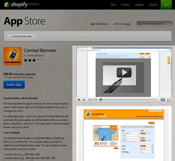
Eye- and click-tracking studies show that once the user has landed on your app’s page, they tend to look at the screenshots and videos first. This means a couple of things:
- You should make sure that you include at least one screenshot of your app in action. Better still, you should include a screenshot for every major feature of your app.
- Although it’s optional, you should include a video. It could be a video capture of your app in action or something that explains what your app does and why you’d want to buy and install it. The better selling apps tend to include videos on their app pages.
In this series of articles, we’ll cover ways to get the most out of the video and pictures on your app’s page.
4. Then they look at the rating.
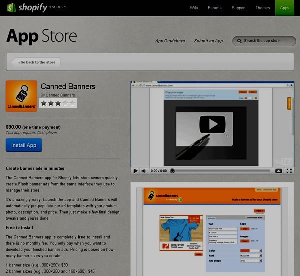
A very important factor affecting how well something sells online is the rating. Ever since Amazon, we’ve become quite accustomed to checking the ratings before buying something. It happens not just online, but in real life; I’ve seen people at all sorts of bricks-and-mortar stores – restaurants, liquor stores, big-box electronics stores, car dealerships – whip out their smartphones and check out the ratings for something they’re thinking of buying. That’s why social media and word-of-mouth marketing are hot topics these days: they influence people’s opinions, which in turn can make or break sales.
“Get a good rating” is the obvious advice. Less obvious is how you get that rating. We’ll cover what we believe are best practices for getting good ratings, and through them, good sales.
5. And finally, they read the description.
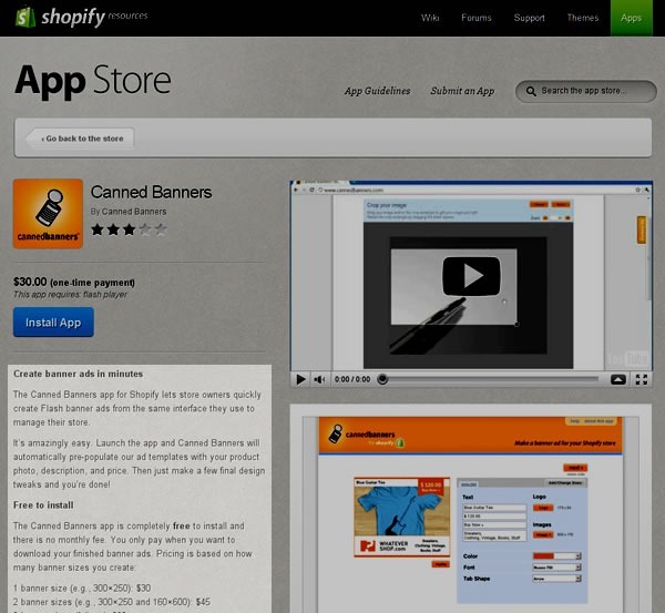
Once the user’s done with the quick-and-dirty visual scan of your app’s page, they then look at your app’s description. If the user has come this far in the process, they’re close to the point where they make the decision to buy or not buy. The description is where you close the deal, and we’ll show you what successful apps do in their descriptions.
6. That’s when they make their decision.

If you’ve done everything right, this is when the user clicks the “Install App” button. Get enough users doing that, and life’s like this:

Next: A picture is worth a thousand…bucks?