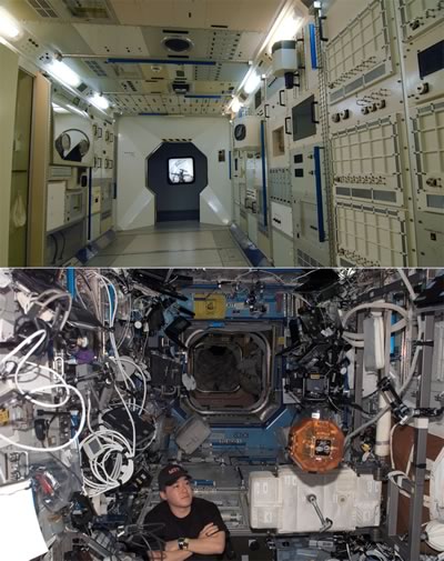
Pictured below are two photos:
- The mockup of an International Space Station module at Leicester’s National Space Centre, and
- The reality — a photo taken a week ago aboard the actual International Space Station.

Click the photo to see it at full size.
Photo courtesy of Miss Fipi Lele.
I think it’s a pretty apt visual metaphor for the difference between your application’s design and the actual implementation.
4 replies on “Mockup vs. Reality”
Looks a bit like the back of my TV
[…] February 9, 2008 at 2:15 pm (Uncategorized) Found at http://globalnerdy.com/2008/02/05/mockup-vs-reality/ […]
just wait till ISS runs on bluetooth! and i totally hear you on app design vs. reality, i am experiencing that right now.
It’s akin to a model house in a planned housing development. The model house is perfect for display and show purposes, but then try and live in it. I may not like the lived-in space station look, but it’s real.