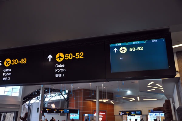
While flying home from TechDays Vancouver, something on the sign pointing the way to the gates caught my eye. Note the screen on the right:

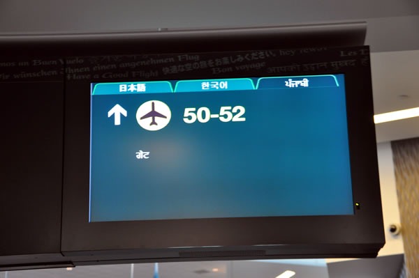
Here’s a closer look:


It’s an interesting use for a tab control. The content of each tab page is the same, but each one shows that content in a different language: Japanese, Korean and Hindi (I have no idea why there’s no Chinese; there are lots of Chinese visitors at Vancouver airport). The sign cycles through each tab page, displaying each one for about 10 seconds before switching to the next one.
Is it an appropriate use for a tab control? My guess is that user interface/user experience types (Qixing, if you’re reading this, feel free to chime in) would say “no”. I say “no”, myself. It’s based mostly on a gut feeling, but a little thinking provides me with some rationale, which includes:
- There’s so little information on each tab. The purpose of a tab control is to break down a large or complex set of controls into more manageable groups, which in the world of .NET controls are called ”tab pages”. The current tab page, which shows something in Hindi, has no more than a line of tex,t, and the same is true for the Japanese and Korean tabs. They could’ve shown all three languages on a single screen.
- Tab controls imply interactivity. The tabs in a tab control are for all intents and purposes buttons. Buttons imply interactivity: you click them and something happens. The same is true for tabs: you click a tab and its tab page becomes the frontmost one. These tabs aren’t clickable at all; they’re just being used to show you what languages the sign uses. Using a tab control in this fashion seems like using a button as a label. It gets the job done, but it is the best way?
What do you think? Feel free to opine in the comments.
2 replies on “Airport Signage and the Tab Control”
what language is below english and french? is this japanese?
i agree with your thoughts about the implied interactivity. but i think most people are aware of the unidirectional communication because of the situation (it IS still a sign).
more interesting is the ‘little information’ thing.
i do not know whether these signs are designed for other information, but
i think most of the time there are things like (“all passengers for this flight go to gate 24”, “delayed for 15 minutes”, “JFK closed because of bad weather”,…) and all the other messages which are quite lenghtly – and not only in asian sign language. i think this extra-panel is in idle mode and the designers felt like showing something helpfull instead of nothing.
so you encountered the most popular problem in logic. your deduction is wrong because your assumption turns out to be wrong – this panel is not designed to show only one single line.
Chinese isn’t in the tab display because it’s on the fixed sign