Sometimes, you have to do more than just start from scratch. Sometimes, you have to burn the boats.
“Burning the boats” is an expression that comes from a story – some say legend — about Cortes, the Spanish Conquistador (and yes, the subject of Neil Young’s Cortez the Killer). Wishing to guarantee that his men would stay in Veracruz (which he’d just taken over from the Governor of Cuba) and only move forward into terra incognita without retreat, he ordered them to burn the ships that brought them to the New World. It was an extreme measure, but without the distraction of a way home, they committed themselves completely to business of exploring and conquering.
The Original Mac: No Arrow Keys
Bruce “Tog” Tognazzini, former user interface guy at Apple and the company formerly known as Sun, and now member of the Nielsen/Norman Group, wrote about how Apple burned the boats back when they released the original Macintosh in his 1992 book Tog on Interface and more recently in an article on his blog, AskTog.

In 1984, the Macintosh represented a break from the dominant paradigm at the time: the command-line interface. Back then, you’d issue commands to a program these ways:
- Typing them in
- Using control-key combinations
- Using function keys
- Using the arrow keys to navigate
Software developers at the time had little experience developing for GUIs, which meant that there would be great temptation for them to simply develop apps for the Mac the way they did for other platforms. The software they’d end up writing would be a command-line app that just happened to run on the Mac.
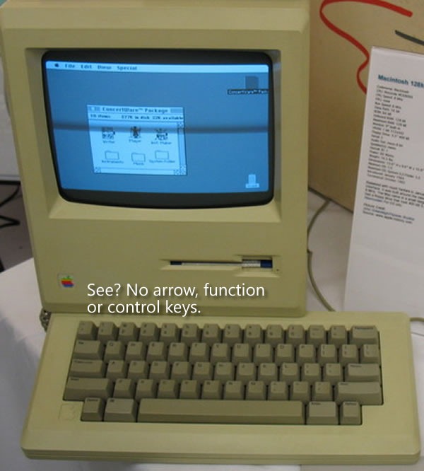
Steve Jobs and Apple’s Macintosh team, an unconventional bunch who were said to have nary a classical computer science degree among them, thought that existing software sucked. I was 16 at the time, and I’d have to agree. In order to prevent straight ports of existing software to the Mac, they decided to “burn the boats” and make it difficult for developers to “go home” and simply rely on the UI techniques from the Old World. The first Mac keyboards didn’t just omit the function keys, they also left out the arrow keys:

Tog writes:
That was a big deal. Almost every application then in existence depended on the arrow keys (then called cursor keys) for navigation. With that one stroke, Steve reduced the number of apps that could be easily ported to the Mac from tens of thousands to zero, ensuring that this new computer would have a long and painful childhood.
It’s counterintuitive to want to have your creation go through a long and painful childhood, but there was a method to their madness. In “burning the boats” by getting rid of the function and arrow keys on which developers relied and taking away their “way home”, they forced developers to redesign and rewrite their applications to fit a mouse-driven graphical interface rather than a keyboard-driven command-line interface.
They eventually brought back the arrow keys about a year and a half later. By that point, developers had grown used to developing GUI apps that took advantage of the UI controls and mouse that we’ve come to know and love. The return of the arrow keys at that point would now be a welcome addition and convenience, rather than a dangerous temptation to return to “the old ways”.
It was a bold move, but when you’re making radical changes to the way things are done, bold moves are often required.
Windows Phone 7: No Copy and Paste

There’s been some talk about Windows Phone 7’s lack of copy and paste. It’s similar to the hue and cry about the original iPhone’s lack of copy and paste, and having been reminded by Tog’s article about the design decisions made for the original Mac, I can see the method to Microsoft’s madness.
“Copy and paste already exists in Windows,” people have said, “why not Windows Phone 7?”
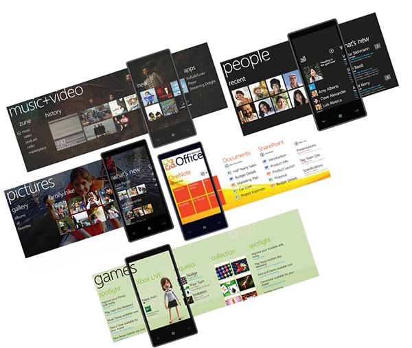
The answer is simple: because Windows Phone 7 apps aren’t supposed to be like Windows apps. For non-enterprise, non-industrial use, the “Windows, but scaled down” approach of previous versions of Windows for phones, which goes under the name Windows Mobile, didn’t catch on (Windows Mobile still rules the roost for compact devices used in enterprises and industries, and will be supported for years to come). Hence Albert Shum’s completely different-from-the-desktop, and even different-from-other-phones Windows Phone 7 interface, which went by the codename “Metro”.

The use of copy and paste implies a keyboard-centric user interface, which isn’t what Windows Phone 7 is about. People often use their smartphones one-handed, with only their thumb to access the touchscreen. Windows Phone 7’s interface takes this usage into account, which is why it’s sensor-centric, and applications, should get their information from touch, gestures, accelerometers, location and other sensors where possible. By not including copy and paste in the first release, the Windows Phone team is “burning the boats” and asking developers “How do you write apps so that they don’t need intricate more-suited-to-the-desktop operations like copy and paste?”
(And yes, copy and paste will eventually find its way into Windows Phone 7, just as the arrow keys, function keys and even right-clicking found their way into the Mac.)
The same could be said for many other things that were purposely excluded from Windows Phone 7, such as the compact edition of SQL Server that was part of Windows Mobile. If you think about it, this design decision forces you to build apps so they store and retrieve data from the network, which makes sense, since phones are devices that network with both cellular and wifi.
Windows Phone 7 represents a radical shift in the way Microsoft stuff works, from a very minimalistic look to its task-centric organization. In order to make sure that people built apps that fit it, the Windows Phone 7 team had to burn the boats. It’s a bold move, but it’s the right one.
19 replies on “Apple, Windows Phone 7 and Burning the Boats (or: Why I Think Windows Phone 7 Doesn’t Have Copy and Paste)”
Very interesting post! I think you got the metaphor dead on with the “burning the boats”. Yes, it is different, and yes some “standard” features are gone, but that doesn’t mean that is broken.
Keep it up Joey!
I don’t think this is completely correct..
The copy & paste functionality doesn’t mean that the apps and the UI is only keyboard-centric, the actual function of C&P could just be there, while still having a touch-centric UI.
Besides, C&P is a function that a smartphone actualy needs. while being in one app or another place with text or pics, we will have a need to copy the sentence or the article, while making apps that work to answer to that need without C&P will only make it worst.
What stuck out to me was the existence of SQL Server for Mobile. What purpose did it serve? I Googled it and still have no idea.
Perfect argument. It fits well with multitasking, and all the other things people crib about
@Tal Going by your argument, Apple could have left the arrow-keys on the original mac, the author isn’t discarding C&P as a useless feature, its just that enabling it now would remove the incentive for developers to make unique designs which allow the users to accomplish the task in a more content oriented way rather than key-board oriented.
As someone who has been using Windows Mobile since v5.0, this may push me over the edge to not stick with Windows Mobile. Apple had crap cut and paste on the iPhone and they had to add it back. Android (which I really like) has crap cut and paste, and every day I feel its absence. Why wouldn’t Microsoft learn a lesson from *others’* mistakes, rather than make the mistake themselves again.
You *need* text cut-and-paste. You may not want apps to *rely* on it, but any app that involves typing will *inevitably* require it., It seems to be removing functionality for no reason, and I think that not making the new O/S backward compatible is a much more apt “Burning the boat” metaphor. You don’t not have e-mail just to say “invent a new way to communicate with each other”.
Bah. As a business owner who has always evangelized for WinMobile, I feel incredibly let down. This focus on games and social networking and removing features that adults might use to no purpose is pushing people like me away.
I don’t mind the games and social networking stuff, but don’t cripple the damn phone for those of us who want to use it to get real work done.
maybe that’s why, but I’m not sure I like it.
imagine someone sends me an email with an address in…. how do I look it up?
imagine I’m in a train tunnel or in “flight” mode and have no 3G/WiFi connection…. can I check my facebook history?
there’s encouraging developers to build smarter apps, and they’re making things painful. I hope the needle hasn’t swung too far to the latter end of the scale….
You’re right on the money, using another sea metaphor, you will never discover new land and you can’t sail without seeing the shore, this “extreme” measures need to be taken if you want to innovate, if you want draw a new path instead of following a previous one.
Great journalism Joey!!
You make a great point, unfortunately I do not entirely agree :)
Ok, there has to be a better way for apps to send information to each other, but ultimately, it has to be the user to control this. Of course that I want to send something by email to a friend and the best way is to “Click trough a Send Email button”. But I might want to only send some information, or a little bit changed! For this, copy paste is the king.
I think I read somewhere that apps can register themselves in the system so that they can take action with these kind of action. I’m afraid that in the long run, users start to face the explorer-context-menu problem where every little app has it action and in the end it will only confuse the user more.
Here’sa video of Windows Phone 7’s Smart-Sensing functionality :
http://www.mobiletechworld.com/2010/04/21/video-of-smart-sensing-vs-copy-and-paste-in-windows-phone-7/
Looks nice but I don’t think it can replace copy/paste.
Let me copy and paste a Google Streetview link in here:
http://maps.google.com/?ie=UTF8&hq=&ll=52.959148,4.769075&spn=0,0.020621&z=16&layer=c&cbll=52.959219,4.769007&panoid=MnEh58YA38-oTtK0cF5U0A&cbp=12,80.22,,1,-0.97
Hint: it’s not a Spanish galleon. This view is from before the fire.
Result: there is no ship anymore, and there won’t be any to replace it. End result: failure
(and if Apple fails to do something, you don’t need to copy and paste that failure in your product).
I hope they will have a business-grade version of WP7 before people will jump ship to Android.
While I see validity in your point (and I think it applies very well to the managed code rule for example), I pretty much agree with Tal about copy and paste.
Unless we say people shouldn’t attempt to work with text on their phones (and why shouldn’t they?), copy and paste functionality is simply something they require to work effectively with text. Leaving it out is less bold and daring than it is annoying.
That said, I love the platform, even though I despise the Neo-Yuppie “Life-Maximisers” and want to see them trampled by a herd of rabid yaks.
The danger of selective rationalisation.
There’s another difference between Windows Phone 7 (and Windows in general) and Macintoshes that you’ve left out, but was vital to the Mac’s survival…
Two things actually.
First, a rich and *consistent* set of UI controls that were robust enough to discourage people from writing their own stuff. Consistency is a hallmark of MacOS, and while hardly perfect, is far, far better than in Windows. (Don’t think so? Here’s an experiment. Try right clicking on different text entry fields to paste text into it, See how many apps support it. See how many *Microsoft* apps support it… Now, for bonus points, try double clicking on a word and then slide the mouse back and forth – it *should* select from the entry point all the words, by word. Heck try single clicking and doing that – you’d be amazed by how many apps will select forward, but not backwards.)
Second, Apple wrote the core apps. And they went to great lengths to create a suite of apps that got most of the basics done. These apps became the first things any Mac users saw – and the paradigms encompassed in those apps became expected in all Mac apps. Microsoft is finally getting there – but it’s still a long way off.
Don’t think so? Open Notepad, Wordpad and Word 2007. Three similar apps – that are all written by Microsoft, but you’d think three different companies had written them.
Which bring me to WP7… It’s got promise – but unless Microsoft makes it VERY easy to write to the paradigms in it – AND very hard (and equally – very unnecessary) to roll your own solutions, it’s going to be a mess fast. Based on the CTP for the dev kit – I’m thinking ‘wow – this is going to be ugly.’
I know it’s not baked yet – but I’m not even sure the cake has the right ingredients yet.
Let’s see, so this is for better applications on WP7… Here’s the message for satnav developers:
Here guys, get this challenge: there’s no C&P, you can’t hook into this cool thing we call smartlinking, there’s no other way to exchange data between applications. You also can’t set your application as a default mapping app to replace Bing maps. Get it? Cool. Now the only way your users will be able to navigate anywhere will be by typing in addresses into your apps manually. Obviously, because this is not Windows, and it’s not a keyboard-centric OS, your application will suck. Now go and try to make it usable (homeric laughter).
Of course, Microsoft isn’t applying the same restrictions to themselves. Why would that be?
[…] So you need a typeface What web design can learn from the harpsichord Apple, Windows Phone 7, and burning the boats […]
I think the analogy is a little flawed in the Cortes and his dudes were left with little choice but to move forward. The reality is that users and developers have plenty of choices if MS wants to burn its boats ( or its bridges in another analogy )…
As a fairly long time user of a smart phones I think the simple ability to take a phone number from a email, facebook wall, tweet and paste it into my dialer is phone functionality 101. Yes, apps can work around this but phone number detect is never perfect in any app, and not all app instances will consider situations where a copy/paste would quickly solve the problem. Overall I think the lack of copy/paste is a failure but only time will tell…
@Jeff, I just tried about 8 different apps and at least 20 distinct text boxes. They all allowed paste, although some allowed paste-special. I guess there exists some app that doesn’t, but it’s pretty darn consistent.
I also tried your selection thing, and all the apps that had text for me to select did what you stated too.
Regarding Notepad v WordPad v Word. Wordpad looks like an extremely simplified version of Word. Has the ribbon and everything. Using it is just like Word. Notepad is a fair bit different, but in fairness it was written 20 years ago, and most people who use it don’t want it to change. It’s meant to be no frill and come up and extremely quickly. It does the job.
Regarding the CTP, what in particular is the problem? It actually seems like a its easier to build stock WP7-looking apps than it is using XCode to write stock iPhone looking apps. Although in both cases I feel like you have to go a bit out of your way to write apps that look like they don’t belong.
For me it’s simple: if I use a web browser or e-mail: I need copy/paste.
Ya a copy and paste function is very important to have now.