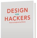
Here’s a video of David Kadavy, freelance web designer and author of the upcoming book Design for Hackers, spoke at Ignite Chicago back in November about the font everyone loves to hate: Comic Sans. He calls it “the most hated font in the world,” and it probably is – at least among typographers, designers, UX specialists and anyone who works with computers and has a modicum of taste.
He talks about Comic Sans by comparing it to one of the world’s most beloved typefaces (well, at least among design geeks, anyway), Helvetica, explains its origins as a font meant to be used for the word bubble in Microsoft Bob and how it was created in the time before antialiased onscreen text was common and how back then, he’d rather have read something set in Comic Sans than something set in Garamond, which has considerably more designer approval.
You can find out more about what David thinks about Comic Sans by checking out his latest blog post.
What is Design for Hackers?
 Keep an eye on David: he’s currently working on Design for Hackers, a book to be published by Wiley and Sons. Here’s how he describes this project:
My goal for Design for Hackers is to help Software Developers and Entrepreneurs (Hackers) – who are interested in design – see the world the way a designer does. Hackers are used to teaching themselves whatever is necessary to achieve their vision; and for most things this is relatively straightforward. If they are learning to program, and come across an error, they can do a quick Google search. If they want to know how to do their own bookkeeping, they can learn about this easily with a book or by looking around on the web. Unfortunately, there’s no quick fix found when you Google “my design sucks.”
The problem with most advice given by designers is that it usually consists of rules (“use no more than two fonts”) that are often conflicting and easy to forget. Naturally, the decisions made by designers are difficult to put into words, and many designers are better with images than words. Rather than teaching you to fish, they give you a fish. When you’re still confused, they may shrug their virtual shoulders and explain that its just their natural talent that makes them able to design. This is usually true, but I believe natural talent is not a requirement for understanding design – especially not for naturally curious people who can teach themselves nearly anything, given the right information.
There are some very consistent principles behind what makes a design visually compelling, and these principles are as important on the screen of your iPad as they were on the streets of ancient Rome. My goal is to weave these principles into your brain using examples from today, as well as from the history of art, architecture, and design. I will tell stories and present examples that will infect your brain, make you look smart when you retell them at parties, and change the way you see the world around you. I’ve been telling my friends, “it’s like Freakonomics, for Design.”
Freakonomics, but for design? I could get into that.
One reply on “Why You Hate Comic Sans / Design for Hackers”
[…] This post was mentioned on Twitter by Joey deVilla and Julie Jancen, StevenTait. StevenTait said: RT @AccordionGuy: Why you hate Comic Sans / Design for Hackers: http://bit.ly/emjcK0 / http://bit.ly/gLGAtV #in […]