The iPhone 5 and Scratchy Show
Click the photo to see the source.
Just like as the white zone at the airport is for loading and unloading only, my left pocket is strictly just for my iPhone (still a 4S — I got it in November, and I’ve no compelling reason to upgrade yet). That way, there’s considerably less chance for it to get scratched. Even so, I keep my iPhone in a case, even if Darth Gruber disapproves.
Click the photo to see the source.
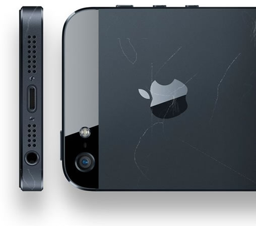
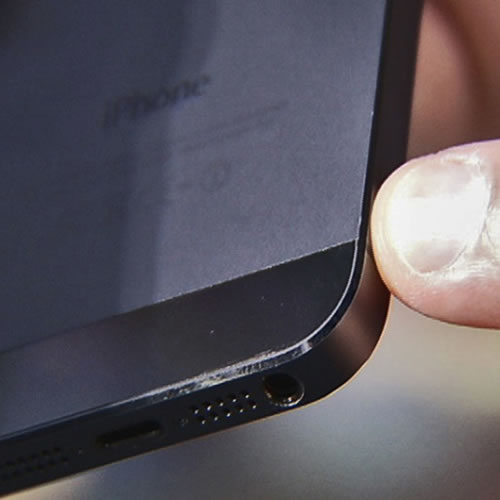
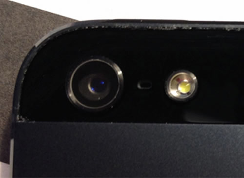
With the iPhone 5, Apple ditched the “glass sandwich” design in favour of aluminum. The problem is that customers have noticed — and remember, it been available for less than a week — is that it scuffs, scratches and even chips a little too easily.
Click the photo to see the source.
Any aluminum product may scratch or chip with use, exposing its natural silver color. That is normal.
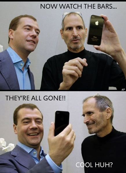
He must be channeling the spirit of Steve Jobs — this is “You’re holding it wrong”, version 2.0.
Design for Deterioration
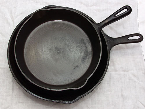
All this reminds me of an article by Khoi Vinh in his blog Subtraction, in which he talks about designed deterioration. He waxes poetic about his cast iron skillet and other things that look better when worn or used heavily:
…I have a US$20 cast iron skillet that I bought several years ago from a restaurant supply shop in downtown Manhattan. I’ve cooked hundreds of meals with it, and over time it has developed a coating from oil and food — the manufacturers call it ‘seasoning.’ It’s a little unbecoming when you think about it; in fact, though I clean it, it’s a dirty piece of cookware, and it resembles its original, store-bought state not at all.
…After cooking in it and cleaning it up, I’ve spent a lot of time just looking it over, marveling at how its very deterioration has been incorporated into the design of the object, at how it’s gotten more attractive — less ignorant — the more I use it. I’m not particularly sentimental about much in my kitchen, but I would be heartbroken if you took away this iron skillet…
He compares it to his technological goodies, for which the opposite is true:
I mention these things because I’ve noticed recently that the concept of what we might call designed deterioration is fairly anathema to digital hardware. The objects we purchase from purveyors of digital technology are conceived only up to the point of sale; the inevitable nicks, scratches, weathering, and fading they will encounter is not factored in at all. The result is that as they see more use, their ignorance may recede, but they wear it poorly. They don’t age gracefully.
Looking at the digital technology I own, what moderate deterioration to be found — dents in my laptop, a gash in the side of a laser printer I own, the accumulated grime on my computer keyboard — doesn’t make these items more desirable at all. In fact, when I see the way the corner on my aluminum PowerBook has been warped due to a nasty fall from a chair, I cringe. Through this obvious, glaring example of use, of accumulated knowledge, the object itself hasn’t attained an additional whit of beauty.
In fact, the damage is actually quite repulsive. This is because the laptop was conceived by Jonathan Ive based on an assumption that it would remain perfect forever. There was no designed deterioration factored in whatsoever, and so no real thought was given to how the laptop might change with use. Marks of knowledge, like the warped corner, aren’t meant to be embraced, but rather denied.
He also astutely observes that if you designed things like iPhones to look better with age and use, you’re discouraging people from upgrading to a newer model.
One reply on “The iPhone 5 and Scratchy Show (or: You’re Holding It Wrong 2.0 and Design for Deterioration)”
Part of me is relieved when some gadget I own gets scratched or dinged. Because from then on, I’m not living in fear of the event.