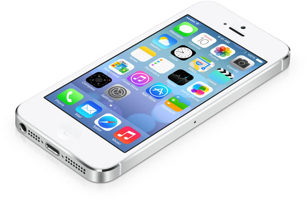
The New iOS
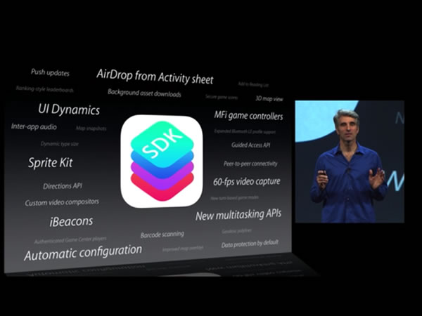
iOS 7 was saved for last at Apple’s WWDC 2013 keynote, and rightfully so: it was the announcement that the iFaithful were waiting for. In case you’ve been busy and haven’t yet had a chance to see it in action, here are a couple of videos to get you started. First, the trailer: a 7-minute 29-second promo video with Apple’s “right brain” Sir Jony Ive tackling the visual design aspects and Apple’s new “left brain” Craig Federighi describing the new functionality.
Few companies know how to send subtle messages the way Apple does, whether in their user interfaces or their marketing, so the contrast between Ive (the visual design guy; with no hair, V-neck T-shirt, and an English accent) and Federighi (the software guy; with the coiff that earned him the nickname “Hair Force One”, collared shirt, and an American accent) is an interesting one. I’m certain that “has a personal style that’s quite different from Jony’s” wasn’t the reason they picked Craig to be Senior Vice President of Software Design, but it would be very un-Apple not to play it up. It says “We’ve got looks and brains; a beautiful, usable interface, and some great underlying technology to boot”.
If you’d rather watch the actual WWDC presentation, here are those 33 minutes that were devoted to iOS 7. Jony’s not into doing keynotes, so Craig took the reins. He’s a solid presenter; I’m looking forward to seeing him do more demos in future Apple announcements:
The Changes in iOS 7
This is the first post-Seve Jobs/Scott Forstall version of iOS, and it shows. As Jon “Daring Fireball” Gruber wrote in his post-keynote article:
…in some ways Apple’s software design has gotten better, because it was Jobs (and Forstall) who had a penchant for exuberant textures and gimmickry. Jobs’s taste in hardware was nearly perfect, but his taste in software had a weakness for the saccharine. Wood grain, linen, Rich Corinthian leather, etc. It was all just sugar for the eyes. This is a weakness Jony Ive’s software taste clearly does not suffer.
Application designers and developers generally take their cues from the designers of their target operating systems. iOS shared Steve Jobs’ taste for skeuomorphic, and it showed in app such as the built in Compass, with its polished wood and brass UI:

Many iOS developers took that fascination with simulated three-dimenisonality, real-world objects, and realistic textures to strange new heights. If you want to see some of the most over-the-top examples of these designs, point your browser at the Skeu It! site and be prepared to facepalm:
It’s hot and humid today…in my pants!
A lot of apps feature texture for texture’s sake.
The new iOS represents a step away from the simulated 3-D, literalist approach to user interfaces and towards a flatter, simpler, brighter look. Note the differences between the icons for standard apps in iOS 6 and 7:
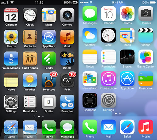
iOS 6 / 7 screen comparison from Matt Gammel’s writeup.
Here’s one of the most-used built-in apps, Messages, in iOS 6 and 7.:

iOS 6 / 7 screen comparison from Matt Gammel’s writeup.
This is what you see when you get a phone call in iOS 6 and 7:

…and here’s a side-by-side comparison of the sample “periodic table” app, “TheElements”, in iOS 6 and 7:
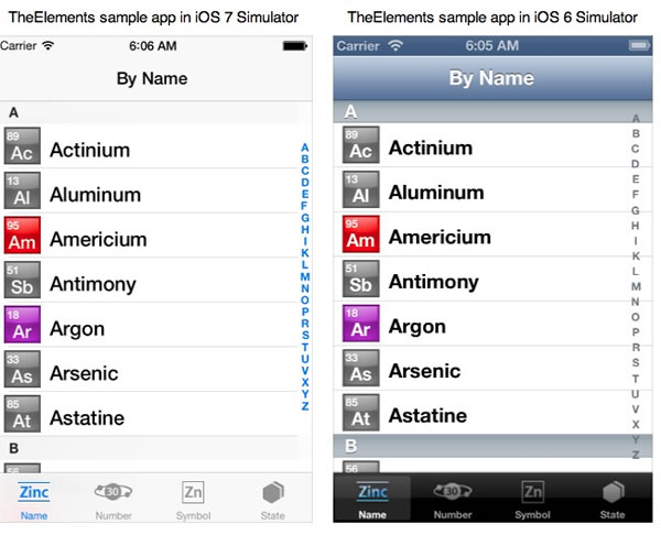
As you can see (and as the tech press has been reporting), they’ve gone to a “flatter” interface, with a greater emphasis on text and the removal of a lot of UI “chrome”.
The best writeup covering the user interface changes in iOS 7 that I’m aware of it Matt Gemmell’s. Published a mere two days after the WWDC keynote and the availability the iOS 7 beta to developers, it’s as a complete an overview of the changes as we’ll see for the time being. If you plan on designing applications for iOS 7, it’s a worthwhile read.
The Developer Opportunity
If you’re a developer who’s been meaning to get into iOS development but worry that you’re starting from way behind the curve, the redesign in iOS 7 is a disruption that works in your favour. While apps written for previous versions should work, they’ll seem out of place and maybe even archaic in iOS 7’s new UI. Marco Arment, in a post titled Fertile Ground says that this is great news for you:
Apple has set fire to iOS. Everything’s in flux. Those with the least to lose have the most to gain, because this fall, hundreds of millions of people will start demanding apps for a platform with thousands of old, stale players and not many new, nimble alternatives. If you want to enter a category that’s crowded on iOS 6, and you’re one of the few that exclusively targets iOS 7, your app can look better, work better, and be faster and cheaper to develop than most competing apps.
This big of an opportunity doesn’t come often — we’re lucky to see one every 3–5 years. Anyone can march right into an established category with a huge advantage if they have the audacity to be exclusively modern.
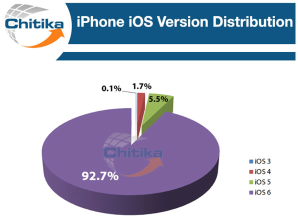
Another thing to keep in mind is that iOS users tend to upgrade quickly. In a world where it’s still not all that unusual to see a machine running Windows XP or where a third of the Android devices out there are running version 2.3, iOS users set themselves apart by keeping up to date. According to Chitika, almost 93% of iPhone users are running the current version of iOS:
Click the graph to see the source article.
All this means is that it’s not too late to learn how to develop for iOS, especially if you start now.
Regular iOS Developer Articles, Here on Global Nerdy
If you search around the web for developer courses or “boot camps” for iOS and Android, you’ll find that they’re
- Quite short, running anywhere from 2 to 5 days, and
- Quite expensive, running anywhere from $900 to almost $4000
 There are some people who benefit from getting started by taking a course: perhaps they need the structure of a classroom to give them initial momentum, or perhaps it’s the idea of having to pay for a course that motivates them (just a smokers who pay to join a “quit smoking” program have been observed to be more successful in quitting than those who spent no money). If you feel that classes would help you get started and you have the money — or someone, perhaps your employer, does — by all means, take them.
However, if you don’t have the money to attend an iOS development course or boot camp, or if you want to supplement your courses, keep coming back to Global Nerdy. I’ll be posting articles on iOS 7 development on a regular basis, sharing tips and tricks, pointing you to valuable resources, and generally presenting information that you, the developer new to iOS 7, will find useful. Watch this space!

2 replies on “New iOS, New Interface, New Opportunity, New Developer Tutorial Series!”
[…] As I mentioned in my previous article, iOS 7 represents more than a change in Apple’s approach to their mobile device user interfaces; it also represents an opportunity for developers who’ve been putting off learning how to build native iOS apps to get started. iOS 7 is the latest in a series of changes that makes the present time the best time for a new developer to try their hand at making apps for the iPhone, iPad and iPod Touch, which include: […]
[…] The changes being made to iOS and the opportunities that arise from them […]