Yesterday, we looked at three internal Apple documents that were presented in the Apple/Samsung patent infringement suit. These showed a side of Apple that we normally don’t see: a company that is worried about the competition, is greatly concerned that they might not be offering what customers want right now, and despite having produced some of the industry’s most memorable ads, is greatly disappointed with their advertising agency.
Today, we’ll look at three internal Samsung documents that came to light in the case’s opening arguments. As with Apple, these documents show a company that is watching its competition closely and looking to shore up its shortcomings.
Touch and software: The new value drivers
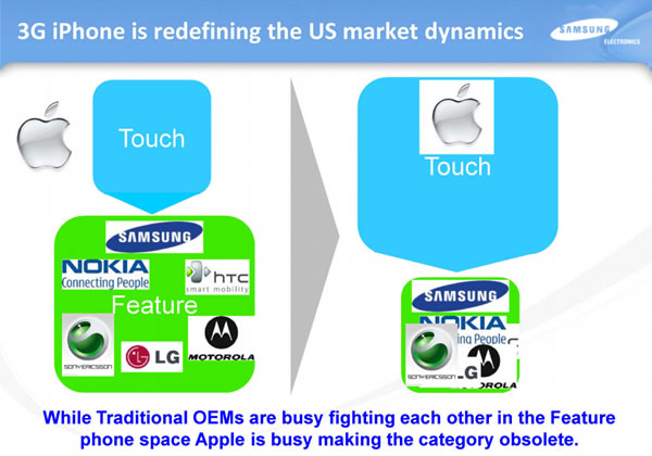 This first document is a slide presentation titled 3G iPhone US market impact, which was probably meant to convince Samsung management that smartphones were the future. Dated July 2008, between the time Steve Ballmer dismissed the iPhone and the time he dismissed Android, it shows a Samsung coming to realizations that would eventually make it the number one Android hardware vendor and the number two smartphone vendor in the US today.
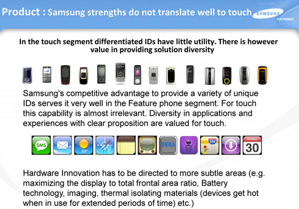
When Steve Ballmer was still thinking that business users would dismiss touch-based phones and prefer physical keyboards and that customers wanted a wide variety of hardware and hardware features to choose from, this slide presentation was putting forth the argument that:
- Customers much preferred variety in software, rather than hardware, and
- setting yourself apart in hardware is a more subtle matter, and geared mostly about improving the user experience.
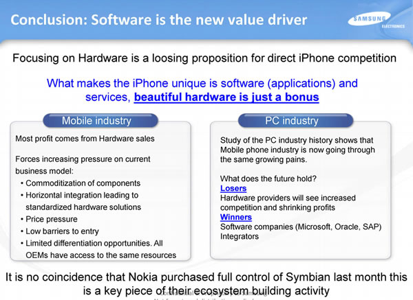
Their conclusion: software and services — which incidentally was part of the Microsoft mantra at the time — is the future of the mobile phone business. They saw mobile phones as computers that just happened to fit into your pocket and make phone calls, rather than as something you used in the place of a “real” computer.
Note the “beautiful hardware is just a bonus” line. Dismissing design is a prejudice that many (but thankfully not all) engineers have, but the best products merge both excellent engineering and beautiful, functional design.
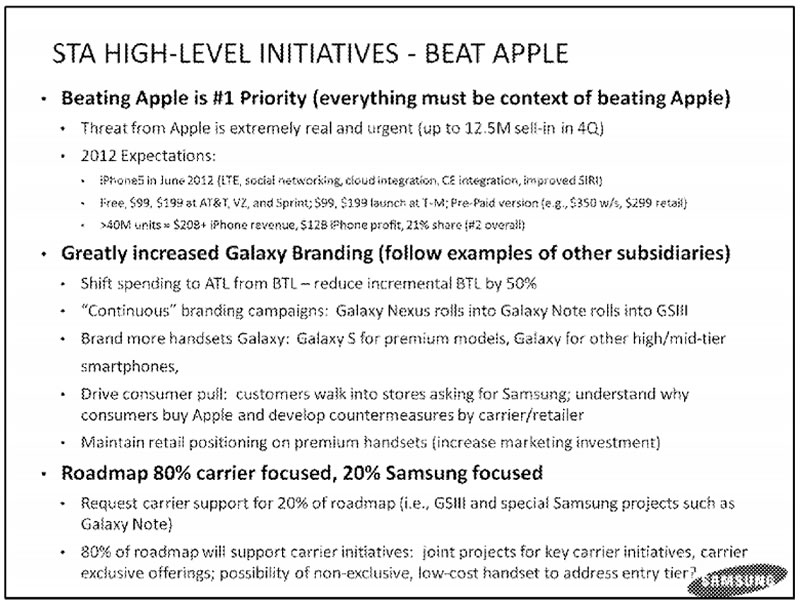
“Beating Apple is #1 Priority”
Click the image to see it at full size.
Like Apple, one of the reasons that Samsung is successful is that they recognize threats. In this document, 2011 Summary and Lessons Learned / 2012 Business Forecast, they declare their own version of Steve Jobs’ “Holy War” on Google and declare Apple as Samsung Enemy Number One.
I love this slide. It states their mission for 2012 clearly and concisely: beat Apple, promote the Galaxy brand, and work closely with the carriers. It’s far less muddled than any set of goals for Windows Phone that I saw during my time as a Windows Phone Champ at Microsoft. To paraphrase web design guru Jeffrey Zeldman:
“…provide value added solutions” is not a mission statement. “Destroy All Monsters.” That is a fucking mission statement.
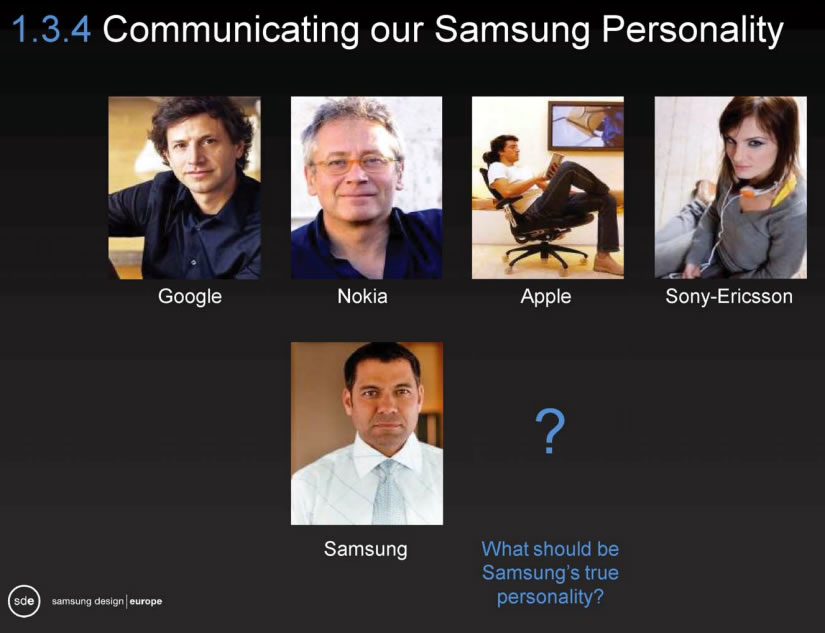
“What should be Samsung’s true personality?”
Click the image to see it at full size.
The title of this 2009 document concerns itself with the findings of a Samsung project called MIEUX, an acronym for “Make It Emotional UX”, where “UX” is industry shorthand for “user experience”. The acronym is based on the French word mieux, which means “better”.
The “better” that the project is going for is “the creation of a more intuitive and emotional Samsung Mobile interface”. They argue that the design of Samsung mobile user interfaces at that time was merely utilitarian, not user-friendly, and utterly devoid of charm. At the same time, they demonstrate how Apple was able to get both fun and functionality into the iPhone user experience. Among the recommendations in this slide deck are:
- Replacing engineer-based UI and technology-driven features
- Enhancing contextual connectivity
- Offering friendly guidance
- Intriguing users
- Applying meaningful creativity
- Introducing charm
The slide above was the one I thought was the most amusing in the deck: it depicts phones from Samsung’s competitors as presenting some king of personality, which Samsung’s as being merely functional and bland. The expressionless guy with the white tie/white shirt combo is a clever, if cutting, touch.
