Categories
Uncategorized

Tomorrow at the Tampa Bay UX Meetup: Workshop: Designing for the Future of TBUX!

Thursday is World Usability Day, and what better day for the Tampa Bay UX Meetup? Want to shape the future of one of Tampa Bay’s biggest meetups? Come tomorrow and take part in Designing for the Future of TBUX!

The event details

Here’s what they plan to do:

It’s time to celebrate in Tampa Bay with a workshop focused on designing the future of TBUX! The Tampa Bay UX 2019 Theme is Designing for the Future We Want. Design has a huge influence on people’s lives. What we design today can have a lasting impact on the world. Let’s use this year’s theme, “Design for the Future We Want”, to focus our work to improve the world through better experiences and create a better future together.

How do we design and build the future of the Tampa Bay UX group? What does UX look like in Tampa Bay? This event will be interactive and we’ll use the design thinking process to discover and test solutions to how we can better educate our communities about the value and craft of User Experience.

Categories
Uncategorized

Tomorrow at the Tampa Bay Full Stack Meetup: Intro to mobile development with Flutter!

If you’re looking at “write once, run on Android and iOS” tools, you’ll want to check out Flutter. If you’re in the Tampa Bay area tomorrow evening, your chance to get an intro to Flutter is at the Tampa Bay Full Stack Meetup, whose topic will be Introduction to mobile development with Flutter.

The event details

  • When: Wednesday, November 13, 2019, 6:00 – 7:30 p.m.
    Networking and food from 6:00 – 6:30
    Presentation starts at 6:30
  • Where: ClearlyAgile’s 4th floor conference room, 201 E. Kennedy Blvd (Fifth Third Bank building)
  • Where to register: Introduction to mobile development with Flutter Meetup page

Here’s what they plan to do:

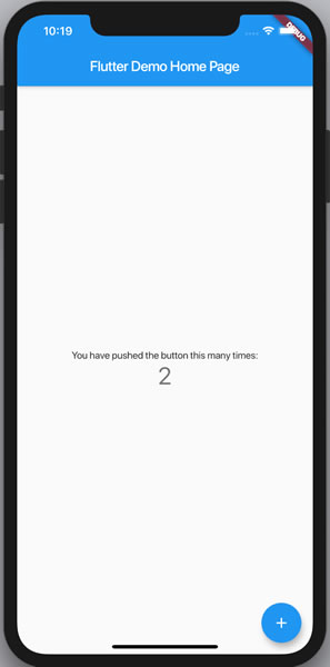
In this meetup we will go over the basics of this framework created by Google which uses Dart as its programming language. We will learn how to install Dart and the Flutter SDK and start creating a basic app. You will see how easy is creating a Flutter app (really fast process) using either the CLI or Visual Studio Code’s Command Palette. We will know how the file structure in the solution looks like and understand its architecture.

Want a head start? Try installing Flutter and deploying your first app.
Why Flutter (say, vs. React)?

You can’t talk about Flutter without talking about the 800-pound gorilla in the cross-platform app development sphere: React Native. Both are trying to solve the problem of developing apps for the two very different platforms of Android and iOS without having to write two different applications using two different SDKs and two different languages.

React Native enjoys a number of advantages, including the first-mover advantage, being a Facebook project, the use of the most popular programming language in the world (JavaScript), and a strong development community. On the other hand, Flutter has a couple of challenges, including:

  • It’s a Google project: While Google is one of the biggest names in Silicon Valley and probably won’t be going away anytime soon, they have a reputation for abandoning projects, including AngularJS, whose end of life happens in June 2021. The farther away a project is from their core cash cows of search and advertising, the more precarious its position.
  • It uses Dart as its programming language. Dart is a Google project, which means that it’s in the same precarious position as anything not directly tied to search or ads. It’s also not as well known or supported as JavaScript.
  • It doesn’t have the maturity of React Native. React Native’s just been around longer, has more developers, and a much bigger community.

So why Flutter?

  • Excellent documentation. The Flutter team have done an amazing job here. React may have more third-party tutorials, but when it comes to direct-from-the-source docs, Flutter beats React Native.
  • Performant architecture. Flutter has native mobile OS components built into its framework as opposed to React Native, which uses JavaScript bridges to connect to native components and modules. Flutter apps have better performance.
  • On-par support for both Android and iOS. React Native is considerably better for iOS app development than Android app development, while Flutter builds Android and iOS apps equally well.
  • Faster development. With “hot reload”, you can make changes and test them almost immediately without having to restart the app. If you’ve ever had to tweak the look and feel of an app, you’ll appreciate the speed of hot reload.
  • Better-looking apps. Flutter makes use a widget sets to get the look and feel you want, with Material Design widgets, Cupertino widgets, and even the capacity for you to roll your own widgets.
  • And finally…

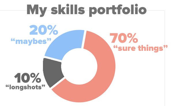
I’ve taken the approach of balancing my skills in the same way financial people balance their stock portfolio:

  • I invest the majority — about 70% — in “sure thing” skills, such as mainstream platforms, programming languages, and technologies. In my case, this is Android and iOS, C#, JavaScript, Kotlin, Python, and Swift.
  • I invest 10% of my time in skills that I consider to be longshots. For me, this is blockchain technology.
  • The remaining time — about 20% — I spend on “maybe” technologies, and one of these is Flutter. At the very least, its in-language reactive way for building UIs mirrors SwiftUI in the iOS world.

See you at the Full Stack Meetup!


Categories
Uncategorized

The UK Home Office’s posters on designing for accessibility

Poster: Designing for accessibility

If you’re designing applications with user interfaces, you might want to check out these posters from the UK Home Office on Dos and don’ts on designing for accessibility. These posters were designed by Karwai Pun, who works with an accessibility group at Home Office Digital to make existing and new services better for the Home Office’s users. She created these “dos and don’ts” posters as a way of approaching accessibility from a design perspective.

These posters cover designing for users with various needs:

  • Designing for users on the autistic spectrum
  • Designing for users of screen readers
  • Designing for users who are deaf or hard of hearing
  • Designing for users with physical or motor disabilities
  • Designing for users with low vision
  • Designing for users with dyslexia
  • Designing for users with anxiety

To find out more, see the UK Home Office’s Dos and don’ts on designing for accessibility page.

Designing for users on the autistic spectrum

UK Home Office poster: Designing for users on the autistic spectrum

  • Use simple colors. Don’t use bright contrasting colors.
  • Write in plain language. Don’t use figures of speech and idioms.
  • Use simple sentences and bullets. Don’t create a wall of text.
  • Make buttons descriptive. Don’t make buttons vague and unpredictable.
  • Build simple and consistent layouts. Don’t build complex and cluttered layouts.

Designing for users of screen readers

UK Home Office poster: Designing for users of screen readers

  • Describe images and provide transcripts for video. Don’t only show information in an image or video.
  • Follow a linear logical layout. Don’t spread content all over a page.
  • Structure content using HTML5. Don’t rely on text size and placement for structure.
  • Build for keyboard use only. Don’t force mouse or screen use.
  • Write descriptive links and headings. Don’t write uninformative links and headings.

Designing for users who are deaf or hard of hearing

UK Home Office poster: Designing for users who are deaf or hard of hearing

  • Write in plain language. Don’t use complicated words or figures of speech.
  • Use subtitles or provide transcripts for videos. Don’t put content in audio or video only.
  • Use a linear, logical layout. Don’t make complex layouts and menus.
  • Break up content with sub-headings, images, and videos. Don’t make users read long blocks of text.
  • Let users ask for preferred communication support when booking appointments. Don’t make telephone the only means of contact for users.

Designing for users with physical or motor disabilities

UK

  • Make large clickable actions. Don’t demand precision.
  • Give clickable elements space. Don’t bunch interactions together.
  • Design for keyboard or speech only use. Don’t make dynamic content that requires a lot of mouse movement.
  • Design with mobile and touchscreen in mind. Don’t have short time-out windows.
  • Provide shortcuts. Don’t tire users with lots of typing and scrolling.

Designing for users with low vision

  • Use good color contrasts and a readable font size. Don’t use low color contrasts and small font size.
  • Publish all information on web pages. Don’t bury information in downloads.
  • Use a combination of color, shapes, and text. Don’t only use color to convey meaning.
  • Follow a linear, logical layout. Don’t spread content all over a page.
  • Put buttons and notifications in context. Don’t separate actions from their context.

Designing for users with dyslexia

  • Use images and diagrams to support text. Don’t use large blocks of heavy text.
  • Align text to the left and keep a consistent layout. Don’t underline words, use italics, or write in capitals.
  • Consider producing materials in other formats (for example, audio or video). Don’t force users to remember things from previous pages — give reminders and prompts.
  • Keep content short, clear, and simple. Don’t rely on accurate spelling — use autocorrect or provide suggestions.
  • Let users change the contrast between background and text. Don’t put too much information in one place.

Designing for users with anxiety

  • Give users enough time to complete an action. Don’t rush users or set impractical time limits.
  • Explain what will happen after completing a service. Don’t leave users confused about next steps or timeframes.
  • Make important information clear. Don’t leave users uncertain about the consequences of their actions.
  • Give users the support they need to complete a service. Don’t make support of help hard to access.
  • Let users check their answers before they submit them. Don’t leave users questioning what answers they gave.

Found via Ramon Grajo.

Categories
Current Events Tampa Bay Uncategorized

What’s happening in the Tampa Bay tech/entrepreneur/nerd scene (Week of Monday, November 11, 2019)

Technology accounts for 10.4% of Tampa Bay’s economy, and that’s why our tech scene is so lively!

Every week, dedicated individuals and organizations in around the Tampa Bay do more than just their “day jobs”. They get involved in events where they share their knowledge, make connections and friends, and gather together to build strong tech, entrepreneur, and nerd communities. That’s why I do this every week: I put together a list of tech, entrepreneur, and nerd events to make sure that they can be found and you can attend them!

Here’s what’s happening in Tampa Bay this week!

This weekly list is posted as a voluntary service to the Tampa tech community. With the notable exceptions of Tampa iOS Meetup and Coders, Creatives and Craft Beer — both of which I run — most of this information comes from Meetup.com, EventBrite, and other local event announcement sites. I can’t guarantee the accuracy of the dates and times listed here; if you want to be absolutely sure that the event you’re interested in is actually taking place, please contact the organizers!

Monday, November 11

Tuesday, November 12

Wednesday, November 13

Thursday, November 14

Friday, November 15

Saturday, November 16

Sunday, November 17

Do you have an upcoming event that you’d like to see on this list?

If you know of an upcoming event that you think should appear on this list, please let me know!

Join the mailing list!

If you’d like to get this list in your email inbox every week, enter your email address below. You’ll only be emailed once a week, and the email will contain this list, plus links to any interesting news, upcoming events, and tech articles.

Join the Tampa Bay Tech Events list and always be informed of what’s coming up in Tampa Bay!


Categories
Uncategorized

My “Kotlin Cheat Sheet and Quick Reference” at RayWenderlich.com has been updated!

Whether you’re new to Kotlin or bounce between so many languages that you need a quick reference (like me), I think you’ll find the Kotlin Cheat Sheet and Quick Reference at RayWenderlich.com handy! It covers the syntax that you’re most likely to use in day-to-day Kotlin development using clear — and in some cases, amusing — examples to help explain how to use various Kotlin features.

This is a revised edition: same content, improved layout. Best of all, you don’t have to be a RayWenderlich.com subscriber to get your hands on it. Check it out!

If you’d like to learn more about Kotlin and Android programming, be sure to check out RayWenderlich.com’s books, Kotlin Apprentice and Android Apprentice, two fantastic introductory books to the Kotlin programming language and Android development with Kotlin!

Categories
Uncategorized

Tech comic of the day: “Cutting out the middleman” by Jeremy Nguyen

Click the comic to see it at full size.

Why should Facebook and their ilk make all the money off my data? I want in on some of that action!

Want to see more of Jeremy Nguyen’s work? See his site, JeremyWinsLife.com!

Categories
Uncategorized

Beginning ARKit

Want to learn to how write augmented reality apps for iOS devices? Check out Beginning ARKit, my video tutorial on RayWenderlich.com, the premier mobile tutorial site!

In the tutorial, you’ll build the following apps while learning the fundamentals of developing apps using ARKit, the augmented reality development framework for iOS:

  1. Hello, Augmented World! A quick “Hello, World!” app to get your AR programming feet wet.
  2. Happy AR Painter. An app that lets you “paint” over the real world with 3-D objects.
  3. Raykea. Here’s a scaled-down version of “IKEA Place” — it lets you put virtual furniture into the room you’re in, and automatically adds posters to the wall.
  4. BaedekAR. A AR museum guide that identifies known works of 2-D art, draws their titles over them in AR text, which you can tap to find out more.
  5. BaedekAR 3D. A 3D version of BaedekAR, which identifies known 3-D objects.

Want a taste? Here are some excerpts…

If this sounds like your kind of tutorial, check out the full thing at RayWenderlich.com!