
Don’t forget:
- Land Your Dream Job 2.0, which takes place at Mercury Lounge from 4:00 – 6:00 p.m.
- Node.JS Ottawa Pub Nite, which takes place at the Sir John A. Pub from 7:00 – 9:00 p.m.
For more details, see my earlier post on tonight’s events.
Don’t forget:
For more details, see my earlier post on tonight’s events.

This weekend, I’ll be in Seattle for BarCamp as part of the BarCamp tour, a cross-North-America sponsorship put together by five startups: Batchblue, Grasshopper, MailChimp, Wufoo and the company for whom I am representative, Shopify.
BarCamp is an unconference – a gathering that turns the traditional notion of a “conference” upside-down. Rather than the content being determined by its organizers, it’s determined by the attendees. At the start of the conference, any attendee can propose a session topic, and if it’s accepted by the group, that session gets put on the schedule grid and assigned a time slot and a room. Sessions themselves are somewhat different from sessions at a traditional conference: while there’s still roles akin to a “presenter” or “presenters” and an “audience”, the line between the two is considerably more fuzzy. They’re closer in spirit to open discussions rather than lectures.
![]()
BarCamp Tour are not your typical sponsors. Just as BarCamp is an unconference that turns the notion of a conference upside-down, you might say that we’re “unsponsors” doing the same to what is traditionally viewed as sponsorship. Yes, we provide funding to various BarCamps, but we do something that most sponsors don’t do: we show up and participate. We help out the organizers with everything from putting together parties to helping move furniture and clean up. We take part in the sessions, sometimes as participants in the “audience”, sometimes as “presenters”. While we do promote our companies, it’s not in a hard-sell way, and often, we do it by listening to and learning from the people there – after all, they’re potential customers, partners and even hires.
BarCamp Seattle takes place this weekend on Saturday, June 24th and Sunday June 25th at the Adobe Conference Center in Seattle’s Fremont neighbourhood (801 N 34th Street). Saturday is a full day with check-in starting at 8:00 a.m. and the unconference kicking into full swing at 9:00 a.m.; Sunday is a half day with check-in starting around 8:00 a.m. (emphasis on around; there’s a party on Saturday night) and the unconference resuming at 9:00 a.m..
BarCamp Seattle, like all BarCamps, is free but you need to register. To register, visit BarCamp Seattle’s EventBrite page.

My next BarCamp will be BarCamp New Orleans, also known as BarCamp NOLA. I’m rather looking forward to this one for a few reasons:
BarCamp New Orleans takes place on Saturday, July 16th and Sunday, July 17th at the Launch Pad coworking/startup space (643 Magazine Street, Suite 102). Registration on the Saturday is at a very civilized 9:30 a.m. with the unconference getting into full swing at 10:00 a.m. and running until 5:00 p.m.. Sunday is a “Hack Day” with registration at 9:30 a.m., start at 10:00 a.m. and running until 5:00 p.m..
Like all BarCamps, BarCamp New Orleans is free but you need to register. You should register soon – only 76 spaces remain as of this writing!

A couple of weeks ago, I put out the call for help in getting together a BarCamp in Accordion City. We haven’t had one in four years and I think it’s about time! The other folks on the BarCamp Tour, most notably Jonathan Kay of Grasshopper who absolutely loves “Toe-RON-toe”, have expressed interest in having one in Canada and are willing to be a sponsor.
A great collection of people have stepped forward and volunteered to help. I’ll be meeting with them online very shortly (I’m in Ottawa for the summer, but I return to Accordion City in the fall) to discuss what happens next, but know this: the first step toward bringing BarCamp back to Toronto has been made.

Do you rock at iOS/Objective-C? How about Ruby and Rails? Or perhaps JavaScript and CoffeeScript? Would you like to do some fun, challenging and profitable work at Shopify? We’d like to have a word with you. Don’t forget, the job has some awesome perks!
Drop me a line at joey@shopify.com and we’ll talk.

If you’re in the Ottawa area on Wednesday and you’ve been looking for tech get-togethers or a chance to meet the Shopify crew, you’re in luck! We’ve got a couple of events taking place, and as the Shopify spokesmodel, I’ll be at both of them:
The Venn diagram below shows where your dream job is: smack in the heart of the “Hooray!” zone:

I’ve been fortunate enough to live in that zone for a good chunk of my career, and my current job as Shopify’s Platform Evangelist certainly applies. I’ve landed these sorts of jobs in rather atypical ways and I think that going outside the “expected” or “typical” gives you the best odds at landing your dream job.
 The Land Your Dream Job 2.0 event is part of OCRI’s smarTALKS series and all about doing just that. My fellow Shopifolks will be among the people there talking about how you can land that job that blends what you do well, what you want to do and what you can be paid to do.
You’ll learn about:
And you’ll hear from:
Land Your Dream Job 2.0 takes place this Wednesday, June 22nd at Mercury Lounge (56 ByWard Market Square) from 4:00 p.m. to 6:00 p.m.. This is a FREE event, but you do have to register.


If you’re into JavaScript, Node.js or related tech like CoffeeScript, come to the Sir John A. Pub on Elgin later Wednesday night for Node.js Ottawa Pub Nite! We’ll be there to talk about Node and related technologies, as well as to get to know what people are up to, talk about our projects, answer the “What is Node, anyway?” questions that are still floating about and discuss what we’d like to see happen with the Node.js meetup group.
Node.js Ottawa Pub Nite takes place this Wednesday, June 22nd at the Sir John A. Pub (284 Elgin Street) from 7:00 p.m. to 9:00 p.m.. This is also a FREE event, and we recommend that you register so they have an idea of how much space to claim in the pub.

Welcome to the second installment of Selling More Shopify Apps! In this article series, I show developers how to sell their apps — add-on applications that extend Shopify’s capabilities. Since this is really more about selling than developing, the series appears here in the Shopify blog instead of in the Shopify Technology blog, even though it’s aimed at developers.
Oh, yes: for those of you who’ve been wondering: I will do a series of articles for shopowners who want to sell more stuff through their Shopify stores. Soon! But in the meantime, give this series a look — even though this series is about selling apps, there are some principles that do apply to regular stores.
In the previous article in this series, I talked about the decision-making process that users go through when perusing the app store and deciding whether to buy your app.
They go through these steps:
In this article, we’ll look at a very effective way to make your app’s App Store page better: by adding pictures and video. Pictures and video are part of step 3 of the user’s decision to buy, and they’re the first thing the user looks at when s/he ends up on your app’s page. They make that oh-so-important first impression that can help drive a sale.
Take a look at the screenshot for an app in the App Store:
The video and pictures (which I’ve highlighted above) take up the entire right-hand side of the screen. Your eye is drawn to them. People naturally gravitate towards pictures and videos in app stores, whether they’re Shopify Apps, or apps for mobile phone and tablets or stores for desktop apps, such as the Mac OS App Store. You wouldn’t run a Shopify store without pictures of the goods you’re selling; the same rule applies to apps!
Think of your app’s page as being two sections: the show section and the tell section. The show section is the opener, and it’s where you show your app in action and give your potential customers a broad overview of what it’s for, what it does and what the experience of using it is like. The tell section is the closer, and it’s where you provide a more in-depth view of your app, listing its capabilities and showing the payoff of enhancing the customer’s store with your app.
The pictures and video of your app’s page are the show section, the rating and description of your app’s page are the tell section. You lead with show and finish with tell. Let’s talk about show right now, and in a later article, we’ll delve into tell.
People like seeing screenshots of apps. That’s why just about every app store, from mobile to desktop to Shopify includes them. Even the simplest of applications can benefit from a screenshot because they give users a better “feel” for the app, even though the written description may contain far more information useful to their decision to buy or not buy. There’s a reason why bricks-and-mortar shops invest a lot of money in storefront and in-store displays, even if you’re not going to get much information from just looking at the products: people make decisions based on appearances.
The first question that comes to mind at this point is “what screenshots should I use?” I suggest reviewing your app and keeping these questions in mind:
If there’s a feature in your app that makes the customer or shopowner experience better and it doesn’t take up the whole screen, remember that you don’t have to use a full-screen screenshot. You can simply use a screenshot of the feature without including the rest of the screen. If the feature is particularly small in comparison to the rest of the screen or if it has a lot of text, you might want to enlarge it using your favourite image editing program.
In their App Store page, Optimizely includes a screenshot of just the portion of the page relevant to their app:

Sometimes it’s hard to tell what’s going on with just a screenshot. If this is the case with your app, annotate it: use you favourite image editing program and use text, arrows, highlighting or whatever else helps to make what’s going on onscreen easier to understand. Just be careful not to go overboard with the text on your screenshots: that’s what the app description is for.
Here’s a quick example of an annotated screenshot:

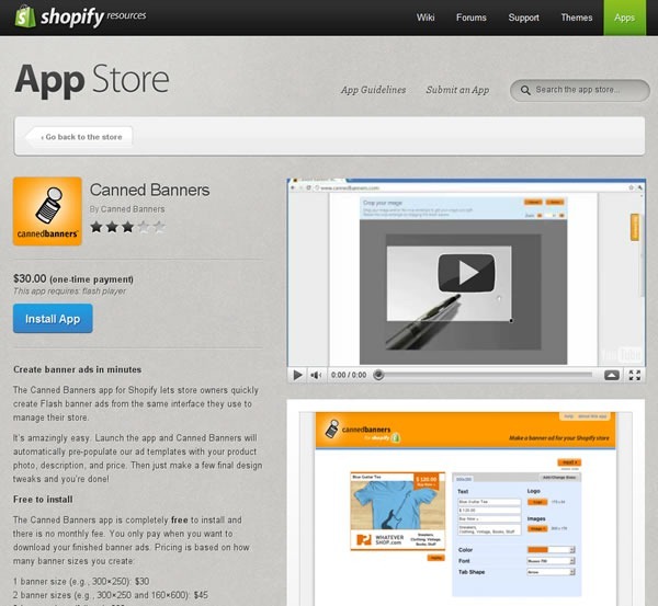
When we built the App Store, our original intention for letting you upload pictures to your App Store page was for you to provide screenshots of your app in action. We’ve since discovered that a couple of app makers came up with the clever idea of posting graphics that aren’t screenshots but explain how their app works. We think it’s a great idea, and if you’ve got some kind of image that makes it easier for potential customers to understand your app and why they should use it, you should include it in your App Store page.
For a good example where an app maker used a non-screenshot image, take a look at the App Store page for Canned Banners. They have a screenshot of their app in action, but they also have the graphic below, which explains how you use their software to create quick and easy banner ads for your store:

Clever! I think it’s in the same spirit as cyberpunk author William Gibson’s line from his “Sprawl” stories: “The street finds its own uses for things.” If you’ve got an image that helps potential customers “get” what your app does, use it!
Next: Video!

It is. If you want to sell stuff or services online in exchange for money – a business model so crazy that it just might work – Shopify is the best, easiest and most hassle-free way to do it. You can use a store that lives on our hosted service or build a program that calls our API to do the ecommerce stuff: the catalog, the shopping cart, the credit card hoo-hah, and so on.
While Shopify does a lot, it can’t do everything. Perhaps there’s a feature that you wish Shopify had, but it applies only to a small vertical or maybe even only your business. Or there just might be some feature that we haven’t thought of implementing yet.
That’s where apps come in: they’re applications that make use of the Shopify API to:
Want to declare a “happy hour” where you drop the price of an item from 5 to 7 p.m. next Thursday? Shopify doesn’t do it out of the box, but an app can! Want to send a Twitter direct message or SMS text to a merchant whenever a customer places a big order, so s/he can make sure it gets handled properly? You can write an app for that. If you can think of a feature to make the experience for customers or shopowners (or both) better, you can make it an app. And you can make money doing it!
You can reach the 15,000 Shopify users – a very focused, dedicated bunch – and sell apps to them through the Shopify App Store. We know a number of developers who are doing quite nicely selling apps and making Shopify showowners productive and happy, and when our customers are happy, so are we.
That’s what this series of articles is all about: selling more Shopify Apps. If you’re a Shopify App developer (or thinking of becoming one), this series will show you how to sell them better. We’ll also be publishing articles about writing apps, from how-tos to ideas for apps that we’d like to see become real.
Take a look at Shopify’s App Store, and I’ll walk you through the typical customer’s decision making process when they’re looking for apps.
1. They see your app’s icon, its name and the short description on the App Store page.

When you visit Shopify’s App Store, you see a page like the one shown above, featuring apps displayed on shelves. Rather than being broken up into pages, the App Store’s main page is an “infinite scroller”; you simply scroll down the page to see all the apps in the Store. For the user, scrolling — especially in the age where most mice have scroll wheels and scrolling-by-flicking is increasingly common thanks to smartphones and tablets — seems faster and more effortless than paging.
Each app is represented by its icon, with its name and a short description (140 characters maximum) to its right. Clicking on the icon, the name or the description will take you to the page for the corresponding app.
There are a number if ways users can sift through the apps in the store. They can filter the apps by category, as shown below:

They can also filter apps by which software or services they integrate with:

And they can also change the way the apps are sorted in the store:

The default sort is “from newest to oldest”, and the other three options are:
Ideally, you want your app to be as close to the top of the App Store page as possible – what they used to call “above the fold” in the newspaper world. Being on top of the list puts you in the user’s path of least resistance and makes it more likely that the user will move to the next step on the path to purchasing your app: your app’s page.
Your app will be on top of the list just after you submit your app for the first time, as it will be newest. However, your app won’t remain the newest forever, so your eventual goal will be to make your app the highest rated, the most popular, or preferably both.
You’ll also want to make sure that your app makes a good first impression on the App Store’s main page. The good news (and the bad news, too) is that once the user sees your app on the page, there are only three things that you have at your disposal to catch his/her attention:
Get all three right, and you’ll increase the odds that the user will get to the next step in the decision-making process: moving away from the big list of apps and focusing on just yours.
If your app has piqued the user’s interest on the App Store’s main page, s/he’ll click on it and be taken to your app’s page, which displays a lot of information about it, namely:
Each of these items affects the user’s decision-making process, and in this series of articles, we’ll look at what you can do with them to make it more likely that the user will buy it.
Based on experience with app stores of all sorts, from Shopify’s to shareware to smartphone and tablet stores, here’s what the users typically do next…

Eye- and click-tracking studies show that once the user has landed on your app’s page, they tend to look at the screenshots and videos first. This means a couple of things:
In this series of articles, we’ll cover ways to get the most out of the video and pictures on your app’s page.

A very important factor affecting how well something sells online is the rating. Ever since Amazon, we’ve become quite accustomed to checking the ratings before buying something. It happens not just online, but in real life; I’ve seen people at all sorts of bricks-and-mortar stores – restaurants, liquor stores, big-box electronics stores, car dealerships – whip out their smartphones and check out the ratings for something they’re thinking of buying. That’s why social media and word-of-mouth marketing are hot topics these days: they influence people’s opinions, which in turn can make or break sales.
“Get a good rating” is the obvious advice. Less obvious is how you get that rating. We’ll cover what we believe are best practices for getting good ratings, and through them, good sales.

Once the user’s done with the quick-and-dirty visual scan of your app’s page, they then look at your app’s description. If the user has come this far in the process, they’re close to the point where they make the decision to buy or not buy. The description is where you close the deal, and we’ll show you what successful apps do in their descriptions.

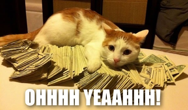
If you’ve done everything right, this is when the user clicks the “Install App” button. Get enough users doing that, and life’s like this:
Next: A picture is worth a thousand…bucks?
I just noticed this tweet from our HR queen, Brittany:

and here’s the photo she linked to, featuring Tobi, our CEO, being a 1337 H4X0R (and an agile one, too!):

As much as I’d like to do pair programming with Tobi, I’m afraid I’d be completely outclassed by him. What with all the great coders in this office, I’m certain that I’m the dumbest guy in the room (which is nowhere as bad as it sounds).