What’s This All About?

Welcome to the second installment of Selling More Shopify Apps! In this article series, I show developers how to sell their apps — add-on applications that extend Shopify’s capabilities. Since this is really more about selling than developing, the series appears here in the Shopify blog instead of in the Shopify Technology blog, even though it’s aimed at developers.
Oh, yes: for those of you who’ve been wondering: I will do a series of articles for shopowners who want to sell more stuff through their Shopify stores. Soon! But in the meantime, give this series a look — even though this series is about selling apps, there are some principles that do apply to regular stores.
A Quick Recap
In the previous article in this series, I talked about the decision-making process that users go through when perusing the app store and deciding whether to buy your app.
They go through these steps:
- They see your app’s icon, name and short description on the App Store page.
- They click on your app’s icon, taking them to the App Store page for your app.
- They look at your app’s screenshots and videos first.
- Then they look at the rating.
- And finally, they read the description.
- That’s when they make their decision. (And hopefully, at that point, they click the “Install App” button.
In this article, we’ll look at a very effective way to make your app’s App Store page better: by adding pictures and video. Pictures and video are part of step 3 of the user’s decision to buy, and they’re the first thing the user looks at when s/he ends up on your app’s page. They make that oh-so-important first impression that can help drive a sale.
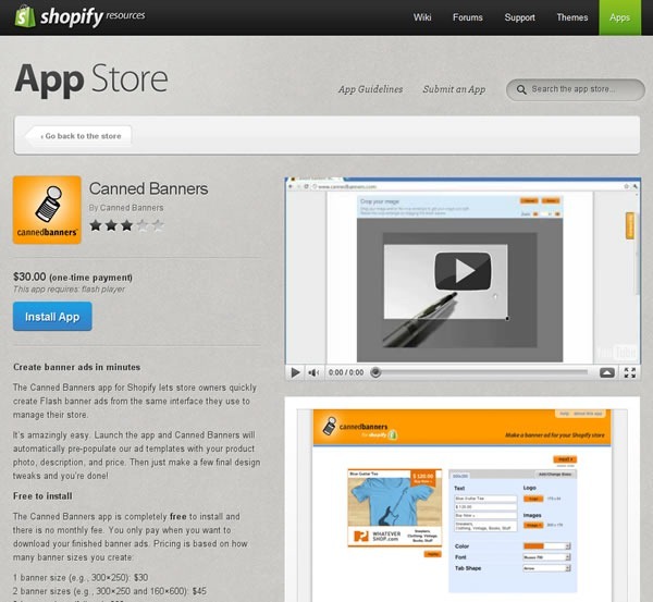
Take a look at the screenshot for an app in the App Store:

The video and pictures (which I’ve highlighted above) take up the entire right-hand side of the screen. Your eye is drawn to them. People naturally gravitate towards pictures and videos in app stores, whether they’re Shopify Apps, or apps for mobile phone and tablets or stores for desktop apps, such as the Mac OS App Store. You wouldn’t run a Shopify store without pictures of the goods you’re selling; the same rule applies to apps!
Think of your app’s page as being two sections: the show section and the tell section. The show section is the opener, and it’s where you show your app in action and give your potential customers a broad overview of what it’s for, what it does and what the experience of using it is like. The tell section is the closer, and it’s where you provide a more in-depth view of your app, listing its capabilities and showing the payoff of enhancing the customer’s store with your app.
The pictures and video of your app’s page are the show section, the rating and description of your app’s page are the tell section. You lead with show and finish with tell. Let’s talk about show right now, and in a later article, we’ll delve into tell.
Pictures
Screenshots
People like seeing screenshots of apps. That’s why just about every app store, from mobile to desktop to Shopify includes them. Even the simplest of applications can benefit from a screenshot because they give users a better “feel” for the app, even though the written description may contain far more information useful to their decision to buy or not buy. There’s a reason why bricks-and-mortar shops invest a lot of money in storefront and in-store displays, even if you’re not going to get much information from just looking at the products: people make decisions based on appearances.
The first question that comes to mind at this point is “what screenshots should I use?” I suggest reviewing your app and keeping these questions in mind:
- Which screen is the one where the user will be spending the most time when using your app? You’ll definitely want a screenshot of that.
- For customer-facing apps, which screen shows something that makes the customer experience better? If your app has a feature that makes the process of going through the shop’s catalog, make a purchase decision or buying easier and it has some kind of visual element, that feature probably needs a screenshot.
- For shopowner-facing apps, which screen shows something that makes the shopowner experience better? If your app has a feature that lets them go through their store data more easily, serve and communicate with customers better, process and fulfill orders more quickly or helps them save or make money and it has some kind of visual element, that feature probably needs a screenshot.
- And finally, which screen just looks good? Perhaps it’s a graph generated by a shopowner-facing app or a cool-looking widget on a store page created by a customer-facing app, but if it’s attractive, you might want to consider including it in the screenshots for your app.
Screenshots Don’t Have to Be Full Screen
If there’s a feature in your app that makes the customer or shopowner experience better and it doesn’t take up the whole screen, remember that you don’t have to use a full-screen screenshot. You can simply use a screenshot of the feature without including the rest of the screen. If the feature is particularly small in comparison to the rest of the screen or if it has a lot of text, you might want to enlarge it using your favourite image editing program.
In their App Store page, Optimizely includes a screenshot of just the portion of the page relevant to their app:

If It Helps, Annotate Your Screenshots
Sometimes it’s hard to tell what’s going on with just a screenshot. If this is the case with your app, annotate it: use you favourite image editing program and use text, arrows, highlighting or whatever else helps to make what’s going on onscreen easier to understand. Just be careful not to go overboard with the text on your screenshots: that’s what the app description is for.
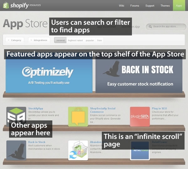
Here’s a quick example of an annotated screenshot:

You Can Include Other Graphics, Not Just Screenshots
When we built the App Store, our original intention for letting you upload pictures to your App Store page was for you to provide screenshots of your app in action. We’ve since discovered that a couple of app makers came up with the clever idea of posting graphics that aren’t screenshots but explain how their app works. We think it’s a great idea, and if you’ve got some kind of image that makes it easier for potential customers to understand your app and why they should use it, you should include it in your App Store page.
For a good example where an app maker used a non-screenshot image, take a look at the App Store page for Canned Banners. They have a screenshot of their app in action, but they also have the graphic below, which explains how you use their software to create quick and easy banner ads for your store:

Clever! I think it’s in the same spirit as cyberpunk author William Gibson’s line from his “Sprawl” stories: “The street finds its own uses for things.” If you’ve got an image that helps potential customers “get” what your app does, use it!
Next: Video!
This article also appears in the Shopify Blog.
