Categories
Uncategorized

MeshU Workshops: Toronto, May 17th

MeshU: May 17th, 2010 - Toronto, Canada

MeshU – short for “Mesh University” – takes place on Monday, May 17th at the MaRS Collaboration Centre (101 College Street, just east of University). It’s a series of workshops for web designers, developers and “suits” that takes place the day before the Mesh Conference (“Canada’s Web Conference”) and will feature 12 workshops divided into “Design”, “Development” and “Management” streams delivered by people with real-world startup/tech business experience.

I’ll be there, as both an attendee furiously taking notes (which I’ll post here) as well as a representative of Microsoft Canada and Silverlight, who are MeshU’s event partners.

Keynote: Bill Buxton

Keynote: Bill Buxton

Bill Buxton, Principal Researcher at Microsoft Research, human-computer interaction guru extraordinaire and fellow alumnus of Crazy Go Nuts University, will deliver the morning keynote. Every presentation I’ve ever seen him do has always inspired me and given me at least three new ideas, and I expect that this one will be no different. He’s an intelligent, engaging and interesting speaker – don’t miss your chance to see him live!

MeshU Sessions

Here are the MeshU sessions:

Registering for MeshU

Alas, the $49.00 student tickets for MeshU are sold out. Here’s what remain:

  • Regular tickets: CAD$289.00 each
  • “Friends of MeshU” sponsorship: CAD$1000 each – with this, you get:
    • 1 regular ticket
    • 1 student ticket
    • Your logo on the MeshU site and at the event
  • “Really Good Friends of MeshU” sponsorship: CAD$2000 each — with this, you get:
    • 2 regular tickets
    • 2 student tickets
    • Your logo on the MeshU site and at the event
    • A table at the event

To register for MeshU, go to the MeshU registration page.

This article also appears in Canadian Developer Connection.

Categories
Uncategorized

MIX10 Thoughts: Design, Windows Phone and Bill Buxton

Joey deVilla and Bill Buxton posing on the dance floor at LAX nightclub in Las VegasMe and Bill Buxton at the MIX10 Attendee Party last Tuesday night.

There’s one reason I’m particularly excited about Windows Phone 7 Series. The radically reworked look and feel is the surest sign that the company is really beginning to understand design and is willing to start from scratch (a risky and pricey proposition) to get it right. It would appear from Microsoft’s Principal Researcher Bill Buxton’s interview in The Register that I’m not the only one who thinks this:

"We kinda changed the water that we drink, in the sense that all through the design community within the company we talk, and we have a common goal in terms of trying to bring a certain change of sensibility," he said.

"For me it’s not even about the phone, but what’s interesting is that it’s the first product in the company with critical mass that’s embraced this … it will have an impact on other parts of the company."

If (or better still, when) you start building Windows Phone applications – or hey, any kind of application — I hope that you’ll follow the spirit of “Metro” (the codename for the design philosophy behind Windows Phone 7) and keep it in mind. Yes, it’s absolutely important to know the Silverlight and XNA APIs as well as how to read the touch sensors, GPS, accelerometers and so on, but it’s just as important to design your applications around the people who’ll use them. That means understanding your users, how they’ll use what you’re making, knowing how to give them what they need as quickly and unobtrusively as possible and delighting them. Yes, “a pretty interface” is included in all that – and there’s research to suggest that beautiful interfaces work better –but looks are merely part of the design equation.

Some Design Sessions from MIX10

Want some interesting lunchtime viewing on design? Look no farther than these two videos.

The first is Bill Buxton’s MIX10 session, simply titled An Hour with Bill Buxton, a conversation about design:

Get Microsoft Silverlight
Don’t have Silverlight? Get it here or download the video in
WMV, WMV (High) or MP4 format.

If you haven’t the time to watch the video of Buxton’s presentation, check out this hit list of metaphors complied by Sharon Chan at Microsoft Pri0.

If you’re planning on getting into Windows Phone 7 design, you’re going to want to learn the “design language” – not a programming language, but the guiding principles and philosophies behind the new user experience – behind it. Here’s the MIX10 presentation on that topic, Designing Windows Phone 7 Series with Albert Shum, Michael Smuga and Chad Roberts:

Get Microsoft Silverlight
Don’t have Silverlight? Get it here or download the video in
WMV, WMV (High) or MP4 format.

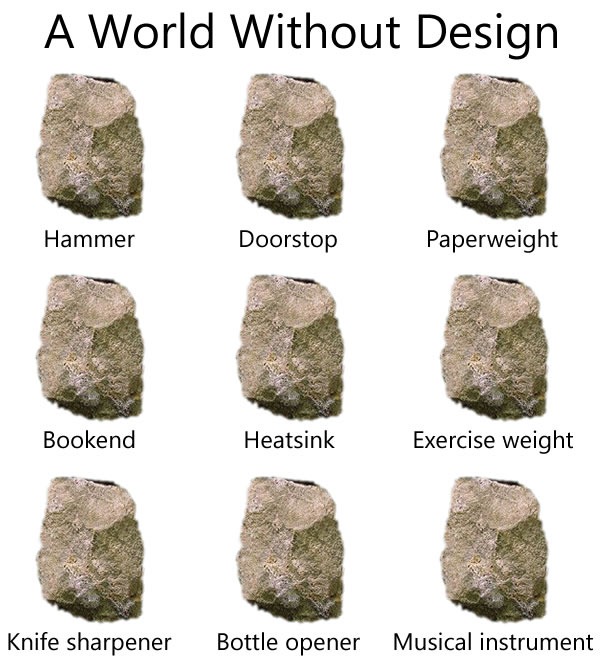
A World Without Design

Here’s a little something extra for those of you who like to think about design and user experience:

"A World Without Design": The same rock, described as a hammer, doorstop, paperweight and so on.

I whipped up this graphic, modelling it after a poster I remember seeing many years ago. I can’t remember what it was for – a museum, art gallery or exhibit, perhaps? – but I remember thinking that it was right on the money. If you remember the original poster and what it was for, please let me know, either via email or the comments!

This article also appears in Canadian Developer Connection.