Categories
Uncategorized

Counting Down to Seven: Millennials and Mobile

Welcome to another installment of Counting Down to Seven, a series of articles about mobile app development that I’m writing as we count down the days to MIX10, when we reveal more about the up-and-coming Windows Phone 7 Series.

"Counting Down to Seven" badge

Who are the Millennials?

In Andy Hunt’s book, Pragmatic Thinking and Learning (which we’re covering in Ignite Your Coding in a couple of days!), there’s a chapter devoted to recognizing and compensating for your cognitive biases. In that chapter, there’s a section titled Recognize Your Generational Affinity, and it begins with this quote from Douglas Adams:

Anything that is in the world when you’re born is normal and ordinary and just a natural part of the way the world works.

Anything that is invented between when you’re fifteen and thirty-five is new and exciting and revolutionary and you can probably get a career in it.

Anything invented after you’re thirty-five is against the natural order of things.

It’s an interesting quote to keep in mind when discussing that demographic known as “Millennials” or “Generation Y”. While there aren’t any hard and fast rules for defining the boundaries of a generation, it’s generally accepted that when we’re talking about Millennials, we’re referring to a group of people born after 1982.

Here’s a quick video introduction to the Millennial Generation from Futurist.com [length 8:04]:

By Douglas Adams’ maxim above, even the oldest members of this generation, who were 15 in 1997, would consider the web and mobile phones that actually fit in your pocket as normal and ordinary and just a natural part of the way the world works. Members of this generation who are in university or just about to enter the job market probably can’t even remember a world where the internet and mobile phones weren’t household items.

How Millennial are You?

I followed a tweet from my friend, co-worker and fellow Generation Xer David Crow which lead me to the Pew Research Center’s How Millennial Are You? Quiz. David scored 51/100, which suggests that his tendencies fall somewhere between Generation X and Millennial. Here are my results:
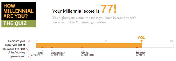
Results from "How Millennial Are You" quiz: 77/100
I don’t know how I should feel about that score (I was born in 1967). Millennial tendencies or not, I don’t think you’re going to hear me blasting any Justin Bieber tunes out of my car anytime soon.

(Go ahead, take the quiz. If you feel like sharing, tell me your score in the comments!)

Millennials: Under the Microscope and With Mobile Phones

The quiz led me to the Pew Research Center’s study titled Millennials: A Portrait of Generation Next [1.25 MB PDF]. It’s subtitled with “Confident. Connected. Open to Change.”, and it’s a pretty interesting read if you’re the sort of person who likes to know what makes people tick (and if you know me, I’m just that sort of person). It’s also worth reading – at least parts of it are – if you’re planning to get into developing for Windows Phone 7 (and yes, any other vendor’s smartphone platform, but those don’t pay my bills).

Millennials grew up in the networked world and spent at least part of their adolescent years in the era of what Microsoft Research’s danah boyd calls “networked publics”. They’re the first “always connected” generation, having grown up with broadband, wifi and mobile devices. They’re more technophilic than previous generations, as the chart below shows:
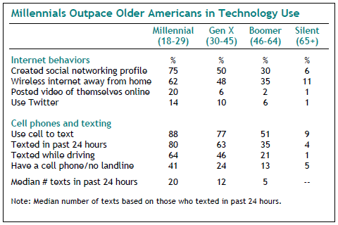
image

(Note the use of the phrase “cell phone” – clearly an Xer or Boomer wrote the study.)

The stats about mobile phones are worth repeating:

  • 88% of Millennials use their mobile phone to send text messages
  • 80% have texted in the past 24 hours
  • 64% have texted while driving (how you do this, I don’t even know)
  • Of those who’ve texted in the past 24 hours, the median number of texts they have sent and received is 20.

Here’s another observation: 83% of Millennials sleep with their mobile phones nearby, according to the chart below:

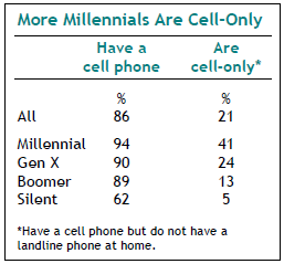
Most Millennials have a mobile phone, and many of them have the mobile as their only phone (as opposed to having a land line at home):
image

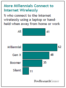
Millennials are also big on wireless ‘net access:
image

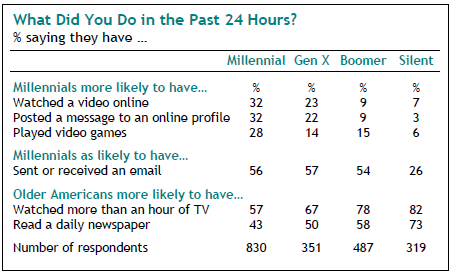
In the past 24 hours, Millennials are more likely to have watched an online video, posted a message to an online profile and played a video game than the other generations. Here’s a chart showing “Past 24 Hours” activities for various generations:
image

Motorola on Millennials

Given the Millennials’ technophilic tendencies, it’s not surprising that a number of high-tech companies have researched this generation. Here are a couple of videos posted by Motorola Media Center:

Microsoft on Millennials and Money

The Empire has also done some studies on Millennials. One of the most recent was on the difference between the way Boomers and Millennials deal with banks:

  • Millennials are much more likely than Boomers to use web banking (49% versus 35%)
  • See online service capabilities as important when researching a bank (54% versus 42%)
  • Care less about doing transactions in person at a bank branch (32% versus 44%)

Summary

Keep the Millennials in mind when you’re thinking about apps to write for Windows Phone 7. Think of the sorts of application that would appeal to people who:

  • Don’t think of mobile phones as just phones that fit in your pocket, but as remote controls for the world.
  • Send a lot of text messages, sometimes at inadvisable times.
  • Always have their phones close by, even when they’re asleep.
  • Are bigger videogame players than any previous generation.
  • Are more likely to have their mobile phone as their primary and sole phone.

What needs would they have? What goals would arise from those needs? What user contexts would they have, and how would you use them to filter what your apps would present to them?
This article also appears in Canadian Developer Connection.

Categories
Uncategorized

Counting Down to Seven: 7 Rules for Your Mobile Strategy

Counting Down to Seven (Mar 15th at MIX 10): A series about ideas for mobile apps

Welcome to another installment of Counting Down to Seven, a series of articles about mobile app development that I’m writing as we count down the days to MIX10, when we reveal more about the up-and-coming Windows Phone 7 Series.

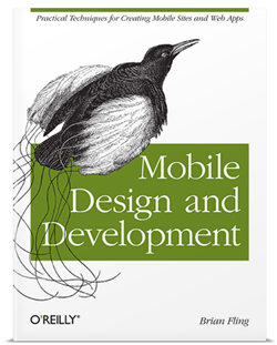
Cover of 'Mobile Deisng and Development'In an earlier article, I wrote that Brian Fling’s book, Mobile Design and Development, led me to a couple of instances where the number 7 appeared in writing on mobile development. The first was Tomi Ahonen’s thesis that mobile is the 7th mass medium.

The number 7 also appears in Chapter 5 of Mobile Design and Development, titled Developing a Mobile Strategy. In it, Fling lists seven rules for developing your own mobile strategy, which I’ve summarized below.

1. Forget what you think you know.

The mobile industry is highly competitive, evolves quickly and produces a lot of press releases full of speculation and empty promises on a scale that dwarfs that of the early dot-com days.

“Do yourself a favor and forget everything you think you know about mobile technology,” writes Fling. Instead, he suggests that you:

  • Ask the hard questions about your business, your customers and your development capacity without considering the latest hype about a new tool or technology.
  • Focus on what’s right for your user instead of simply emulating what your competitors are doing.
  • Forget what you think you know about mobile – it’s most likely wrong.

2. Believe what you see, not what you read.

Fling writes: “In mobile, any argument can be made, and for a few thousand dollars you can buy a
report or white paper that supports your argument.”

His suggestions include:

  • Mobile industry reports have a short shelf life. Anything over a year or so old is probably useless. (And you should probably ignore anything pre-iPhone other than for a good laugh.)
  • Ask your users questions in person, in their context, rather than relying on focus groups.
  • Record what your users say. “Nothing makes your case like your users’ own words.”

3. Constraints never come first.

There are many constraints in mobile development: the size of the device, processor speed, battery life, networks, business issues and so on. You will have to account for them, but if you do so too early, you might end up killing some ideas before they even get prototyped, never mind implemented.

Fling writes:

If you are concerned about the constraints of the mobile medium, know that there will always be constraints in mobile. Get over it. It isn’t a deal breaker. Just make sure you aren’t the deal breaker. Focus on strategy first, what they user needs, and lay down the features; then, if the constraints become an issue, fall back to the user goals. There is always an alternative.

4. Focus on the user’s context, goals and needs.

Here’s how Fling defines the terms:

  • Needs are simple. The example he uses is the need to eat. He says that our of context, goals and needs, a user’s needs are the easiest to predict if you know some basic information about the him or her.
  • Goals arise from needs. In his example, the goal is to get food.
  • Context is the user’s current state. It could be something like “I am at this location and I’m in the mood for Thai food.”

Fling’s suggested strategy for focusing on context, goals and needs:

  • Define the users’ context first. Without that context, you don’t have a mobile strategy, it’s just a plan of action.
  • Uncover the users’ goals, then try to understand how the user’s context alters those goals.
  • Once you know the users’ goals, find out the actions they want to take.
  • Look for ways to filter what you present to your users by their context.

5. You can’t support everything.

That’s right! Just stick with supporting Windows Phone 7!

But seriously: unless you’ve somehow got access to a big pool of developers to cover them all, you’re going to have to narrow down the number of devices you support – possibly even down to one. I’ll do what I can to make sure that Windows Phone 7 is the platform people want, but you need to see what platform your users are using.

Fling’s tips:

  • Start with the devices that your customers are using.
  • The most popular device or the one that’s easiest to develop for may not be the best device for your project.
  • If you’re converting a web application into a mobile app, look at your server logs and see what mobile devices are accessing it. Target those devices.
  • Go mobile phone window shopping and see what devices the stores are targeting at different types of users.

6. Don’t convert, create.

My mother, a piano player, bought an “electronic sheet music” tablet. The idea was that instead of having to keep lots of books and folders of sheet music, she could get rid of the clutter and have a convenient, easily expandable music library. Unfortunately, the device uses a standard desktop interface – actually, a sub-standard Linux window manager, not even a decent one like Gnome or KDE – and it’s a royal pain to use. Mom went back to sheet music on actual sheets of paper and the device is now gathering dust.

On the other hand, the TiVo – also a Linux device – has a great user interface. It’s designed around the way you use a TV, not around what’s easier to implement. It’s not a port of desktop TV recording software (most of which is terrible to use), but a whole new thing, and it’s better for it.

With that in mind, here are Fling’s “Don’t covert, create” tips:

  • Understand your user’s’ context. Knowing how, when and under what conditions your users will use your mobile app will allow you to create a better user interface and experience.
  • Don’t forget that mobile isn’t just a shrunken-down desktop; it’s its own thing, with its own strengths. 

7. Keep it simple.

That’s simple, not stupid. People tend to use their mobile devices while they’re on the go or doing something else, so helping them get their task done is far more important that loading your mobile app with features. Mobile users have to deal with many constraints, so show restraint in the mobile products you build.

This article also appears in Canadian Developer Connection.

Categories
Uncategorized

Counting Down to Seven: Charlie Kindel and the Windows Phone 7 Team’s Focus

"Counting Down to Seven" badgeTime for another installment of Counting Down to Seven, a series of articles about mobile app development that I’m writing as we count down the days to MIX10, when we reveal more about the up-and-coming Windows Phone 7 Series.

If you’re following what’s happening with Windows Phone 7, you should follow Charlie Kindel – both his blog and Twitter account. Charlie is one of the people behind the new “Phone 7” experience; I don’t think he’s exaggerating in his Twitter bio when he says “The future of application development for Windows Phones is in my hands.”

In his latest blog entry – Focus, Focus, Focus – he writes that the reason that Windows Phone 7 seems atypical of Microsoft is the power of “no”. The Windows Phone team didn’t just decide what they were going to build, they also decided what they were not going to build, and work around the “5P” framework of:

  1. Purpose
  2. Principles
  3. Priorities
  4. Plan
  5. People

Here’s the Windows Phone developer experience team’s stated purpose:

Our purpose is to harness the energy, talent, and attention of developers and designers with a platform and ecosystem that delivers on the developer experience end to end; that, combined with the phone’s end-user experience, results in a winning virtuous cycle.

From that purpose, they derived some principles, among which are:

  • Every decision we make must be made mindful of the effect on end-users. Simply put, the end-user is king. 
  • We will do a few things and do them very, very well; we are better off not having a capability than doing it poorly. There are always future versions.
  • No API will be created or documented without a clear use case; “build it and they will come” APIs almost always do nothing but create bad legacy.
  • We will build on the shoulders of giants; where possible integrate instead of create.
  • We will strive to not show our organizational boundaries to developers.

What’s truly interesting is the list of Windows Phone 7’s targeted developer segments. This is an ordered list, with the highest-priority segment listed first:

  1. Consumer Developer – Pro Devs who build products that are sold directly or given out for free to general public end-users.
  2. Non-Pro Developer – Non-Pro Developers building products for academic/personal use.
  3. In-ROM Developer – Pro Devs who build products & technologies that are sold to mobile operators or device manufacturers.
  4. Enterprise Developer –Pro Devs who build apps & technologies that are sold to corporate clients and businesses.
  5. IT Developer – Pro Devs who build apps & technologies that are only for use by their own corporation.

I have often quipped that sometimes using Microsoft stuff “feels like eating from the dumpsters outside a cubicle farm”; that is, that their software targets enterprise and IT first and small-shop/indie coders like I was last. This list inverts the priorities I image the Windows Mobile team had, and my response to that is “good”.

Charlie makes a point of saying that the prioritization is temporal; over time, the priorities may change and they will serve some of the lower-priority segments, but all the while adhering to the purpose and principles listed above.

Then there’s the plan. The plan is to have Windows Phone 7 ready for the MIX conference, and it looks like that will happen. “Events,” Charlie writes, “are great forcing functions for engineering teams”.

Finally, the people. The Windows Phone 7 team is a diverse bunch coming from all across Microsoft – the Xbox people, developer division geeks as well as members from Windows Live, Exchange, Windows OS, Office and Developer and Platform Evangelism.

Go check out Charlie’s full blog entry, which describes the Windows Phone 7 team’s purpose, principles, priorities, plan and people in greater detail, and check in on him often. If you’re planning on building apps for Windows Phone 7, he’s one of the people to follow.

This article also appears in Canadian Developer Connection.

Categories
Uncategorized

Counting Down to Seven: The 7th Mass Medium and its 7 Unique Qualities

Counting Down to Seven (Mar 15th at MIX 10): A series about ideas for mobile apps

Welcome to another installment of Counting Down to Seven, a series of articles about mobile app development that I’m writing as we count down the days to MIX10, when we reveal more about the up-and-coming Windows Phone 7 Series.

You’re going to have to wait a couple more weeks before I can tell you the specifics of Windows Phone 7 development. In the meantime, I thought I’d write about mobile development in general. If you’re new to mobile development, this series will be a nice overview of the field; if you’ve built apps for mobile phones before, think of it as a refresher course, but you might learn something you didn’t know before.

Mobile Design and Development, by Brian Fling

Cover of "Mobile Design and Development" The O’Reilly book Mobile Design and Development is a worthwhile read for anyone who’s planning to build and sell mobile applications. It’s written by Brian Fling, the owner of the “mobiledesign” mailing list (which could use a little love and attention these days), advisor to big brands getting into the mobile space and someone who (according to his author bio) has “worked with a lot of well funded companies that have failed miserably”.

Mobile Design and Development is probably the best general book on mobile development available right now. You’re not going to learn any specific phone’s API from this book; instead, you’ll learn about the industry, its state as of the time the book was published (August 2009) and the sort of things you should be thinking about if you’re developing mobile apps for an audience. While the ever-changing nature of the mobile world means that some of the information in the book has a “sell-by” date, many of the ideas covered in the book will be applicable for much longer.

“The 7th Mass Medium”

By happy coincidence, the version number of our soon-to-be-unleashed mobile OS, 7, keeps popping up in discussions of mobile technology.

The number 7 makes an appearance in Mobile Design and Development’s third chapter, titled Why Mobile? In it, Fling refers to mobile technology as “The 7th Mass Medium”, an term he attributes to Tomi T. Ahonen, author of the book and blog Communities Dominate Brands.

You were probably wondering what the 6 previous mass media are. In chronological order, they’re:

  1. Print
  2. Sound recordings
  3. Cinema
  4. Radio
  5. Television
  6. Internet

The interesting thing about the 7th mass medium is that it encapsulates the previous 6. Although we’re only just beginning to do so, we read, listen, watch and surf on mobile devices.

The 7 Unique Qualities of the 7th Mass Medium

Man on mobile phone: "Yeah, I'm posing for a stock photo right now..." Mobile Design and Development cites an old blog entry of Ahonen’s, in which he lists 5 unique qualities of mobile as a medium. Ahonen wrote a later article, bumping that number up to 7. They’re things worth keeping in mind when you’re designing mobile apps. Depending on your point of view, some of the qualities may be good things or bad things, but no matter what you think of them, you have to account for them. They are:

1. The mobile phone is the first personal mass medium.

We share books and magazines, listen to the radio and dance to DJ en masse, watch TV shows and movies with others, and many households have a computer used by more than one person. But for most people, their mobile phone is theirs and theirs alone.

Ahonen points to a 2006 survey by the advertising agencies BBDO and Proximity in which that 63% of the people surveyed wouldn’t lend their mobile phone to anyone else.

2. The mobile phone is a permanently carried medium.

According to a Morgan Stanley survey from 2007, 91% of the respondents said that they kept the phone within a meter of them day and night, even when in the bathroom or asleep. Many people use it as the 21st century equivalent of the pocket watch, and when I travel, I’ve found it to be a very reliable alarm clock. It’s the computing, communications and media device you have with you all the time.

According to BBDO/Proximity 2006 study cited in the previous point:

  • People in China were choose between retrieving a forgotten wallet or phone at home; 69% chose the phone.
  • Women in Japan have daytime and evening phones, in the same way they have daytime and evening handbags.

3. The mobile phone is the only always-on mass medium.

There may be times when we turn off the ringer and vibrate functions, but the only time most people turn off their mobile phones is when they’re on a plane (and if you fly often, you know that many people turn on their phones moments after the plane’s wheels touch the ground). The closest any other medium comes to always-on is the internet that subset of people who keep a computer with broadband powered up all the time, followed by falling asleep with the TV or radio on.

According to BBDO/Proximity 2006 study cited in the previous point, 81% of youth between the ages of 15 and 20 sleep with their mobile phones turned on.

Woman on mobile phone: "That's odd...I'm posing for a stock photo too!" 4. The mobile phone is the only mass medium with a built-in payment mechanism.
Between the “app store” model for delivering applications and the fact that they’re tied to a networking provider that also acts as a billing agency, mobile phones are the first mass medium with a built-in toll booth. Even people too young to have credit cards can be billed; they can pay for purchases made via their phone through their phone bill with cash.

5. The mobile phone is the only mass medium available at the point of creative inspiration.

This is a direct by-product of mobile phones being always-on and always with us. Even those of us who carry our laptops everywhere have them tucked away in a carry case or bag, and I’m the rare person who always has a camera handy. While popular with the “lifehacker” crowd, not everyone carries a Moleskine notebook for jotting down ideas. But many people carry a mobile phone in an easy-to-reach place. It lets us create content in the form of writing, photos, and audio and video recordings in near real time. This is the basis of citizen journalism (whose effects were recently felt here in Toronto during the recent “cold war” between passengers of our rapid transit system and its employees).

6. The mobile phone is the only mass medium with accurate audience measurement.

“The internet gave us a false promise,” Ahonen writes, but audience measurement wasn’t what its creators had in mind. However, the mobile phone, it’s possible to know what every subscriber does since each is uniquely tied to a specific ID.

According to Ahonen:

  • TV audience measurement can catch 1% of audience data
  • Internet audience measurement can catch 10% of audience data
  • Mobile phone audience measurement can catch 90% of audience data

7. The mobile phone is the only mass medium that captures the social context of media consumption.

By “social context of media consumption”, Ahonen means that with mobile phones, we can measure not just what people use, but with whom. It’s the next generation version of Amazon’s “recommendations” system and a direct result of mobile’s always-on, always-with-us, and audience measurement qualities.

This article also appears in Canadian Developer Connection.

Categories
Uncategorized

Windows Phone 7: Challenge Accepted!

Hands holding Win 7 Phone that reads "You'll find out at MIX10! (Mar 15)"

"Counting Down to Seven" badge Over at Wired’s Gadget Lab blog, there’s an article titled Microsoft’s Challenge with Windows Phone 7 is Wooing Developers. They saved the most important line for last, and in case you missed it, I’ll repeat it here:

The company plans to preview its development tools at its MIX developers conference next month.

If you can wait three weeks, you’ll get a fuller story. If you attend MIX (Monday, March 15th through Wednesday March 17th at the Mandalay Bay Convention Center in Las Vegas), you’ll even get development tools and support!

I agree with the title of the article. Complete changes of direction and the circumstances that dictate them are never easy (but then again, that’s why I signed on with Microsoft: for the challenge). We will have to work hard to gain mobile developers’ interest and trust, and it’s quite clear that we’ll have to reach out to the same sort of independent developer coding away at a kitchen table, cafe or converted warehouse office – the kind who made the apps that made the iPhone what it is today. From what I’ve seen of the developer outreach plans for Windows Phone 7, I think it’s doable.

I’d take the quotes from the people interviewed in the article with a big grain of salt. The writer took the “cover all bases given your deadline” approach and quoted a whopping three people whose collective opinions cover the full spectrum of reactions: one positive, one negative, and one (mostly) neutral. None of their titles suggests “developer”: two are CEOs and one is a COO. The negative guy completely misses the point in his remark about hubs and a cool-looking UI, and the neutral guy seems to be drinking deeply of the anti-RIA kool-aid, dismissing technologies like Flash and Silverlight as made for desktops and not for mobile, while forgetting that other technology now considered to be mobile – like browsers and operating systems — have the same supposed limitations. They were, after all, originally made for the desktop.

I accept the challenge of wooing developers. I know what it’s like, speaking as someone who left Microsoft development in the wake of the dot-com bubble burst for other tools and technologies. But what brought me back were signs of a sea change at Microsoft, from the Xbox to SDL to its initiatives to better “get” the web to dynamic languages and much more, and I think that Windows Phone 7 is part of it.

In the end, the developer whose opinion matters most is you. To that end, I plan to use every resource at my disposal to get the toolkits, tutorials and techniques necessary for Windows Phone 7 development into your hands. I’m going to support your development beyond just the “download this, and here’s the code for Hello, World!” – expect stuff on how to build great mobile experiences, what people are looking for and how to sell your mobile apps. (And hey, if you have any ideas or suggestions, I’m open to them – drop me an email, a tweet or a comment).

This article also appears in Canadian Developer Connection.

Categories
Uncategorized

Counting Down to Seven: Lou Reed, Mobile App Designer

Three Weeks to Go!

Counting Down to Seven (Mar 15th at MIX 10): A series about ideas for mobile appsWe’re three weeks away from the day when a lot more about Windows Phone 7 will be revealed. On Monday, May 15th, the MIX10 conference in Las Vegas is expected to open with a bang as developers and designers will learn about “WP7’s” programming and design models as well as the opportunities that Microsoft’s reworked-from-the-ground-up mobile phone OS will provide. As part of a team of evangelists who were picked to champion WP7, I’m looking forward to getting my feet wet developing for this new platform and sharing what I learn with all of you.

As good as the early indications are – the demos are impressive, and this is likely the first time that anything made by The Empire been described as “soulful” – WP7’s introduction won’t be without some significant challenges. As far as current-generation smartphones go, WP7 is a late entry into a fiercely competitive market featuring a rival who can boast about having an impressive 100,000 applications in its store. There’s the matter of the wait; the 7 Series phones won’t hit the market until later this year, and in the meantime, the Esteemed Competition will be releasing new models. There will also be the cries of “Too little, too late,” from the people who observed Microsoft squander an early lead with smartphones (I can understand the argument for “late”, but having seen some advance inside info on what these babies can do, “little” is not a valid argument).

The Real Challenge

Windows Mobile 6 user interfaceI think that the biggest challenge is going to be creating a new Windows Phone culture. I believe that one of the problems with the developer culture surrounding the old Windows Mobile was that they treated the mobile phone as simply a shrunken-down version of the desktop. As I’ve written before, the desktop is what made Microsoft a successful company, but it’s also turned into an albatross that has impeded forward movement. The company built their mobile OS in a specific way with a specific design philosophy for a specific audience: “suits”. The developers took their cues from those decisions and built applications to match. The end result wasn’t pretty in any way: business-wise, functionally or aesthetically.

We – that’s both Microsoft as well as the development community that we want to gather around Windows Phone 7 — need to create a culture that “gets” the smartphone and cares about software craftsmanship, both in the underlying programming as well as in the user experience. I want to see a development culture that encourages both technical and design chops, the way that the iPhone community does, as well as that the way web app developers like 37signals do. I want Windows Phone to set the standard for mobile applications.

To that end, I decided to write this series – Counting Down to Seven – as a way to get developers to start thinking about mobile applications. I’ve been looking at applications written for the Esteemed Competition’s phones, books and articles on mobile development for other platforms and ideas from the world of user interface and user experience design as well as from science fiction (a long-standing source of ideas for neat-o devices that fit in your pocket). My hope is to convince you not just to write apps for Windows Phone 7, but also to write apps that redefine mobile computing, do interesting and useful stuff and delight our users.

Take a Walk on the Phone Side

Lou Reed, in sunglasses, with a cigarette

There’s a mobile app that was designed by Lou Reed. Yes, that Lou Reed – the guitarist, vocalist and songwriter for the Velvet Underground, then Mr. Walk on the Wild Side and more recently, Mr. Laurie Anderson.

The app is called Lou Zoom, and although he didn’t implement it (that job went to Ben Syverson), he came up with the idea and co-designed it. That’s the sort of excitement that I’d like to see behind Windows Phone 7: so full of possibilities that even people who’d never think of designing applications start doing just that.

The idea behind Lou Zoom is quite simple: it’s a contact manager app, like the Contacts app that comes with the iPhone. The difference is that it has a couple of tweaks, no doubt born out of frustration with the current app. I’ve listed the tweaks below:

Tweak : Easy-to-Read Contact List

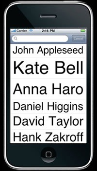
In the standard Contacts app, the list of contacts is shown as a standard list, with all entries the same size. In Lou Zoom, the list of contacts has variable-sized names: each name in Helvetica Neue, with the font size increased so that it is fills the width of the screen. Here’s a screen shot taken from the Lou Zoom page:

Screenshot of contact list from Lou Zoom app

This design might make the sort of designers who prize uniformity cringe, but think about this: phones have small screens and are often used in less-than-ideal reading conditions. If you’re going to remain under 30 forever, are guaranteed to always have 20/20 vision and vow to always remain stationary and alone in a well-lit room, you don’t need this feature. For the rest of us – including me, a guy in his early forties with standard issue Asian myopia, who finds himself squinting more and more at small type, who often uses his phone from places like dimly-lit cabs going over potholes at breakneck speeds or in crowded, dimly-lit conference spaces and having had a couple of caesars – this user interface tweak is very helpful indeed.

Tweak : Easy-to-Read Contact Pages

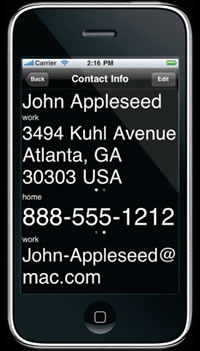
Just as the contacts are listed in nice big type, so is the info on each contact page:

Screenshot of contact info page from Lou Zoom app

As with the contact list, Lou Zoom goes for legibility and displays the information in large type. It goes one step further by displaying the text in high contrast. If the contact has multiple addresses, phone numbers or email address, a left or right swipe over the appropriate field will give you those alternates.

An Aside: Windows Phone 7’s People Profiles

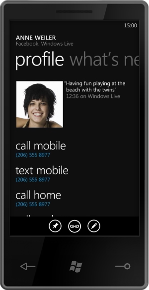
The “Profile” page in Windows Phone 7’s “People” hub takes an approach that is stylistically similar to the way Lou Zoom displays contact info:

Screenshot of Windows Phone 7 profile page for a person in the "People" hub

…but it takes a markedly different approach to which items are displayed prominently. Windows Phone 7’s design is centered around what you want to do rather than with just throwing information at you. For example, the actions “call mobile”, “text mobile” and “call home” are in large type, while the person’s mobile and home numbers are in smaller text. This is a good idea — after all, what you really want to do is reach someone, not look up their phone number. The “address book” paradigm is a holdover from the days when phones weren’t smart enough to dial themselves.

Tweak : Search on Any Part of the Name

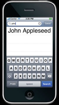
The standard Contacts app has a simple search function. Type in j and it will immediately present you with a list of all names in your contacts beginning with “j” (ignoring case, of course). If you expand that j to become john, you’ll get a list of all the names in your contacts beginning with “john”. The Contacts app will apply the search term you provide only to the leftmost end of the names in your contacts:

Screenshot of search for Lou Zoom app

Lou Zoom improves on search by letting you search on any part of the name. Typing in john gives you a list of all the names in your contacts containing “john” in any part of the name, such as “John Smith”, “Alice Johnson” or “Olivia Newton-John”.

The Lou Zoom site provides its own example:

Has Kate Bell recently become Kate Appleseed-Bell? Searching for "Bell" will still bring up her name in Lou Zoom. From there, her full info is just a tap away.

It’s also great for searching for people by nickname. For instance, typing in mclovin into Lou Zoom’s search will give you the name of your buddy, who’s listed in your contacts as Christopher “McLovin’” Fogell.

What Can You Tweak?

It’s time to take a page from Lou Reed’s book and find apps that could benefit from a little tweaking. Look around at mobile apps and if you find yourself and other people saying “if only it did this”. Those are opportunities! The best applications aren’t always brand-new paradigm-shattering ideas; sometimes they’re old ones with a couple of tweaks.

This article also appears in Canadian Developer Connection.

Categories
Uncategorized

“Our Fine Tradition of Clumsy Names”

"Counting Down to Seven" badgeNice phone, shame about the name.

As I quipped in an earlier post, the name “Windows Phone 7 Series” is a bit long, and suggests that the people who do Microsoft’s branding get paid by the syllable. This is the sort of left-brain-lopsided mindset that has produced names like “Windows Server 2008 R2”.

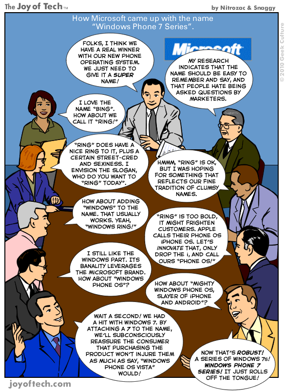
My fellow Developer Evangelist John Bristowe pointed me to this Joy of Tech comic which attempts to ratiocinate the etymology of this unwieldy appellation:

"Joy of Tech" comic illustrating the meeting that led to the name "Windows Phone 7 Series"