Categories
Uncategorized

Scott “UnMarketing” Stratten: “First Name and Email are Enough” and Other Thoughts on Online Interaction

Last night at a gathering of Toronto digital marketing and social media types held by TheBizMedia – I’m not sure I qualified for an invite, but hey, free beer!Scott Stratten, president of UnMarketing, gave a very entertaining, funny and insightful presentation in which he talked about the lessons he learned as an online marketer.

I shot a five-minute video snippet of his presentation, where he talked about:

  • First name and email address are often enough. When you need users to sign up for things like contests or surveys, do you really need to take up their valuable time by collecting information that you probably don’t need? (I know that at Microsoft, we ask for great gobs of information when you sign up for even the simplest of things. I do try to get them to tone it down.)
  • How to get people to take your surveys. Telling them that “your answers will help us” isn’t going to get them to take your surveys. Scott found that what works for him is offering a chance at a prize – even a $50 Amazon certificate – boosts the number of people who take survey by orders of magnitude.
  • Auto-DM replies on Twitter. Don’t. Just don’t.

You’ll probably want to turn up the volume on the video. Scott was speaking without a microphone, and as good a videocamera as the Flip Mino HD is, I would’ve had to get obnoxiously close to the stage to get better sound.

This article also appears in Canadian Developer Connection.

Categories
Uncategorized

If You Speak Database, Science Needs Your Brain!

 database brain

If you’re in the Greater Toronto Area, have basic knowledge of database queries and want to help a grad student with a research project, Zuzel Vera Pacheco, one of Greg Wilson’s students at University of Toronto, needs to borrow your brain! In exchange, you’ll get a chance to win a $100 Best Buy gift card.

Here’s her description of the project:

Want to win a $100 Best Buy gift card? Do you have basic knowledge about database queries? If so, I need you!

Subjects are needed to take part in a study concerning the visualization of database queries. Participants will be asked to draw diagrams that represent the execution of database queries or to determine what queries are represented by a set of diagrams. This study will help design a tool intended to help expert and novice programmers to design and debug such queries. The time needed for the study will range from 30 minutes to an hour, and can take place in the Bahen Centre at the University of Toronto or elsewhere in the Greater Toronto Area.

A basic understanding of relational databases and database queries is required. The examples will contain queries in SQL and other programming languages like Ruby or Python. The participants should be fluent/conversant in English.

Participants who complete the study will be entered into a random draw for a $100 Best Buy gift card. The odds of winning this prize are 1 in 30.

If you think you can help Zuzel with her project, drop her a line!

This article also appears in Canadian Developer Connection.

Categories
Uncategorized

Counting Down to Seven: 7 Rules for Your Mobile Strategy

Counting Down to Seven (Mar 15th at MIX 10): A series about ideas for mobile apps

Welcome to another installment of Counting Down to Seven, a series of articles about mobile app development that I’m writing as we count down the days to MIX10, when we reveal more about the up-and-coming Windows Phone 7 Series.
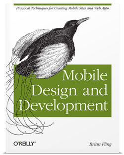
Cover of 'Mobile Deisng and Development'In an earlier article, I wrote that Brian Fling’s book, Mobile Design and Development, led me to a couple of instances where the number 7 appeared in writing on mobile development. The first was Tomi Ahonen’s thesis that mobile is the 7th mass medium.

The number 7 also appears in Chapter 5 of Mobile Design and Development, titled Developing a Mobile Strategy. In it, Fling lists seven rules for developing your own mobile strategy, which I’ve summarized below.

1. Forget what you think you know.

The mobile industry is highly competitive, evolves quickly and produces a lot of press releases full of speculation and empty promises on a scale that dwarfs that of the early dot-com days.

“Do yourself a favor and forget everything you think you know about mobile technology,” writes Fling. Instead, he suggests that you:

  • Ask the hard questions about your business, your customers and your development capacity without considering the latest hype about a new tool or technology.
  • Focus on what’s right for your user instead of simply emulating what your competitors are doing.
  • Forget what you think you know about mobile – it’s most likely wrong.

2. Believe what you see, not what you read.

Fling writes: “In mobile, any argument can be made, and for a few thousand dollars you can buy a
report or white paper that supports your argument.”

His suggestions include:

  • Mobile industry reports have a short shelf life. Anything over a year or so old is probably useless. (And you should probably ignore anything pre-iPhone other than for a good laugh.)
  • Ask your users questions in person, in their context, rather than relying on focus groups.
  • Record what your users say. “Nothing makes your case like your users’ own words.”

3. Constraints never come first.

There are many constraints in mobile development: the size of the device, processor speed, battery life, networks, business issues and so on. You will have to account for them, but if you do so too early, you might end up killing some ideas before they even get prototyped, never mind implemented.

Fling writes:

If you are concerned about the constraints of the mobile medium, know that there will always be constraints in mobile. Get over it. It isn’t a deal breaker. Just make sure you aren’t the deal breaker. Focus on strategy first, what they user needs, and lay down the features; then, if the constraints become an issue, fall back to the user goals. There is always an alternative.

4. Focus on the user’s context, goals and needs.

Here’s how Fling defines the terms:

  • Needs are simple. The example he uses is the need to eat. He says that our of context, goals and needs, a user’s needs are the easiest to predict if you know some basic information about the him or her.
  • Goals arise from needs. In his example, the goal is to get food.
  • Context is the user’s current state. It could be something like “I am at this location and I’m in the mood for Thai food.”

Fling’s suggested strategy for focusing on context, goals and needs:

  • Define the users’ context first. Without that context, you don’t have a mobile strategy, it’s just a plan of action.
  • Uncover the users’ goals, then try to understand how the user’s context alters those goals.
  • Once you know the users’ goals, find out the actions they want to take.
  • Look for ways to filter what you present to your users by their context.

5. You can’t support everything.

That’s right! Just stick with supporting Windows Phone 7!

But seriously: unless you’ve somehow got access to a big pool of developers to cover them all, you’re going to have to narrow down the number of devices you support – possibly even down to one. I’ll do what I can to make sure that Windows Phone 7 is the platform people want, but you need to see what platform your users are using.

Fling’s tips:

  • Start with the devices that your customers are using.
  • The most popular device or the one that’s easiest to develop for may not be the best device for your project.
  • If you’re converting a web application into a mobile app, look at your server logs and see what mobile devices are accessing it. Target those devices.
  • Go mobile phone window shopping and see what devices the stores are targeting at different types of users.

6. Don’t convert, create.

My mother, a piano player, bought an “electronic sheet music” tablet. The idea was that instead of having to keep lots of books and folders of sheet music, she could get rid of the clutter and have a convenient, easily expandable music library. Unfortunately, the device uses a standard desktop interface – actually, a sub-standard Linux window manager, not even a decent one like Gnome or KDE – and it’s a royal pain to use. Mom went back to sheet music on actual sheets of paper and the device is now gathering dust.

On the other hand, the TiVo – also a Linux device – has a great user interface. It’s designed around the way you use a TV, not around what’s easier to implement. It’s not a port of desktop TV recording software (most of which is terrible to use), but a whole new thing, and it’s better for it.

With that in mind, here are Fling’s “Don’t covert, create” tips:

  • Understand your user’s’ context. Knowing how, when and under what conditions your users will use your mobile app will allow you to create a better user interface and experience.
  • Don’t forget that mobile isn’t just a shrunken-down desktop; it’s its own thing, with its own strengths. 

7. Keep it simple.

That’s simple, not stupid. People tend to use their mobile devices while they’re on the go or doing something else, so helping them get their task done is far more important that loading your mobile app with features. Mobile users have to deal with many constraints, so show restraint in the mobile products you build.

This article also appears in Canadian Developer Connection.
Categories
Uncategorized

Counting Down to Seven: Charlie Kindel and the Windows Phone 7 Team’s Focus

"Counting Down to Seven" badgeTime for another installment of Counting Down to Seven, a series of articles about mobile app development that I’m writing as we count down the days to MIX10, when we reveal more about the up-and-coming Windows Phone 7 Series.

If you’re following what’s happening with Windows Phone 7, you should follow Charlie Kindel – both his blog and Twitter account. Charlie is one of the people behind the new “Phone 7” experience; I don’t think he’s exaggerating in his Twitter bio when he says “The future of application development for Windows Phones is in my hands.”

In his latest blog entry – Focus, Focus, Focus – he writes that the reason that Windows Phone 7 seems atypical of Microsoft is the power of “no”. The Windows Phone team didn’t just decide what they were going to build, they also decided what they were not going to build, and work around the “5P” framework of:

  1. Purpose
  2. Principles
  3. Priorities
  4. Plan
  5. People

Here’s the Windows Phone developer experience team’s stated purpose:

Our purpose is to harness the energy, talent, and attention of developers and designers with a platform and ecosystem that delivers on the developer experience end to end; that, combined with the phone’s end-user experience, results in a winning virtuous cycle.

From that purpose, they derived some principles, among which are:

  • Every decision we make must be made mindful of the effect on end-users. Simply put, the end-user is king. 
  • We will do a few things and do them very, very well; we are better off not having a capability than doing it poorly. There are always future versions.
  • No API will be created or documented without a clear use case; “build it and they will come” APIs almost always do nothing but create bad legacy.
  • We will build on the shoulders of giants; where possible integrate instead of create.
  • We will strive to not show our organizational boundaries to developers.

What’s truly interesting is the list of Windows Phone 7’s targeted developer segments. This is an ordered list, with the highest-priority segment listed first:

  1. Consumer Developer – Pro Devs who build products that are sold directly or given out for free to general public end-users.
  2. Non-Pro Developer – Non-Pro Developers building products for academic/personal use.
  3. In-ROM Developer – Pro Devs who build products & technologies that are sold to mobile operators or device manufacturers.
  4. Enterprise Developer –Pro Devs who build apps & technologies that are sold to corporate clients and businesses.
  5. IT Developer – Pro Devs who build apps & technologies that are only for use by their own corporation.

I have often quipped that sometimes using Microsoft stuff “feels like eating from the dumpsters outside a cubicle farm”; that is, that their software targets enterprise and IT first and small-shop/indie coders like I was last. This list inverts the priorities I image the Windows Mobile team had, and my response to that is “good”.

Charlie makes a point of saying that the prioritization is temporal; over time, the priorities may change and they will serve some of the lower-priority segments, but all the while adhering to the purpose and principles listed above.

Then there’s the plan. The plan is to have Windows Phone 7 ready for the MIX conference, and it looks like that will happen. “Events,” Charlie writes, “are great forcing functions for engineering teams”.

Finally, the people. The Windows Phone 7 team is a diverse bunch coming from all across Microsoft – the Xbox people, developer division geeks as well as members from Windows Live, Exchange, Windows OS, Office and Developer and Platform Evangelism.

Go check out Charlie’s full blog entry, which describes the Windows Phone 7 team’s purpose, principles, priorities, plan and people in greater detail, and check in on him often. If you’re planning on building apps for Windows Phone 7, he’s one of the people to follow.

This article also appears in Canadian Developer Connection.

Categories
Uncategorized

MIX10 Web/UX Conference: March 15 – 17 in Las Vegas

MIX10: The Next Web NowI’m going to be at Microsoft’s MIX10 conference, which takes place from Monday, March 15th through Wednesday, March 17th at the Mandalay Bay Hotel in Las Vegas, where I’ll be catching sessions and posting photos and reports. If you can spare a couple of days off work to attend Mix10, you should too – and soon, because the early bird discount is going to evaporate very soon!

What is MIX?

MIX10: Where designers and developers intersect to make the web a great place

The email sigs for people involved with MIX claim that it’s a “designer/developer lovefest for the web”, and I think it’s a pretty one-line summary of the event. It’s a conference for people who develop and design for the web, with particular attention paid to user interface and experience. This will be the 5th MIX conference, the first one having been held in 2006.

What Sort of Sessions Will There Be at MIX10?

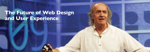
The future of web design and user experience

Here’s a selection of some of the sessions and workshops at MIX10:

There are some other cool things happening at MIX10 that I can’t talk about until the conference. Be there, or if you can’t, watch this space!

You Get to Vote!

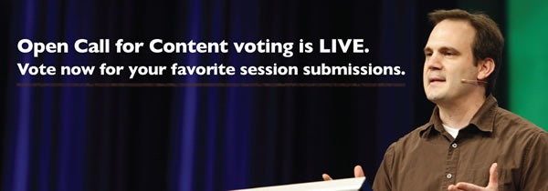
Open call for content voting is live. Vote now for your favortie session submissions.

You can help choose some of the content for MIX10! We took a number of submissions for presentations in an open call for content, and now it’s time to vote for them. You can see all the submissions here, and voting ends on Friday, January 15th.

Early-Bird Discount

Register by Jan. 15th and save: $600 on your pass and a free night at Mandalay Bay

If you register for MIX10 by January 15th, you’ll save US$600 off the admission and pay only US$795 – and you’ll also get a free night at the conference hotel, Mandalay Bay! After the 15th, the price goes up to a full US$1395, so if you want to go, register now!

This article also appears in Canadian Developer Connection.

Categories
Uncategorized

Microsoft Canada and OCAD Announce a Surface Team-Up (or: OCAD Gets a Big-Ass Table)

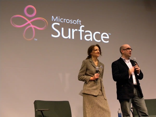
Sara Diamond and Mark Relph onstage at the Mesh Conference 2009

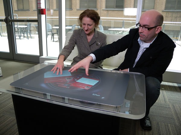
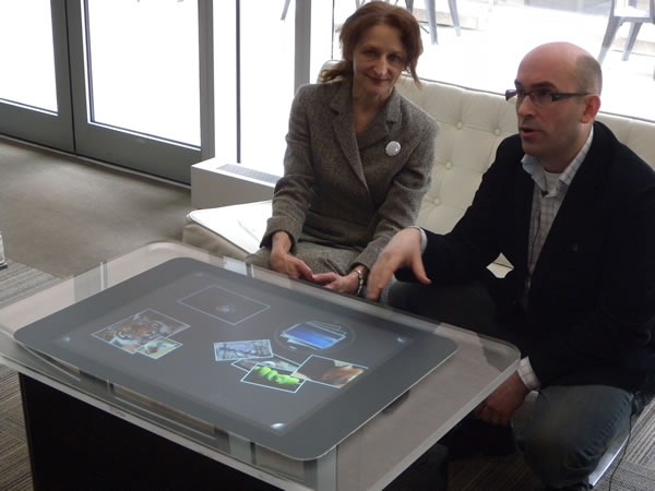
This morning at the Mesh 2009 Conference, Microsoft’s Mark Relph (my boss’ boss) and OCAD President Sara Diamond announced a Microsoft/OCAD partnership. Microsoft will provide OCAD with a Surface tabletop computer along with software and support (which includes training and courses by Infusion Development, who know a lot about developing software for the Surface).

sara_mark_surface_02

We’re providing OCAD with a Surface development unit along with Visual Studio and other developer tools related to building software for it. The Surface will be put in OCAD’s Digital Media Research + Innovation Institute, whose first phase is currently under construction. It’ll be used as a tool within the school’s -disciplinary Digital Futures Initiative (DFI) program, whose goals include establishing a research and innovation laboratory for interactive design, art and digital media.

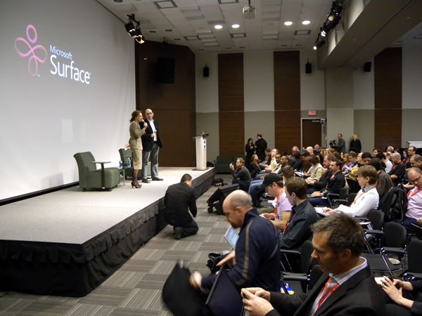
Sara Diamond, Mark Relph and the Mesh 2009 audience

Mark Relph writes:

Microsoft Surface will help OCAD students, faculty and researchers to apply interactive technology to their work in digital media, art and design.  In conjunction with our partner Infusion Development, we will be directly engaged with teaching students how to harness the power of these new technologies.  This is only the start – in the years ahead we’ll be bringing in our technology and design experts to OCAD to help further strengthen this relationship. Our focus will not just be on the Surface technologies – as we move into a world where the interaction with software will depend on new user experiences like touch, speech and other capabilities it is critical that we prepare the next generation of software designers and experience experts.

sara_mark_surface_01

As programmers, engineers and techies, we at Microsoft can come up with all sorts of interesting uses and applications for Surface, but we can’t come up with all of them. We feel that the students at OCAD, who have a strong bent towards design, will come up with some interesting ideas and applications that would never occur to us whose bent is towards geekery. Having worked at a job where OCAD graduates were the majority, I can say from experience that there’s a certain “something” that you get from design-oriented minds that you don’t get from engineering-oriented minds. You can see that “something” in Apple’s products, and it’s something I’d like to see more of from The Empire.

Categories
Uncategorized

The Simpsons and “Mapple”

Last night’s episode of The Simpsons made some pretty funny pokes at Apple, or as they’re referred to in the episode, "Mapple":

In three minutes’ worth of opening sequence, they manage to get in a fair number of jabs and gags, including:

  • Apple stores’ design aesthetic: “It’s so sterile!”
  • The price points of Apple products – even the fake “myPod” earbuds cost forty bucks
  • The "silhouette” iPod ads
  • Steve Job’s keynotes and the breathless, worshipful way they’re received
  • The “cool factor” associated with Apple products
  • The “1984” ad for the original Macintosh. Comic Book Guy is the perfect guy to throw the hammer – he even has the same shorts as the hammer-throwing revolutionary.

There are many lessons that tech companies (and yes, that includes the empire of which I am part) could learn from Mapple – er, Apple – from differentiating yourself with good design to making an emotional and experiential connection with your users. It’s not just feature sets and price points. After all, even though we’ve had electric light for over a century, candles remain a $2 billion dollar industry and can be found in seven out of ten homes.

(As for Bart’s bit about Steve Jobs and Bill gates smooching on a pile of money, that’s been done before in the form of hot Steve-on-Bill slash fiction.)