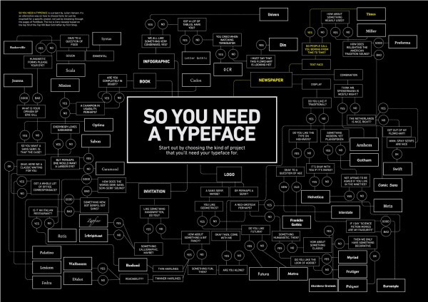
Got a project and can’t decide on a typeface? This chart is by no means complete, but it might help steer you in the right direction. Click it to see it at full size.
Tag: fonts

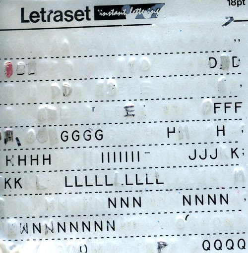
You young’uns may have learned about typefaces and the difference between serif and sans serif from using the “font” settings on your computers, but I learned from using Letraset (and often, its budget-priced brother, Geotype). They were sheets of rub-down transfer lettering and clip art. The principle behind Letraset wasn’t all that different from temporary tattoos. The stuff went the way of the dodo once desktop publishing and laser, inkjet and dye sublimation printers caught on.
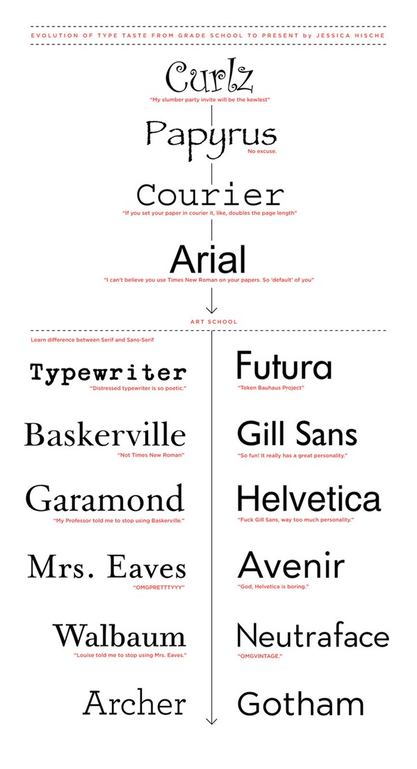
Graphic artist and typeface fancier Jessica Hische – who recently wrote the brilliant “The work you do while you procrastinate is the work you should be doing for the rest of your life” – posted this great graphic showing the evolution of her type taste from grade school to the present day. Click it to see it at full size. Oh, I remember my Helvetica Condensed Black Oblique phase…
This article also appears in The Adventures of Accordion Guy in the 21st Century.
Smashing Magazine’s “Free Fonts of the Month” for this particular month are really, really, really, good. Grab ’em while they’re still up!
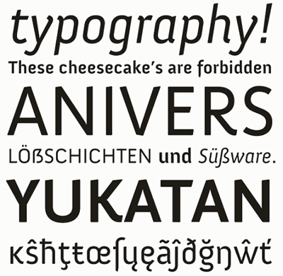
Here’s a sample of Anivers, a font created for Smashing Magazine’s first anniversary. It’s been updated for “extended language support, improved glyph shapes and improved metrics and kerning.” Note that only Anivers Regular is free:
Here’s Fresco Semi Bold, “just one member of a large and flexible type family by Dutch design legend Fred Smeijers:”
And finally, Gentium, designed by Victor Gaultney:
Websites You Shouldn’t Have Missed in April 2008 is a collection of 52 links featuring graphic design tutorials, Ajax, CSS, tips for freelance workers, free fonts, icons and graphics, tools and generators, WordPress themes, typography sites and sites to inspire you. Well worth perusing.
Roadside Signage Fonts
If you’re working on an app like the Church Sign Generator or Photoshopping your own roadside signs, you might want to take a look at these fonts, “Signage Standard” and “Signage Modern”, which are designed to look like the black letters on clear plastic that you see on roadside signs all across North America.


