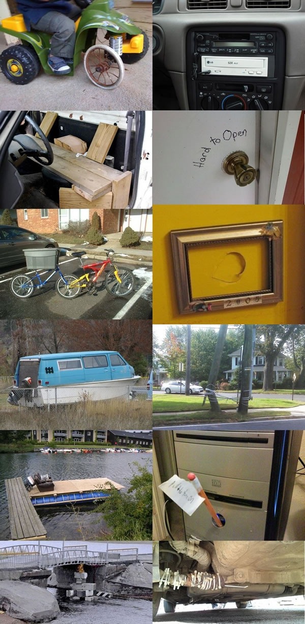
There, I Fixed It is a hilarious photoblog that catalogs kludges, jury rigs and hastily-improvised duct-tape repairs and modifications to everyday objects. The photos below are a sample of some of the quick fixes shown on the site, each one somewhere on the spectrum spanning “clever and thrifty” to “cheap, shoddy and frightening”:

(Regarding the photo in the right column, second one from the bottom – the piece of paper attached to the pencil sticking out of the computer says “Pull to turn on”. It’s a jury-rigged replacement for the power switch.)
Sloppy work like this isn’t limited to the physical world. I’ve seen (and okay, sometimes I’ve written) code that could’ve been a candidate for There, I Fixed It, and chances are you have too:
- Some of my hacks were a little more elegant and useful in the long-term, as long as you weren’t going to be too fussy about aesthetics. They were the software equivalent of the CD-ROM drive installed below the car radio and attached to it with a cable with 1/8” stereo jacks. They weren’t pretty, but they were solid, reasonably maintainable and viable in the long term.
- Others were terrible kludges that were originally intended to be temporary solutions that forgotten and lived much longer than they should have. They were like fixes shown in the two photos on the bottom (the hasty bridge repair and the car exhaust held together with zip-ties).
- I’ve also copped out by glossing over bad user interface design with some explanatory text or dialog box instead of actually correcting the design. This is not unlike labelling a doorknob “hard to open” or a hastily-improvised switch “pull to turn on”.
Be sure to check out There, I Fixed It. They’ve had some pretty hilarious pictures lately, and perhaps it’ll inspire (or shame) you to eschew the quick fix or kludge in favour of putting some time and thought into writing better code and building better user interfaces.
This article also appears in Canadian Developer Connection.


