Categories
Uncategorized

IE’s Big Leap Forward

"nine" spelled using the IE logo for the "e"Peter-Paul “ppk” Koch writes in his blog, QuirksBlog (which lives on his site, QuirksMode):

In the past few days I’ve been revising the CSS compatibility table with information about the latest crop of browsers. There’s no doubt about it: this is IE9’s show. It just supports nearly everything. No hassle, no buts.

Microsoft has finally taken the big leap forward we’ve been waiting for ever since they announced their decision to restart IE development back in 2005.

IE9 promises to be an excellent browser. Its CSS support is now at par with that of the other browsers — although each browser still has its specific areas where it performs less. But we cannot in good faith say that IE is behind the others any more.

In the article, he does a run-down of CSS selectors and finds that the upcoming IE9 does an excellent job of supporting them.

Go take IE9 for a spin – download Platform Preview 3 and try it out – and make sure to try your hand at CSS 3 as well!

Download IE9 Platform Preview 3 now!

This article also appears in Canadian Developer Connection.

Categories
Uncategorized

My Photos from Make Web Not War 2010

I’ll post a more detailed write-up of the Make Web Not War conference later, but I thought that those of you who were there (or wished they were there) would like to see some photos as soon as possible. I’ve posted my photos at full resolution to my Make Web Not War Flickr photoset, which you can view either on Flickr or the slideshow above. The photos all have titles, and I promise I’ll finished the remainder of the descriptions over the next couple of days.

This article also appears in Canadian Developer Connection.

Categories
Uncategorized

Apple, Windows Phone 7 and Burning the Boats (or: Why I Think Windows Phone 7 Doesn’t Have Copy and Paste)

Replica Spanish galleon on fire

Sometimes, you have to do more than just start from scratch. Sometimes, you have to burn the boats.

“Burning the boats” is an expression that comes from a story – some say legend — about Cortes, the Spanish Conquistador (and yes, the subject of Neil Young’s Cortez the Killer). Wishing to guarantee that his men would stay in Veracruz (which he’d just taken over from the Governor of Cuba) and only move forward into terra incognita without retreat, he ordered them to burn the ships that brought them to the New World. It was an extreme measure, but without the distraction of a way home, they committed themselves completely to business of exploring and conquering.

The Original Mac: No Arrow Keys

Bruce “Tog” Tognazzini, former user interface guy at Apple and the company formerly known as Sun, and now member of the Nielsen/Norman Group, wrote about how Apple burned the boats back when they released the original Macintosh in his 1992 book Tog on Interface and more recently in an article on his blog, AskTog.

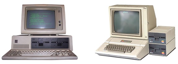
Original IBM PC and Apple // computers

In 1984, the Macintosh represented a break from the dominant paradigm at the time: the command-line interface. Back then, you’d issue commands to a program these ways:

  • Typing them in
  • Using control-key combinations
  • Using function keys
  • Using the arrow keys to navigate

Software developers at the time had little experience developing for GUIs, which meant that there would be great temptation for them to simply develop apps for the Mac the way they did for other platforms. The software they’d end up writing would be a command-line app that just happened to run on the Mac.

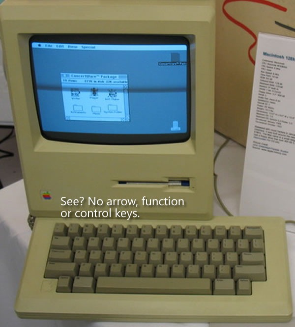
Steve Jobs and Apple’s Macintosh team, an unconventional bunch who were said to have nary a classical computer science degree among them, thought that existing software sucked. I was 16 at the time, and I’d have to agree. In order to prevent straight ports of existing software to the Mac, they decided to “burn the boats” and make it difficult for developers to “go home” and simply rely on the UI techniques from the Old World. The first Mac keyboards didn’t just omit the function keys, they also left out the arrow keys:

Original 128K Macintosh. "See? No arrow, function or control keys."

Tog writes:

That was a big deal. Almost every application then in existence depended on the arrow keys (then called cursor keys) for navigation. With that one stroke, Steve reduced the number of apps that could be easily ported to the Mac from tens of thousands to zero, ensuring that this new computer would have a long and painful childhood.

It’s counterintuitive to want to have your creation go through a long and painful childhood, but there was a method to their madness. In “burning the boats” by getting rid of the function and arrow keys on which developers relied and taking away their “way home”, they forced developers to redesign and rewrite their applications to fit a mouse-driven graphical interface rather than a keyboard-driven command-line interface.

They eventually brought back the arrow keys about a year and a half later. By that point, developers had grown used to developing GUI apps that took advantage of the UI controls and mouse that we’ve come to know and love. The return of the arrow keys at that point would now be a welcome addition and convenience, rather than a dangerous temptation to return to “the old ways”.

It was a bold move, but when you’re making radical changes to the way things are done, bold moves are often required.

Windows Phone 7: No Copy and Paste

Copy and Paste icons

There’s been some talk about Windows Phone 7’s lack of copy and paste. It’s similar to the hue and cry about the original iPhone’s lack of copy and paste, and having been reminded by Tog’s article about the design decisions made for the original Mac, I can see the method to Microsoft’s madness.

“Copy and paste already exists in Windows,” people have said, “why not Windows Phone 7?”

The answer is simple: because Windows Phone 7 apps aren’t supposed to be like Windows apps. For non-enterprise, non-industrial use, the “Windows, but scaled down” approach of previous versions of Windows for phones, which goes under the name Windows Mobile, didn’t catch on (Windows Mobile still rules the roost for compact devices used in enterprises and industries, and will be supported for years to come). Hence Albert Shum’s completely different-from-the-desktop, and even different-from-other-phones Windows Phone 7 interface, which went by the codename “Metro”.

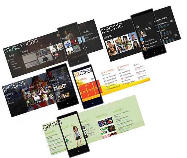
Windows Phone 7 hubs: music+video, people, pictures, office, games

The use of copy and paste implies a keyboard-centric user interface, which isn’t what Windows Phone 7 is about. People often use their smartphones one-handed, with only their thumb to access the touchscreen. Windows Phone 7’s interface takes this usage into account, which is why it’s sensor-centric, and applications, should get their information from touch, gestures, accelerometers, location and other sensors where possible. By not including copy and paste in the first release, the Windows Phone team is “burning the boats” and asking developers “How do you write apps so that they don’t need intricate more-suited-to-the-desktop operations like copy and paste?”

(And yes, copy and paste will eventually find its way into Windows Phone 7, just as the arrow keys, function keys and even right-clicking found their way into the Mac.)

The same could be said for many other things that were purposely excluded from Windows Phone 7, such as the compact edition of SQL Server that was part of Windows Mobile. If you think about it, this design decision forces you to build apps so they store and retrieve data from the network, which makes sense, since phones are devices that network with both cellular and wifi.

Windows Phone 7 represents a radical shift in the way Microsoft stuff works, from a very minimalistic look to its task-centric organization. In order to make sure that people built apps that fit it, the Windows Phone 7 team had to burn the boats. It’s a bold move, but it’s the right one.

Categories
Uncategorized

Interview on ASP.NET MVC and Open Source at Microsoft

I’m looking a tad sleep-deprived in this interview – I was quite busy around the end of February and the start of March — but I managed to stay conscious long enough at the Confoo conference to do an interview with CT Moore (back in early march) and talk about my presentation, which covered both ASP.NET MVC and Microsoft’s relationship with open source:

Should you not have two minutes free to watch the video, the take-away points from the interview are:

  • I really like ASP.NET MVC. It’s the way I choose to build web applications in .NET and it’s similar to other MVC frameworks like Ruby on Rails and Django.
  • Microsoft’s attitude to open source is that’s it’s not a threat, but an opportunity. We compete with other companies, not software movements.
  • Sleep is good.

This article also appears in Canadian Developer Connection.

Categories
Uncategorized

Career Demo Camp Montreal

career demo camp montreal

On Wednesday, a mere hour or so after the end of Day 1 of TechDays Montreal, came Career Demo Camp Montreal, a community event that combined presentations on job-hunting and career-building with demos of projects by Montreal-area developers.

What’s With All These “Demo” and “Camp” Events and Techdays?

techdays canada For this year’s edition of TechDays, we decided to try something new. TechDays is a two-day cross-Canada conference taking place in seven cities – Vancouver, Toronto, Halifax, Calgary, Montreal, Ottawa and Winnipeg – and all the conference events take place during the day. There are no events scheduled for after 5 p.m., which means that on the evening of Day 1, the venues are ours – and unused. Since they’re already set up for presentations and it costs relatively nothing to hire an A/V tech for a few extra hours, we decided to make our venues open to local developer community events. We even lent a hand in helping put the events together.

This year, we opened our space to four such community events:

The Career Portion

People started milling in at around 6:00 p.m.:
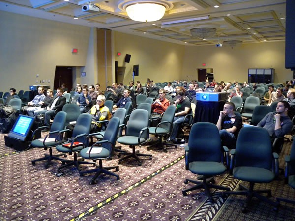
02 audience

The evening began with Alex Kovalenko, Director of Operations at the tech recruiting company Kovasys. His presentation was all about what smart job hunters do, how to write a good tech resume, and the elements of a successful tech interview.
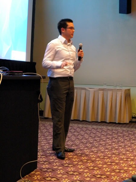
01 alex kovalenko

Alex was joined by a couple of his coworkers at Kovasys for the Q&A session, which included the question “What kind of salary can a PHP developer command in Montreal and Toronto? If I recall correctly, their answer what that in Montreal, they’ve seen a range of CDN$55k for starters to CDN $90k for leads. Salaries are 15% higher in Toronto, but with that comes a commensurate increase in the cost of living.
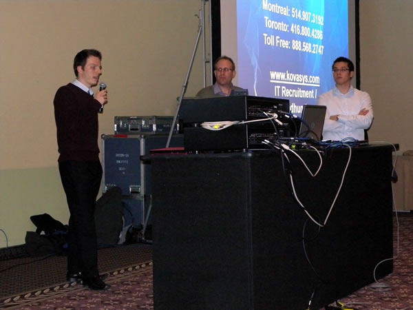
03 kovasys

Next came my presentation, Better Living Through Blogging, in which I talked about how having a blog has improved my life in a number of way, not the least of which was to help land me the last four of my jobs.
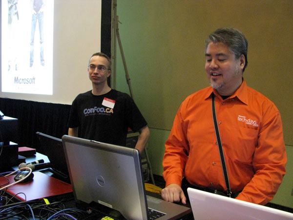
04 yann and joey

Blogs, I argued, were probably the most effective way for you to have control of your online identity and therefore to put your best foot forward to potential employers and customers. Among that stats and opinions I cited in the presentation were:

  • 77% of recruiters surveyed by ExecuNet said that they use search engines to check out job candidates.
  • According to CareerBuilder.com, 1 in 4 hiring managers say that they use search engines to research potential employees.
  • SearchEngineWatch.com reports that there may have been up to 50 million proper-name searches in 2006.
  • Tim Bray, Director of Web Technologies at Sun: “If someone came looking for a senior-level job and had left no mark on the Internet, I’d see that as a big negative.”

goku and vegeta

That was followed by a quick presentation by my coworker at Microsoft, Open Source Strategy guy Arun Kirupananthan, who used Dragon Ball Z as a metaphor for Microsoft (as Vegeta) and Open Source (as Goku) and how they can work together and talked about the Make Web Not War conference, which will take place in Montreal in May 2010.

The Demo Portion

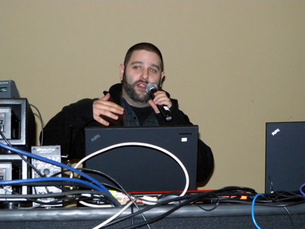
The first demo was by Brendan “DigiBomb” Sera-Shriar, who presented WPTouch.
05 brendan 01

“With a single click,” he said, “WPTouch transforms your WordPress blog into an iPhone application-style theme, complete with Ajax-based article loading and effects when viewed from an iPhone, iPod Touch, Android or Blackberry.”
06 brendan 02

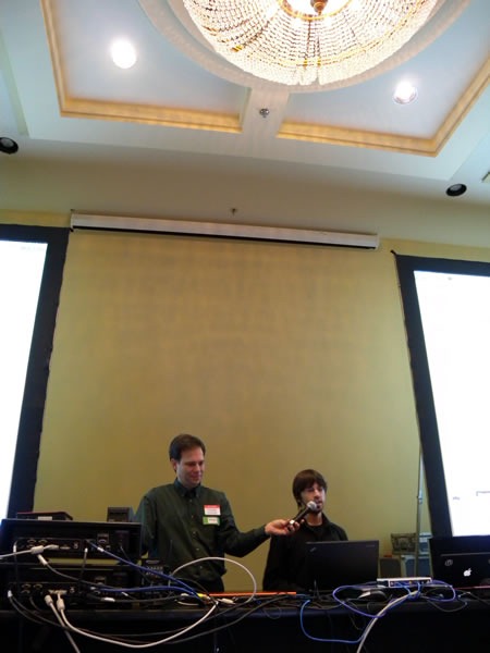
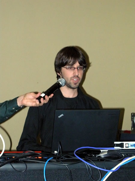
Next up: Patrick Lafontaine, MySQL developer and DBA:
07 christian and patrick

His presentation was on how to back up your MySQL databases effectively and for free-as-in-beer.

(I have to give Christian Beauclair kudos for volunteering to be his mic stand. It’s not easy holding a mic in a single position for ten minutes!)
08 patrick

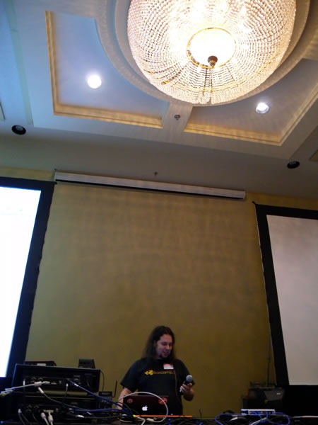
Then came Sylvain Carle of Praized:

09 sylvain 1

Sylvain talked about the Praized API, which lets you harness their “white label” local search platform fro finding people and services in your local community.
10 sylvain 2

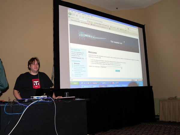
After Sylvain came Marc Laporte demoing TikiWiki, a Full-featured open source multilingual all-in-one wiki with content management and groupware features, written in PHP. It’s our plan to make TikiWiki one of the apps included in Microsoft’s Web Platform Installer:
11 marc

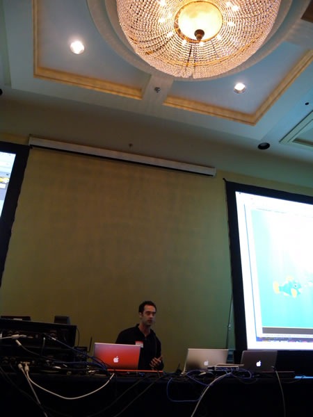
Bruno of DokDok did the next demo. DokDok is a way to share, track and version files of any size, and it’s done using an interface that everyone understands: email.
12 bruno

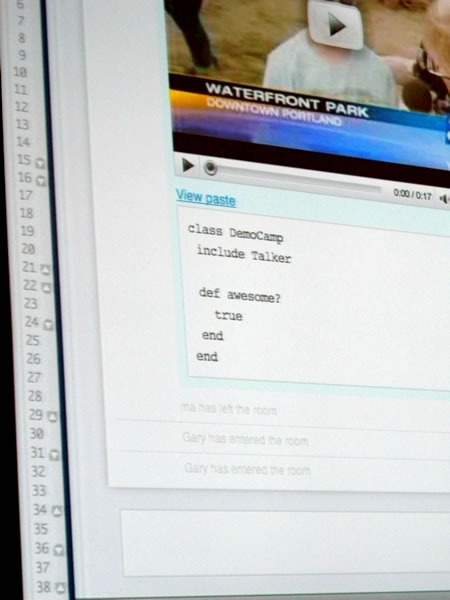
Then came Marc-André Cournoyer and Gary Haran of Talker. I liked the Ruby pseudocode that they displayed on the big screen:
13 talker

Talker is a group chat application that is particularly good for collaborative work. I may have to give it a try soon.
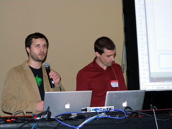
14 marc-andre and gary 1

Testatoo – I think it’s a pun on “tests à tout”, or “tests for everything” – was the next presentation, which was given by David Avenante.
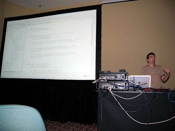
16 david

Here’s a closer look at Testatoo in action:
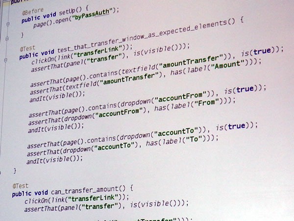
17 testatoo

The final demo was Pierre-Luc Beaudoin’s L’Agenda du Libre du Quebec:
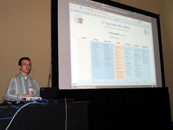
18 pierre-luc

L’Agenda du Libre is an online calendar of Free Software events in Quebec and was implemented in Django in under 30 hours:
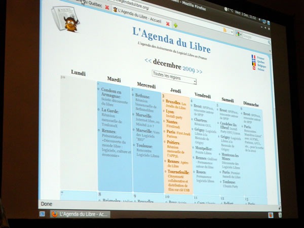
19 agenda du libre

The Aftermath

stewie griffin

This was the first DemoCamp-style event where the presentations were some presentations were done in English while others were done in French. I felt like a Family Guy character listening to Stewie Griffin during the French presentations: I got the general gist, but missed out on the subtleties. Guess I’m going to have to work on my French!

With the demos done, all that was left to do was to award an XBox 360 Arcade to the presentation that the audience liked most, based on their applause. Marc-Andre and Gary of Talker won, and in a very generous move, decided to donate it to the Salvation Army so that some kids who’d otherwise never get the chance would get a video game console this Christmas. Nicely done, gentlemen!

No DemoCamp-style event is complete without a trip to the pub afterwards, so about 35 of us moseyed down to the 3 Brasseurs on Avenue McGill College and St-Catherine, where Microsoft bought the first round of pitchers.
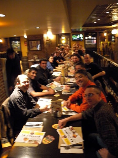
21 3 brasseurs 2

A few brave souls, Arun and I kept the party going at Benelux where we continued to chat and drink until 2 in the morning, after which I had to scurry back to the hotel in order to get some shut-eye for Day 2 of TechDays Montreal.

I’d like to thank the following people for Career Demo Camp Montreal a success:

  • All the presenters, for putting in the time and giving great presentations. It’s not possible without you!
  • Jean-Luc San Cartier and Yann Larrivee for helping us put it together on the Montreal community end.
  • Christian Beauclair for his invaluable assistance with the A/V setup.
  • Matthew the TelAV A/V guy for his work and for staying late.
  • TechDays head honcho Damir Bersinic for giving me the latitude to use TechDays’ space for community events.
  • Microsoft’s Open Source Strategy team of Nik Garkusha and Arun Kirupananthan for helping to put this thing together on the Microsoft end.

(By the way, if you’ve got an open source project and are wondering what Microsoft can do for you, you’d do well to get in touch with Nik and Arun, shown below!)
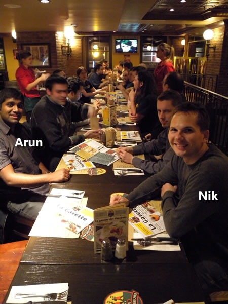
20 3 brasseurs 1

This article also appears in Canadian Developer Connection.

Categories
Uncategorized

Mini-Microsoft and the Sea Change

"Mini-me" in front of a Windows logo

I’m happy to see that the anonymous blogger at Mini-Microsoft is seeing the same “sea change” that I was betting on when I first joined not quite nine months ago. I agonized over the decision all through the interview process (six interviews over the period of a week), pored over articles, books and reports about the company and had phone, email and IM conversations with every Microsoftie I knew, all in an attempt to “read the tea leaves” and see if the company was sailing towards the future or stagnating in the Doldrums. While I saw some serious challenges (including a few that could induce serious facepalms), I saw opportunities to match. And with that, I signed my offer letter back in October, bought my red travel-sized accordion that same afternoon and declared myself a Sith Lord.

The painful-but-necessary process of correcting the company’s course is nowhere near done, but signs like the ones mentioned in the article are not only good news; they’re necessary. It’s like seeing that first drop in the numbers on the scale when starting a diet: while there’s still still a long way to go, it shows that you’re actually heading in the right direction, which encourages you to keep going. Just as vanishing love handles and better-fitting clothes the good signs that a dieter watches for, things like Windows 7, Bing, Silverlight and moves towards interoperability and open source are the good signs that I’ve been watching for. But yes, while we’re turning the corner, we have to watch out, ‘cause Steve Jobs might be waiting ‘round the bend, shovel in hand.

As with many companies and organizations, we’re at the start of a new fiscal year at Microsoft. Like the calendar new year, there was some looking back (as in my annual review, where it was concluded I rocked in my Rookie Year), but there was also looking forward, in the form of setting goals, on personal, team and company-wide levels. My big goal this year to contribute to that “sea change” that both the Mini-Microsoft blogger and I see, and in the process change the Microsoft, the tech world – and hey, why not the whole world? – for the better.

Categories
Uncategorized

Yes, I Think Outlook Needs to be Fixed

Microsoft logo with Evil Monkey from "Family Guy"This would be a very good time to remind you, the Gentle Reader, that Global Nerdy is my personal tech blog and that the opinions expressed within are mine and mine alone. They are not necessarily those of my employer, Microsoft Canada, nor its parent company, Microsoft Corporation, nor or any other Sith Lords, Stormtroopers, Family Guy monkeys or any other agents of evil in the employ of said organization.
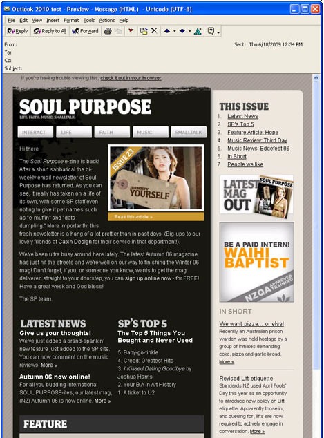
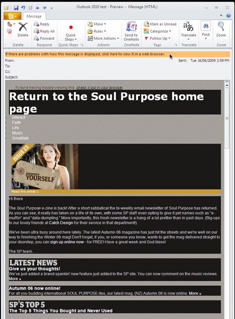
You’ve probably heard the buzz in TechCrunch: Here’s how a properly-coded HTML email, where HTML is used for content and CSS is used for presentation, appears in the version of Outlook that came with Office 2000:

HTML email as rendered in the 2000 version of Microsoft Outlook. Nice.

And here’s the same HTML email, with the same properly-formatted HTML, as rendered by the current version, Outlook 2007. It uses Word as the rendering engine, and Word will be the rendering engine for the upcoming Outlook 2010:

HTML email as rendered in the 2007 (and eventually 2010) version of Microsoft Outlook. Broken.

I understand why the empire wants Word-Outlook interoperability, which is why Word was chosen to be the HTML rendering engine for Outlook. But Word’s HTML renderer isn’t standards-compliant, which is why Outlook renders HTML in such a janky way. Outlook relies on old tricks such as using HTML tables for layout and other non-recommended ways of building web pages. IE8 plays by the rules, why doesn’t Outlook?

In my opinion, this is wrong. It runs counter to the spirit of interoperability, the embrace of open source and the following of standards that has accompanied the “sea change” within Microsoft (and it’s this sea change that help solidify my decision to join the company). I believe that it is in both Microsoft’s and the industry’s best interests for The Empire to be more standards-compliant.

(Besides, I just came back from presenting at a “Building Accessible Web Sites” conference where I told the audience to write compliant HTML. Damn right I’m going to push for everyone – Microsoft included – to do just that!)

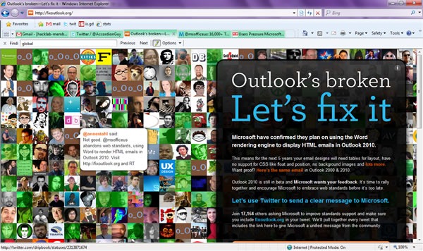
That’s why I’m encouraging you to sign the Twitter petition to fix Outlook’s HTML rendering at FixOutlook.org. Outlook 2010, along with the other parts of Office 2010, is in beta right now, and Microsoft is soliciting opinions. This is the time – tell them to fix Outlook!

Home page of the "Fix Outlook" site