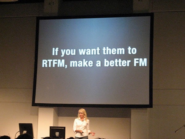
Sound advice from Kathy Sierra (pictured giving one of those mind-blowing presentations that are her stock in trade). Her blog, Creating Passionate Users, while dormant, is still worth reading.
Tag: presentation slides
Here’s the presentation I did at WordCamp Toronto 2009 this weekend, Better Living Through Blogging, in which I talk about how taking up blogging has paid off in all sorts of ways, from relationships to career to even saving my bacon.
Some Notes About the Deck
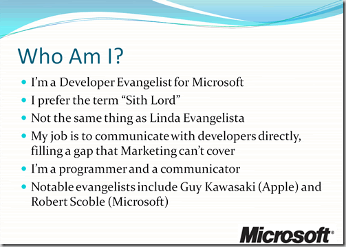
You’ve probably suffered through presentations whose slides look something like this:
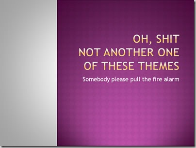
I’m not a big fan of background templates in slides, but at least this one (from one of the themes provided in PowerPoint 2007) isn’t so bad. There are worse themes I could’ve picked, such as this one:
That’s just downright ugly.
I find that a plain black background with white text works best. The plain black background is simple, doesn’t interfere with or overpower your content, and works well with all sorts of room sizes, lighting conditions, projector types, projection surfaces and so on.
Whenever possible, I avoid putting the company logo at the bottom of every slide. It’s not a fight I’m always going to win, but I do my best to convince the guardians of corporate identity that the audience won’t forget the company name if we don’t beat the audience’s head with it on every slide. I think that it detracts from the presentation by drawing attention away from the content; I think that it also reeks of branding desperation. I think it’s enough to show the logo at the start and end.
Your slides are not cue cards. The purpose of standing in front of an audience is not to read aloud a document written in point form. You’re there not only to communicate an idea, but to engage the people in the room as well; the slides are there as support. That’s why slide presentation software has “presenter mode”, where the slides are displayed on the projector and your notes are displayed on your laptop.
A Little Sample
Here’s what my audience saw instead of the “Who Am I?” slide above. I’ve included a rough paraphrase of what I said along with the slides…
“Some of you already know me, some of you think you know me, and some of you are wondering ‘who is this Microsoft Guy and why is he speaking at a WordPress event?’. So I guess a proper introduction is in order.”
“Yes, I work for Microsoft. The Empire. I’m still new, having been working there for just over six months. I’ve had a blast so far – it’s a fun place to work, and in my particular job, they give you a wide degree of latitude.”
“As for my job, if I could pick the title, it would be…Sith Lord.”
“But the company, being what it is, prefers to give me the slightly less interesting title of Evangelista.”
“Actually, that’s not true. The title is Evangelist. It’s a relatively new kind of job in the big scheme of things, which is a combination of…”
“Super-smart hottie with programming skills and…”
“Dapper, intelligent and quick-witted communicator of ideas. I’m kind of like a marketer. But with a brain. And a soul. [Looking at wincing marketers in the audience] Oh, I kid because I love.”
“The concept of a technology evangelist was pioneered by the The Esteemed Competition over at Apple by Mike Boich, but it was Guy Kawasaki who popularized the position. He’s since gone on to do other tech-related things in Silicon Valley, but a lot of what he does can still be considered to be evangelism.”
“Microsoft also has technology evangelists. The one you probably know is Robert Scoble, who was with the company for three-ish years, and like Guy, although he doesn’t have the title or work for Microsoft anymore, a lot of what he does is still evangelism.”
“And yeah, I know the guy.”
I’d much rather see a presentation done in the style that I used rather than seeing someone simply grind through a deck of items in point form, acting as a narration service.
And Now a Question for the Audience
If I were to post a more detailed version of my presentation online, would you rather have it…
- in the form shown above, with the slides shown above what I said in text form?
- as a video, with the slides displayed in the video portion and my voice as the audio?
Let me know.
I started my presentation at WordCamp Toronto 2009 yesterday – Better Living Through Blogging — with this slide, which got a lot of laughs. A number of people have requested it, and I’m only too happy to oblige. Here you go: share and enjoy!
 Click the photo to see it at full size.
The image comes from a Worth1000 Photoshopping contest – here’s the original.
