Categories
Uncategorized

Mobile developer news roundup #1: The phablet era, UX lessons from restaurants, Evernote’s 5% problem, Android and OpenJDK, and Solitaire’s secret history

We’re in the phablet era now

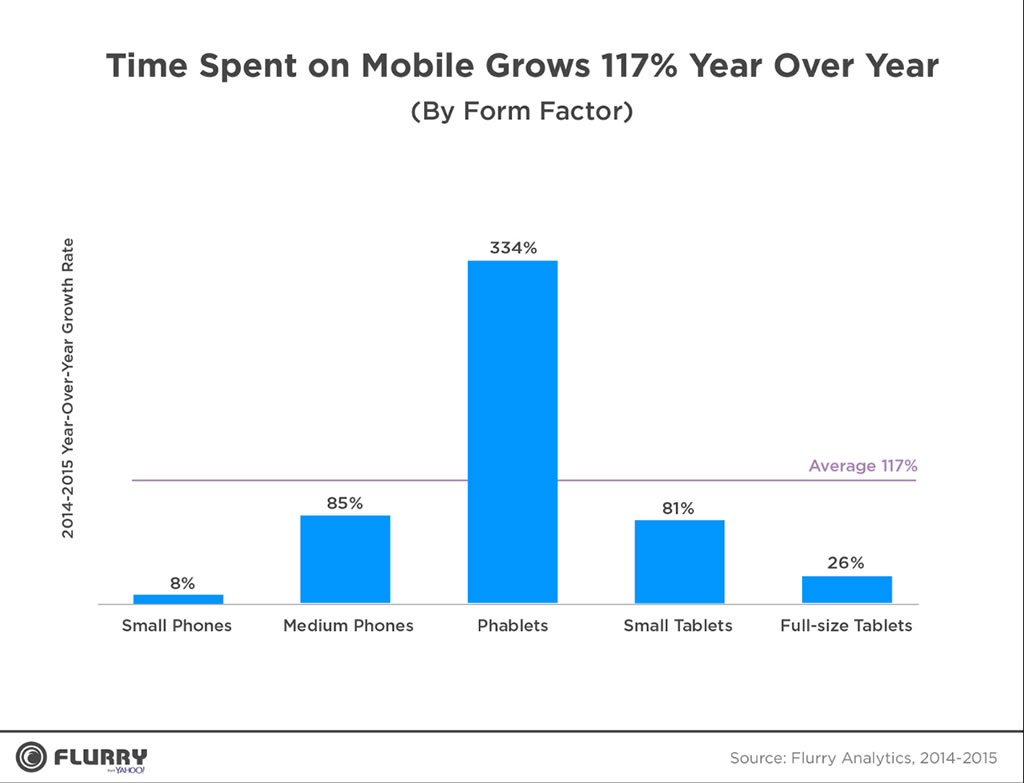
Chart: Time spent on mobile grows 117% year over year.

Click the graph to see it at full size.

Venture capitalist Fred Wilson looked at research firm Flurry’s State of Mobile 2015 report and took note of the chart above, which shows that the greatest growth in time spent on mobile came from “phablets” — those large phones that blur the line between phone and tablet — and wrote:

There’s not a lot new in this data to be honest, but it confirms a lot of what everyone believes is happening. We are converging on a single device format in mobile and that’s driving some important changes in usage. We are in the phablet era.

Everything I needed to know about good user experience I learned while working in restaurants

Waiter and cook working in a restaurant.

At the Neilsen/Norman Group’s blog, Everything I Needed to Know About Good User Experience I Learned While Working in Restaurants lists the many things that you can learn from restaurants and apply to your applications, from designing for both new and expert users to interaction design and error handling to community management.

If you’re not familiar with the Nielsen/Norman Group, they’re the “Monsters of Rock” of user interface and experience. Their principals are:

The cautionary lessons of Evernote’s “5% problem”

An out-of-focus Evernote icon.

Evernote used to be my go-to note-taking app in 2011. I worked across platforms, and I loved that I could start a note on my laptop, continue on my iPad, and then later make tweaks or addenda on my phone. But as time went by, it got buggier and increasingly less usable to the point where I abandoned it worse and buggier until I abandoned it in annoyance.

Their note-taking app got buggier as the company tried to expand so that they had offerings that would appeal to as many people as possible. Therein lay their problem: as their own former CEO put it, people at Evernote conferences would go up to him and say that they loved the platform, but used only 5% of what it could do. The problem was that there was a different 5% for every person. They spread themselves too thin, lost their focus, started half-assign their product lines, and in an attempt to please everyone, ended up annoying them.

Keep calm and carry on developing Android apps

The classic 'Keep Calm and Carry On' poster.

You may have heard that the ongoing legal battle between Oracle (who own Java) and Google (who own Android, which is Java-based) has led to Google’s decision to move from their proprietary version of the JDK to Oracle’s OpenJDK. You may be concerned, but you probably shouldn’t be. It may cause headaches for Google and Android mobile phone vendors, but as Android developers, it shouldn’t really affect you.

As Android developer and online tutor Tim Buchalka puts it:

We write our code accessing the same libraries, and things just work. Of course its going to be a decent chunk of work for Google to get this all working so that we dont have to worry about it, but if anyone has the resources to do it, Google do.

What do you need to do as an Android developer? Absolutely nothing, its business as normal! You dont need to change anything in your development process and it may well be that when Android N arrives you won’t have to either. So fire up Android Studio, and get back to coding!

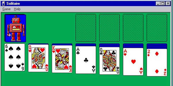
A story you might not know about Microsoft Solitaire: it was created by a summer intern!

Screen shot of Microsoft Solitaire on Windows 3.1

Is Wes Cherry a bit annoyed that he never got paid to write one of the most-used applications of the Windows 3.x/9x days? He once answered “Yeah, especially since you are all probably paid to play it!”

Categories
Uncategorized

This is How a Lot of People Feel About the Changes to Facebook

Facebook came on a little strong with all the changes to its interface, which left users feeling ike the abuela (grandmother) in the video above…minus the laughing. I think they also imagine the dog with Mark Zuckerberg’s face, screaming “GILF! GILF! GILF!

This article also appears in The Adventures of Accordion Guy in the 21st Century.

Categories
Uncategorized

THIS is How You Do It: The USGA Golf Score App for Windows Phone 7

intro slide[3]

One of the tricky things about helping developers build for a platform that has yet to be released is that it’s a tabula rasa. There’s no history, which is both blessing and curse: we developers get to make that history, but at the same time, we’re working in the dark. There are no examples to emulate and no best practices to follow – it’s just us and whatever user interface guidelines there happen to be (which, in the case of Windows Phone 7, is the Windows Phone UI Design and Interaction Guide).

That’s why I’m glad that Microsoft is building WP7 apps like USGA Shot Tracker, a gorgeous golf scorekeeping app that practically announces to developers: “This is how you do it. This is how you write a usable, beautiful, truly Windows Phone 7 app.” Here’s a video of USGA Shot Tracker in action:

Give the app a look, and also make sure you check out the article on Long Zheng’s blog, istartedsomething, which includes images of USGA Shot Tracker’s screens.

Keep an eye on this blog, because I’m a couple of days away from starting an ongoing series on well-designed WP7 apps and how you implement them. I’ll take a closer look at USGA Shot Tracker and other apps, going through them with a fine-toothed comb in attempt to learn as much as possible from them, and share that knowledge with you.

This article also appears in Canadian Developer Connection.

Categories
Uncategorized

A Touchy Subject

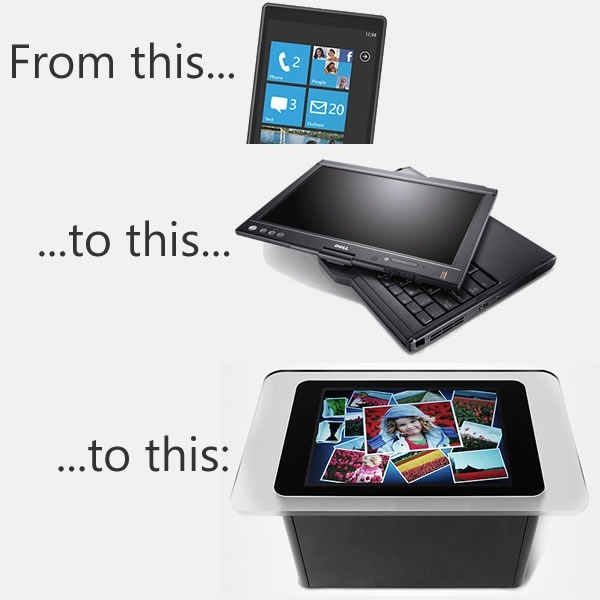
win phone latitude xt2 surface

I think that we – and by we, I mean we developers and developer evangelist types at Microsoft – get touch and tablets, or slates, or pads, or whatever you’d like to call them, better than the Ars Technica article Ballmer (and Microsoft) still doesn’t get the iPad (written by Peter Bright and posted in the One Microsoft Way section) implies. I believe that over the next few months, you’ll see some interesting touch-related stuff coming from Microsoft, and that we have a responsibility to help developers understand the differences between mouse/keyboard computing and touch computing.

In anticipation of this, I’ve been make my move towards touch- (and other sensor-based) computing over the past little while, by migrating to the following devices:

The idea behind this purposeful move towards touch-equipped devices is to truly understand touch-based interfaces, which UI elements work and which ones don’t, and then to pass the lessons learned to my audience – developers and designers, whether you build for the Microsoft platform or the platforms of the Esteemed Competition.

My own move towards touch-based devices is a microcosmic example of the larger changes taking place at The Empire. The move to touch interfaces is taking place on Microsoft computing platforms of all sizes:
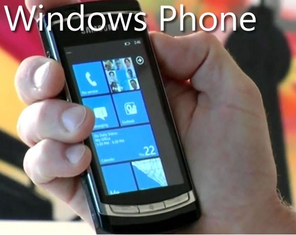
windows phone

As the Ars Technica article points out, one of the signs that we do get touch is the new interface design of Windows Phone 7. The design philosophy is build around touch (and other sensors), and the WP7 “design bible”, the Windows Phone User Interface Design and Interaction Guide [12 MB PDF], explains this philosophy beyond the mere technical details. Here’s the introduction to its section WP7’s touch interface (any emphasis in the quote below is mine):

Touch input is a core experience of Windows Phone 7 and has inherent differences from traditional keyboard and mouse input systems. Designed for natural and intuitive user interaction, touch input in Windows Phone 7 enables users to interact with application content such as a photo or a web page. Touch input enables simple and consistent user touch gestures that imitate real life behavior, such as panning on a photo to move it. Single-touch gestures make interaction easier with one hand, but multi-touch gestures are also available to provide more advanced gesture functionality.

Application developers should strive to create unique and exciting experiences that encourage the discovery of content through the use of touch gestures. Users should enjoy the experience of navigating through the steps of a task as well as the completion of the task itself. Touch gestures should provide a delightful, more colorful, intuitive experience within applications

Touch delights the senses as the user gets to see the interaction match the performance. The touch UI should always have aware and responsive performance, just like how real world objects respond to touch immediately, and applications on Windows Phone 7 should as well, by performing the action in real time and by providing immediate feedback that an event or process is occurring. Users should not have to wait as it breaks their immersion, flow, and concentration, especially as their gestures transition from one to the other. For example, a pan may turn into a flick or a tap can become a double tap, and the user should not be aware that the UI is switching gesture support.

There’s a great amount of understanding behind the nuances of touch-based interfaces in the Windows Phone User Interface Design and Interaction Guide, and over the next few months, we’ll be covering them in great detail in this blog.
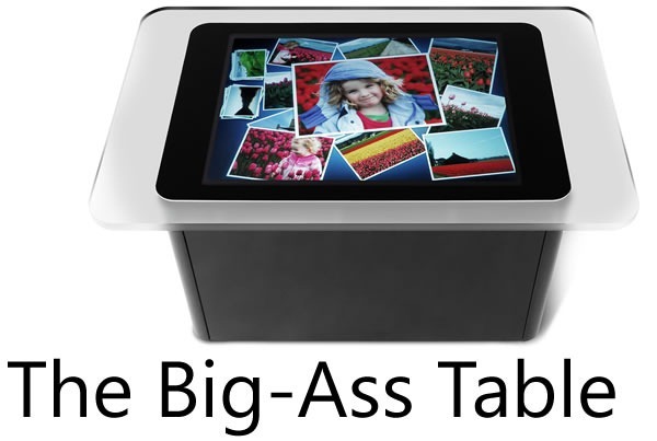
big-ass table

When the Surface, a.k.a. the “Big-Ass Table”, came out, a number of people asked why such a big, expensive thing was built and what practical purpose such a beast would serve.

For starters, there are a number of customers who use it, from casinos in Vegas to bible study classes in megacurches to places closer to home (by which I mean Canada), from the company that did the security for President Obama’s visit to Ottawa to super-sexy Toronto design firm Teehan+Lax to Ontario College of Art and Design to Infusion, who’ve built applications such as Noront Resources’s GSI Surface tool to the security app Falcon Eye.

Equally important are lessons to be learned about input from touch and other sensors from a “concept” machine like the Surface, whose built-in camera systems allow for way more touch points than a resistive or capacitive touch screen will allow, as well as the ability to “see” objects on the tabletop. By being empirical and building such a computer, developing software for it and watching people interact with it, we learn more about touch and sensor-based computing way more than we could from mere theorizing.

I think Des Traynor captured our intent quite nicely in his article about Surface and other Microsoft efforts in the field of user interface:

When the Surface was released two years ago it was chastised by the public. The joke at the time was: “Apple and Microsoft both invest in multi-touch technology, Apple release the iPhone, Microsoft release a $15,000 coffee table!”.

But Surface wasn’t about “re-inventing the coffee table”, so much as it was prototyping a vision of the future of computing. There will come a time when “gathering around a laptop” will seem as ridiculous as connecting an ethernet cable; a time when everyone gathers around a multi-user computer to have a meeting or debate a design. With something like surface, Microsoft are preparing for that day.
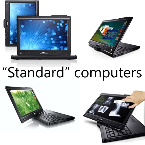
standard computers

A lot of the knowledge from Surface applications have been injected into Windows 7 in the form of the Windows 7 Touch Pack. This pack gives Windows 7 a touch-based API and a set of apps originally designed for the Surface, so that they can run on touch-enabled computers, such as HP’s TouchSmart series, touch-enabled laptops like my own Dell Latitude XT2 as well as any computer connected to one of the new touch-enabled monitors (our manager John Oxley has one in his office).

The Ars Technica article goes on and on about Windows 7’s standard interface controls being too tiny for touch, but a quick look at the Touch Pack apps reveals that they don’t use the standard controls; rather, they use controls better-suited to touch. Here’s a screenshot of Surface Collage, the photo-collage application, running on my XT2:

surface collage

No standard Windows controls here! You manipulate the photos directly using gestures, and the strip along the bottom is a photo list, which you also manipulate through gestures. The closest thing to a standard Windows control is the “close” button near the upper-right hand corner of the screen, which is larger than the typical “close” button – small enough to be out of the way, yet large enough to click with a finger.

Here’s another app from the Touch Pack, Surface Globe, also running on my XT2:
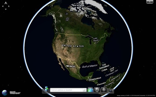
surface globe

Once again, no standard Windows 7 controls here, but a map that you directly manipulate, augmented by finger-friendly controls.

The Touch Pack apps all follow this philosophy: when going touch, eschew the standard Windows 7 UI controls in favour of touch-friendly ones, and then back to bog-standard Windows 7 when exiting them. These apps show not just that we understand that touch computing is a different beast from mouse-and-keyboard computing, but that we also understand where they intersect.
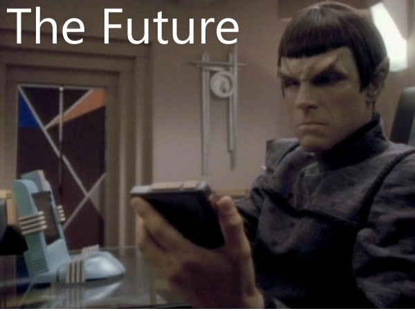
future
We’re working on what I like to call “the touch continuum”, which spans pocket devices such as the Zune HD and Windows Phone, to portable computing with netbooks, laptops and soon, tablets, to desktop and tabletop and wall-sized units. And yes, we get that new types of user input call for new user interfaces and give rise to new usage patterns. We’re aware of the challenges of touch (and other sensor) input and over the next little while, you’ll see our answers to those challenges. And better still, we’ll share what we’ve learned in order to make you better developers and designers of software that use these new interfaces.

This article also appears in Canadian Developer Connection.
Categories
Uncategorized

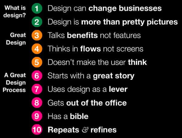
Ten Things You Need to Know About Design

10 things about design

What you see above is a slide from Jason Putorti’s slide deck titled 10 Things CEOs Need to Know About Design. Don’t let the title throw you off: everything in the presentation is even more important for developers because we actually make the things our customers use.

If you decide to commit only one of these ten things to memory, commit this one: Design is more than pretty pictures. It’s about combining different aspects of intelligence – rationality, creativity and empathy – to meet your users’ needs and drive business success. It’s about crafting the user experience, which is how the thing you’re designing works in the real world and how your users feel about it.

I’ve included the slide deck below…enjoy!

This article also appears in Canadian Developer Connection.

Categories
Uncategorized

A11yCamp: June 8 at the University of Guelph

a11ycamp

Just as i18n is shorthand for “internationalization” – it’s made by taking the first and last letters of the word and replacing the 18 letters in between with the number 18 – a11y is shorthand for “accessibility”. That’s why the accessibility unconference taking place at 7:00 p.m. tomorrow, June 8th, at the University of Guelph is called A11yCamp.

Here’s what A11yCamp’s site has to say about the event:

A11yCamp is a participant-driven event about IT accessibility, modeled after the unconference format of BarCamp.  Whether you are an expert or just getting your feet wet in the IT accessibility space, come join us!  With the schedule determined on the spot, A11yCamp Guelph will be a dynamic event with presentations, demos and interaction by and among participants.

Come out to the first A11yCamp at the Aiming for Accessibility conference at the University of Guelph (about an hour west of Toronto) to share and learn about IT accessibility in an open environment.  Also, there will probably be pizza.  And maybe t-shirts.  We hope.  Register Now!

This article also appears in Canadian Developer Connection.

Categories
Uncategorized

Scott “UnMarketing” Stratten: “First Name and Email are Enough” and Other Thoughts on Online Interaction

Last night at a gathering of Toronto digital marketing and social media types held by TheBizMedia – I’m not sure I qualified for an invite, but hey, free beer!Scott Stratten, president of UnMarketing, gave a very entertaining, funny and insightful presentation in which he talked about the lessons he learned as an online marketer.

I shot a five-minute video snippet of his presentation, where he talked about:

  • First name and email address are often enough. When you need users to sign up for things like contests or surveys, do you really need to take up their valuable time by collecting information that you probably don’t need? (I know that at Microsoft, we ask for great gobs of information when you sign up for even the simplest of things. I do try to get them to tone it down.)
  • How to get people to take your surveys. Telling them that “your answers will help us” isn’t going to get them to take your surveys. Scott found that what works for him is offering a chance at a prize – even a $50 Amazon certificate – boosts the number of people who take survey by orders of magnitude.
  • Auto-DM replies on Twitter. Don’t. Just don’t.

You’ll probably want to turn up the volume on the video. Scott was speaking without a microphone, and as good a videocamera as the Flip Mino HD is, I would’ve had to get obnoxiously close to the stage to get better sound.

This article also appears in Canadian Developer Connection.