Categories
Uncategorized

Free Icon-a-Rama

If you’re doing some development work and need interim (or even final) icons for your user interfaces and are short on cash to hire a designer or even buy icon sets, these free — but decent — icon resources may be just what you need!

User Interface Icons

Samples from User Interface Icons’ icon set

User Interface Icons is a new site created by Abdylas Tynyshov as a personal project. “The objective of this project,” he writes, “is to provide high quality, free icons to software and web application developers at zero cost!” The first set he’s posted is a collection of common application icons with a yellow-and-blue color scheme in 80-by-80, 48-by-48, 32-by-32 and 24-by-24 pixel sizes.

FamFamFam’s “Silk” Icon Set

Samples from Famfamfam’s “Silk” icon set

FamFamFam has Silk, a set of 1000 16-by-16 icons that covers all sorts of application needs. I’ve found these to be quite useful on a number of projects.

Pinvoke’s “Diagona” Icon Set

Pinvoke’s “Diagona” icon set

Pinvoke’s Diagona icon set is similar to Famfamfam’s “Silk”, but has icons in both 10-by-10 as well as 16-by-16 sizes.

Drunkey Love Icons

Samples from Drunkey Love’s icon set

Drunkey Love has a set of over 100 icons 16-by-16 icons in the “Silk” and “Diagona” vein.

BrandSpankingNew’s Teeny Grayscale Icons

Brandspankingnew

If you’re developing a grayscale app — maybe something for older mobile phones, or perhaps you’re going for a “retro” look for your app — BrandSpankingNew’s set of 113 10-by-10 icons might fit the bill.

Stylegala’s “Bullet Madness”

Samples from Stylegala’s “Bullet Madness” icon set

This may be of more use for website design than application development, but when you need a graphic bullets, Stylegala’s got a good collection made by various artists called Bullet Madness.

“Sweetie” Icon Set

Samples from the “Sweetie” icon set

Sweetie is a set of “cute and clear” general application icons created by Joe North.

ASP.NET Icons

Samples from the “ASP.NET Icons” set

If you’re looking for icons with a Windows XP look, ASP.NET Icons has over 300 that should do the trick.

Cross-posted to the Tucows Developer Blog.

Categories
Uncategorized

Windows Startup Screens and Sounds, from 1.0 to Vista

Here’s a YouTube video that shows all the startup screens and sounds for Windows, from version 1.0 up to the present. If they ever make a geek version of Koyanisqatsi or Baraka, they should include something like this:


Can’t see the video? Click here.

Categories
Uncategorized

Ease of Use Doesn’t Always Mean “Fewer Buttons”

In yesterday’s posting, Monkey Knife Fight, I point to an argument made by Elliotte Rusty Harold that Java’s java.util.List is more “humane” than Ruby’s Array since it has fewer methods. He posed the question “Which of these three remotes would you rather use?”:

Two complex TV remotes and the very simple Apple TV remote

There is, of course, a point where having too few buttons or controls is a hindrance. Which instrument would you rather play? This beastly thing with an ancient user interface sporting 88 buttons, each of which reacts with volume proportional to the force with which you press them, and three pedals?

Grand piano

Or this much simpler, more “humane” interface with two controls?

“Music Maker” app with a “Pitch” slider and a “Play Note” button.

Categories
Uncategorized

Google Maps: Now Embeddable, Just Like YouTube Videos

Expect to see more maps embedded in blog entries shortly: Google Maps are now embeddable, YouTube-style. No longer do you need an API key or JavaScript know-how to add a Google Map to your blog entries and web pages — if you know how to embed a YouTube video, you also know how to embed a Google Map. Congratulations to Google on a job well done!

I decided to try it out by getting the code to embed a map showing the location of the Tucows head office, shown below:


View Larger Map

Categories
Uncategorized

In Praise of the “Demo Button”

Synthesizer Demo Buttons

I suppose my playing the accordion is a development resulting directly from my dislike of being tied down behind keyboard stacks. That’s why, prior to my getting my first accordion, I was an aficionado of the uncoolest way to play keyboards: the keytar. I’ve rented a number and owned two. My first was the Yamaha SHS-10, pictured below:

Yamaha SHS-10 “keytar”

The next keytar was the one pictured below, the Yamaha SHS-200. I’m on my second one of these:

Yamaha SHS-200 “Keytar”

These two keyboards were released in the late 1980’s and were among the first wave of synthesizers to come with a “demo button”. The first affordable “workstation” synths were appearing on the market around then — these were synths that had enough sounds for pop songs, from keyboards to strings and horns to guitars and drums — and many of them also had sequencers, which could record “perfomance data” (that is, the keys you pressed and also how you pressed them). Pressing the demo button would start up a built-in song that would demonstrate the sound and recording capabilities of the keyboard. In the case of the SHS-200, the demo song was an obviously Japanese jazz fusion number, while for the SHS-10, Yamaha had somehow managed to licence Last Christmas by George Michael’s old group, Wham! I recall that the Roland D-5 synth had a pretty good intro to its demo song — so good that the Happy Mondays sampled it as the intro to one of their numbers.

Although these demo songs were cheesy, they were still useful in the showroom, as they gave the synth shopper a decent idea of a given keyboard’s sonic capabilities. It’s been a dog’s age since I hung around a keyboard showroom checking out the latest models, but I’m pretty sure that many synths, especially the ones aimed at hobbyists and amateur musicians, still have demo buttons.

html2wiki’s Demo Button

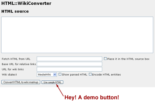
I found the html2wiki page by way of Reddit. It takes HTML that you type or paste in or HTML from an URL and converts it to wikitext, which you can then copy and paste into a wiki:

Screenshot of html2Wiki, with the demo button highlighted.
Click the screenshot to go to the html2wiki page.

When I thought about giving it a try, I thought “Well, I’d better go look around for some suitable HTML to try,” when I noticed the Use Sample HTML at the bottom of the form. I clicked that and a moment later, I had sample HTML as well as its conversion to wikitext.

There’s all sorts of research as well as personal experience that suggests that web users are an impatient sort. A lot of people might have navigated away and never seen html2wiki in action had it not been for that sample button. By providing that “demo button” at the bottom of the form, the creators of the page removed a small but not insignificant barrier to taking html2wiki for a test spin and provided a moment of satisfaction that users will remember.

It’s got me thinking about the software and services that I work on — are there places where a demo button would come in handy?

Categories
Uncategorized

Google Directions Now Include a Rush Hour Estimate

Many lanes of traffic

It may be a small addition, but it’s a useful one. You know how Google Maps directions give you an estimate of how long your trip will take? They now include an additional estimate: how long your trip will take in traffic.

Categories
Uncategorized

Hey, Facebook: It’s Spelled “availAble”!

One area of user interface development that could stand some improvement is spell-checking. I’m not aware of any widely-used system for spell-checking a web application’s template or resource files, but good spelling certainly helps an app look more professional.

The latest spelling mistake in an application I’ve seen comes from the “Edit App” page for Facebook developers. One of the fields on the page lets you specify the “Canvas Page URL”, the URL within apps.facebook.com where your app can be found. It uses Ajax to give you instant feedback as to whether the URL is available or not as you type — but the word “Available” is misspelled:

Facebook Developer UI telling me that my chosen application URL is “availible”

Cross-posted to the Tucows Developer Blog