Categories
Uncategorized

Jing’s Approach to Installing on the Mac

In the most recent posting on Jeff Atwood’s excellent developer blog Coding Horror, the question is posed:

Why does the Mac require the user to jump through a bunch of manual hoops to install an application? Why not use a traditional installer (a.k.a. setup.exe) that automates this manual work for you?

Rather than get into the details of the debate in the comments to that article over the ease of installing apps on the Mac the manual way, let me instead show you Jing’s answer to the question:

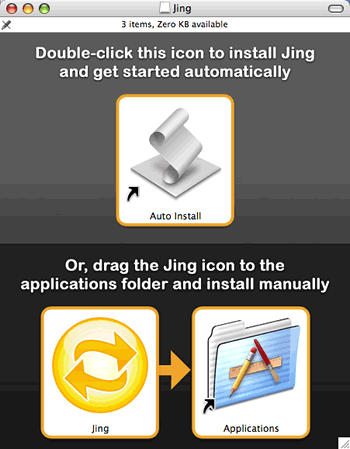
Jing’s installer options

(I wrote about Jing in the last post.)

The Jing approach is to give you two options:

  1. The incredibly easy way: Double-click the installer script and you’ll be shown this a dialog box that tells you that you’re about to initiate an action that will:
    • Copy Jing to the Applications folder
    • Eject the disk image
    • Start Jing
  2. The traditional manual way, in which you drag the app to the Applications folder. An alias to the Applications folder is provided, so you don’t have to open another Finder window.

No options dialog boxes, no EULAs, no extraneous messages for the purposes of marketing — just install and go.

I think it’s a good solution. What say you, Jeff?

Categories
Uncategorized

Happy 15th Birthday, Thinkpad / A Slightly Saucy ThinkPad Story

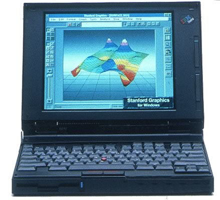
ThinkPad 700c

According to The Register, today is the 15th birthday of the Thinkpad, the laptop originally made by IBM and now Lenovo. Aside from re-establishing IBM’s reputation as a computer hardware manufacturer and becoming an icon for businessperson on the go, the ThinkPad is also notable for popularizing the TrackPoint controller.

And Now, The Saucy ThinkPad Story

IBM TrackPoint controller
Image borrowed from Coding Horror — it’s from the Touchpad vs. Trackpoint article.

My co-worker at OpenCola, Helen Waters, told me this story.

Helen was our tech person was OpenCola (this was back in the late ’90’s), making sure that people got the machines they needed, that their software got installed and so on. One day, she had presented a woman at the office with her new company-assigned ThinkPad whose pointing device, naturally enough, was a TrackPoint.

The woman, who’d used only mice and touchpads before, had no idea how to mouse around with the TrackPoint and began tapping on it as if it were a button — first a couple of tentative taps, and then taps in rapid succession — with predictable results.

Helen stepped in and quickly demonstrated the TrackPoint principle. She reached in and with her finger, pointed the TrackPad the way it was meant to be used — like a tiny joystick.

“It figures,” said the woman, “It was obviously designed by a man.”

Categories
Uncategorized

XBox 360’s New Controllers

XBox 360

It Just Feels Right

I’ve had my XBox 360 for nearly a year now (having won one in a trivia game at last October’s Ajax Experience conference), and it’s been the best experience I’ve ever had with any Microsoft product…because it doesn’t feel like a Microsoft product. Where most Microsoft “consumer” products make you feel as if they were designed by the “B-team” — the ones who didn’t make the cut for the stuff aimed at corporate customers — the XBox 360 feels right. I don’t, as Danny O’Brien puts it, “feel like I’m eating out of the trash bins outside a cubicle farm”.

(According to Scoble, one of the reasons the XBox is a good gaming console is that their headquarters were purposely located miles away from the Microsoft campus.)

The XBox 360 now occupies a nice middle ground between the inexpensive casual/party-game oriented Wii and the overly expensive grind-away-for-hours PlayStation 3, and the two new controllers suggest that the XBox folks know this and are pressing this advantage.

For the Hardcore: The Chatpad

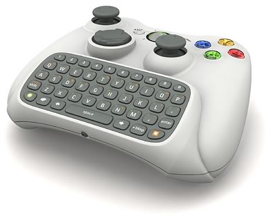
“Chatpad” controller for the XBox 360

The Chatpad marries the standard XBox 360 controller to a QWERTY thumb keyboard, which I assume will be used for in-game communications and IMing among the more hardcore XBox Live set. They’ve been talking about this for some time, and there’s been demand for this sort of thing, so this isn’t a surprise.

What I find more interesting is the other controller…

The “Big Button” Controller

“Big Button” controller for the XBox 360

The upcoming Scene It? game will be bundled with four of these controllers, which have the standard A/B/X/Y buttons and a different-coloured giant button for each one so you can tell them apart. Unlike the standard or Chatpad XBox controllers, whose design seems to be for the more serious gamer playing alone or as a twosome, these controllers’ design suggest that they’re for ther casual gamer in a more social setting. It’s apparent that the XBox team is learning lessons from the Wii.

When I first saw these controllers, I thought of two things:

  • First, I thought that this would be a perfect opportunity to resurrect the game You Don’t Know Jack, one of the most fun computer games I’ve ever played. The game is simple enough for them to turn it into something you could download from XBox Live, and I think it would be a hit. I’m not the only one; check out the comments to this Engadget story on the Big Button controller.
  • I was also reminded of Microsoft’s trackball for kids, the Easyball:

    Microsoft Easyball

Categories
Uncategorized

Jakob Nielsen Doesn’t Drink at “Coyote Ugly”

Jakob Nielsen as a bartop dancer in the Coyote Ugly Saloon
An unsuspecting customer drinking Jakob Nielsen’s kool-aid.

After reading Jakob Nielsen’s rather self-satisfied and smug Write Articles, Not Blog Postings and Robert Scoble’s counterpoint, I have these three things to say:

  1. While Nielsen has a number of good ideas on making things usable, when it comes to communicating and reaching out to people, Scoble is the guy to emulate. As with some other UI guys I know, I suspect that Nielsen’s perspective on human factors come from his perspective as an interested outsider.
  2. Reading Nielsen’s post, I was reminded of a description of user interface specialists that George once wrote: “little dictators — SimCity-sized tyrants — intent on foisting their New Orthodoxy on everyone.”
  3. Finally, I leave you with the best version of an observation that Joel Spolsky has written a couple of times:

    Usability is not everything. If usability engineers designed a nightclub, it would be clean, quiet, brightly lit, with lots of places to sit down, plenty of bartenders, menus written in 18-point sans-serif, and easy-to-find bathrooms. But nobody would be there. They would all be down the street at Coyote Ugly pouring beer on each other.

Categories
Uncategorized

That “Lightswitch” Entry Reminds Me of an Old Story…

The complex lightswitch from the earlier entry

The article The Lightswitch That Might Explain a Lot About Java (which has received way more comments and stimulated more debate that I would’ve ever predicted) reminded me of a story that used to get forwarded back and forth among techie types. I thought I’d post it here…

The Engineer, the Computer Scientist and the Toaster

Toaster

Once upon a time, in a kingdom not far from here, a king summoned two of his advisors for a test. He showed them both a shiny metal box with two slots in the top, a control knob, and a lever. “What do you think this is?”

Scotty from “Star Trek”

One advisor, an engineer, answered first. “It is a toaster,” he said.

The king asked, “How would you design an embedded computer for it?”

The engineer replied, “Using a four-bit microcontroller, I would write a simple program that reads the darkness knob and quantizes its position to one of 16 shades of darkness, from snow white to coal black. The program would use that darkness level as the index to a 16-element table of initial timer values. Then it would turn on the heating elements and start the timer with the initial value selected from the table. At the end of the time delay, it would turn off the heat and pop up the toast. Come back next week, and I’ll show you a working prototype.”

Nerd at an old-school IBM PC and dot matrix printer

The second advisor, a computer scientist, immediately recognized the danger of such short-sighted thinking. He said, “Toasters don’t just turn bread into toast, they are also used to warm frozen waffles. What you see before you is really a breakfast food cooker. As the subjects of your kingdom become more sophisticated, they will demand more capabilities. They will need a breakfast food cooker that can also cook sausage, fry bacon, and make scrambled eggs. A toaster that only makes toast will soon be obsolete. If we don’t look to the future, we will have to completely redesign the toaster in just a few years.”
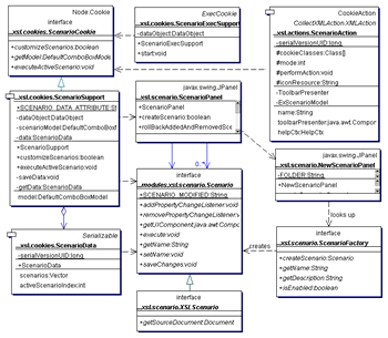
UML diagram

“With this in mind, we can formulate a more intelligent solution to the problem. First, create a class of breakfast foods. Specialize this class into subclasses: grains, pork, and poultry. The specialization process should be repeated with grains divided into toast, muffins, pancakes, and waffles; pork divided into sausage, links, and bacon; and poultry divided into scrambled eggs, hard- boiled eggs, poached eggs, fried eggs, and various omelet classes.”

Country ham and eggs

“The ham and cheese omelet class is worth special attention because it must inherit characteristics from the pork, dairy, and poultry classes. Thus, we see that the problem cannot be properly solved without multiple inheritance. At run time, the program must create the proper object and send a message to the object that says, ‘Cook yourself.’ The semantics of this message depend, of course, on the kind of object, so they have a different meaning to a piece of toast than to scrambled eggs.”

C++ and Erlang

“Reviewing the process so far, we see that the analysis phase has revealed that the primary requirement is to cook any kind of breakfast food. In the design phase, we have discovered some derived requirements. Specifically, we need an object-oriented language with multiple inheritance. Of course, users don’t want the eggs to get cold while the bacon is frying, so concurrent processing is required, too.”

GUI

“We must not forget the user interface. The lever that lowers the food lacks versatility, and the darkness knob is confusing. Users won’t buy the product unless it has a user-friendly, graphical interface. When the breakfast cooker is plugged in, users should see a cowboy boot on the screen. Users click on it, and the message ‘Booting UNIX v.8.3’ appears on the screen. (UNIX 8.3 should be out by the time the product gets to the market.) Users can pull down a menu and click on the foods they want to cook.”
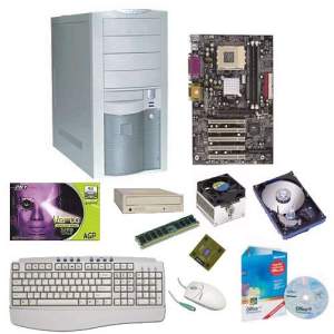
Parts of a Wintel desktop computer

“Having made the wise decision of specifying the software first in the design phase, all that remains is to pick an adequate hardware platform for the implementation phase. An Intel 80386 with 8MB of memory, a 30MB hard disk, and a VGA monitor should be sufficient. If you select a multitasking, object oriented language that supports multiple inheritance and has a built-in GUI, writing the program will be a snap. (Imagine the difficulty we would have had if we had foolishly allowed a hardware-first design strategy to lock us into a four-bit microcontroller!).”

Crowd gathering around a guillotine execution

The king wisely had the computer scientist beheaded, and they all lived happily ever after.
Categories
Uncategorized

The Lightswitch That Might Explain a Lot About Java

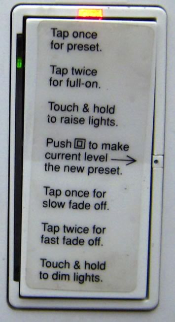
John Maeda at The Laws of Simplicity has an interesting photo of a lightswitch at Sun Labs:

Lightswitch at Sun with a lot of confusing features and instructions.
Click the photo to see the original.

He writes:

I gave a talk at Sun Labs where I encountered a special light switch in one of their conference rooms. At first I thought it was some kind of silly “engineer” joke. But the light switch functions as stated for real. Does it win the award for the most confusing light switch? I bet there are other ones out there that are equally complex to use.

The lightswitch design philosophy at Sun is quite clearly reflected in Java.

Categories
Uncategorized

The World Needs More Dialog Boxes Like This

Here’s a dialog box from Aegisub, an application for subtitling video:

Dialog box from Aegisub warning of the dangers of using “Comic Sans”
Screen capture courtesy of Miss Fipi Lele.

For the benefit of RSS readers and search engines, here’s the text of the dialog box:

You have chosen to use the “Comic Sans” font. As a programmer and a typesetter, I must urge you to reconsider. Comic Sans is the most abused font in the history of computing, so please avoid using it unless it’s REALLY suitable. Thanks.

I’m really glad that such a dialog box exists!

If you’d like to join the cause to rid the world of that horrible font, I suggest that you visit the Ban Comic Sans site.