Categories
Uncategorized

Upwardly Mobile, Part 3: Exploring Windows Mobile 6’s Built-In UI Controls

 Mad Mobile: More Windows Mobile 6 example code from the guy who blogs at Global Nerdy

In my previous article in Upwardly Mobile, the ongoing article series in which I look as various aspects of Windows Mobile 6 development, I showed you a simple application that made use of a couple of user interface controls. In this article, we’ll take a closer look at some of the user interface controls by way of the steak-and-cocktails lifestyle of the characters on the TV series Mad Men.

(In case you’re not familiar with Mad Men, it’s a dramatic TV series set in the early 1960s whos emain characters are advertising executives working at an agency in New York. It was the age of three-martini steak lunches, which serves as the inspiration for the example application in this article.)

Introducing Beef ‘N’ Booze

The application that we’ll build is called Beef ‘N’ Booze. It has no real function other than to demonstrate the use of some of the controls that come with Windows Mobile 6, and do so in a more entertaining way that you’d normally find in a book.

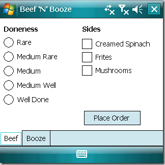
Here’s what the app will look like on startup:
beef_screen_1

The app has a single form and that form is filled completely with a tab control with two tab pages: Beef and Booze. The Beef page lets you choose the “doneness” of your steak as well as a selection of side dishes. Once you’ve made your choices, you click the Place Order button to see a message box containing a summary of your order:
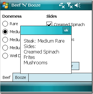
beef_screen_2

Clicking on the Booze tab takes you to the Booze page, where you can place an order from a selection of cocoktails. You can also specify the number of cocktails you want to order and how strong you want the bartender to make them:
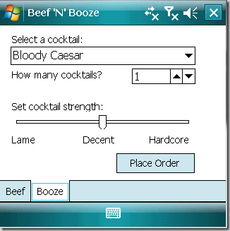
booze_screen_1

When you’ve made your drink choices, you click on the Place Order button to see a message box summarizing your drink order:
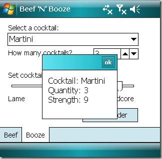
booze_screen_2

That’s the app in a nutshell. Remember that the idea behind Beef ‘N’ Booze isn’t to make something useful; it’s to demonstrate Windows Mobile’s built-in user controls and give you a chance to explore them. With that knowledge and a little practice, you can eventually build apps that actually do something.

TabControl and TabPages

One of the tricks to compensate for the limited screen “real estate” on a mobile device is to break up an application into pages. The simplest “out of the box” way to do this with Windows Mobile is to use a TabControl, which is a container that holds one or more TabPage controls. Each TabPage is itself a container that can hold other controls.

In Beef ‘N’ Booze, I created a TabControl named tabMain, which holds two TabPages:

  • tpgBeef, whose Text property is set to Beef. It will contain the controls for placing and order for a steak and side dishes.
  • tpgBooze, whose Text property is set to Booze. It will contain the controls for ordering cocktails.
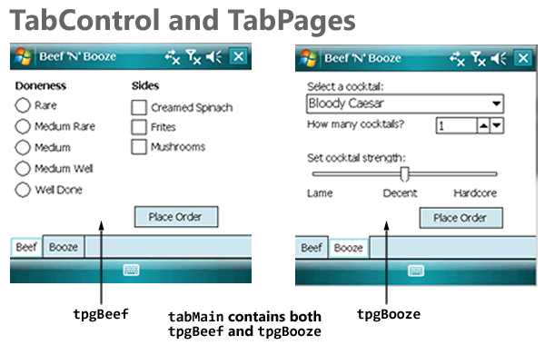
tabcontrol_tabpages

One convenient thing about using TabControls is that the tabbed pages work inside Visual Studio’s form editor. To view and edit a given TabPage, you click on its tab; it becomes the topmost page and you can add, move and remove controls from it.

Buttons

The Beef page has a single button, btnBeef, that when clicked, causes a message box to display the user’s order for steak and side dishes. The Booze page has a similar button, btnBooze, except that it causes a message box to display the user’s cocktail order.
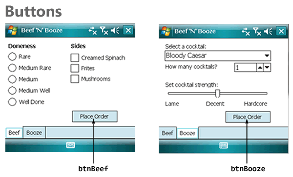
buttons

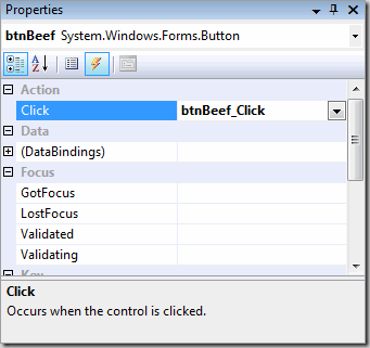
We’ll draw btnBeef on the tpgBeef page and btnBooze on the tpgBooze page. The next step is to create event handlers for both buttons. The easiest way to do this is to select each button and then use the Events view in the Properties window, and double-clicking on the Click event for each button. Here’s a screenshot of me doing that for btnBeef – Visual Studio responds by auto-magically creating a handler named btnBeef_Click:

btnBeef

Creating event handlers for btnBeef and btnBooze creates these empty methods in the code for the form:

private void btnBeef_Click(object sender, EventArgs e)
{
}

private void btnBooze_Click(object sender, EventArgs e)
{
}

While I do like the “magic” provided by Visual Studio, I also feel that you should know what’s going on behind the scenes. How are the btnBeef_Click() and btnBoozeClick() methods attached to the btnBeef and btnBooze controls? It’s taken care of in the Designer code for the form, in which the layout and events for controls on the form is defined. Here’s the chunk of code that concerns with btnBeef’s properties and events:

this.btnBeef.Font = new System.Drawing.Font("Tahoma", 8F, System.Drawing.FontStyle.Regular);
this.btnBeef.Location = new System.Drawing.Point(165, 181);
this.btnBeef.Name = "btnBeef";
this.btnBeef.Size = new System.Drawing.Size(111, 28);
this.btnBeef.TabIndex = 8;
this.btnBeef.Text = "Place Order";
this.btnBeef.Click += new System.EventHandler(this.btnBeef_Click);

When I added a Click event to btnBeef through the Properties window, Visual Studio generated the name btnBeef_Click for the event handler, added a blank btnBeef_Click() method to the form’s code and connected the event to the handler in the form’s Designer code with this line:

this.btnBeef.Click += new System.EventHandler(this.btnBeef_Click);

When the user clicks btnBeef, we want to call a method named OrderBeef(), which will collect the data from the controls on tpgBeef, format it into something human-readable and then display the results in a message box. When the user clicks btnBooze, we want to call a method name OrderBooze(), which will do something similar, but for the user’s cocktail order. Here’s what the resulting event handler code should look like:

private void btnBeef_Click(object sender, EventArgs e)
{
    OrderBeef();
}

private void btnBooze_Click(object sender, EventArgs e)
{
    OrderBooze();
}

We’ll define OrderBeef() and OrderBooze() over the next couple of sections, as we explore the controls.

Radio Buttons

Radio buttons are controls you use when:

  • You want the user to choose one (and only one) item from a selection of items
  • You want the user to be able to see the complete selection of items immediately

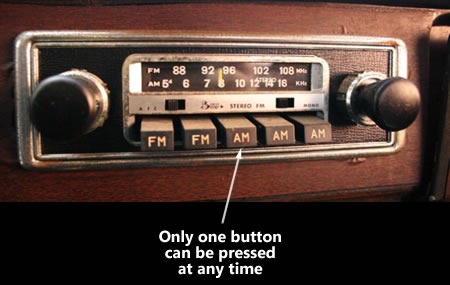
The name “radio buttons” comes from the radio buttons from older radios, such as those in older cars, which let you choose from a number of pre-set radio stations. Selecting one button would change the tuning to the corresponding radio station and de-select the currently selected button:
car_radio_buttons

Radio buttons are grouped together by putting them inside the same container control, such as a panel, or in the case of this particular application, a TabPage. Selecting a radio button de-selects all the other radio buttons occupying the same container control.

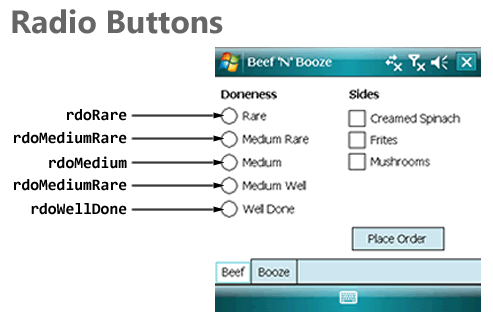
The diagram below shows the radio buttons on tpgBeef and the names I assigned to them:
radio_buttons

Here’s my first iteration of OrderBeef(), which shows you how to determine which radio button is selected by checking each one’s Checked property. Once that’s done, it displays the resulting choice in a message box:

private void OrderBeef()
{
    StringBuilder order = new StringBuilder("Steak: ");

    if (rdoRare.Checked)
    {
        order.AppendLine("Rare");
    }
    else if (rdoMediumRare.Checked)
    {
        order.AppendLine("Medium Rare");
    }
    else if (rdoMedium.Checked)
    {
        order.AppendLine("Medium");
    }
    else if (rdoMediumWell.Checked)
    {
        order.AppendLine("Medium Well");
    }
    else if (rdoWellDone.Checked)
    {
        order.AppendLine("Well Done");
    }
    else
    {
        order.AppendLine("Chef's choice");
    }

    MessageBox.Show(order.ToString());
}

Checkboxes

Checkboxes are useful when:

  • You want the user to select zero, one or more items
  • You want the user to be able to see the complete selection of items immediately

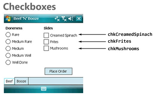
The diagram below shows the checkboxes on tpgBeef and the names I assigned to them:
checkboxes

Here’s my second iteration of OrderBeef(), which adds some code to check to see which side dishes the user ordered. As with radio buttons, we’re using the Checked properties, but for the checkboxes:

private void OrderBeef()
{
    StringBuilder order = new StringBuilder("Steak: ");
    int numSides = 0;

    if (rdoRare.Checked)
    {
        order.AppendLine("Rare");
    }
    else if (rdoMediumRare.Checked)
    {
        order.AppendLine("Medium Rare");
    }
    else if (rdoMedium.Checked)
    {
        order.AppendLine("Medium");
    }
    else if (rdoMediumWell.Checked)
    {
        order.AppendLine("Medium Well");
    }
    else if (rdoWellDone.Checked)
    {
        order.AppendLine("Well Done");
    }
    else
    {
        order.AppendLine("Chef's choice");
    }

    order.AppendLine("Sides:");

    if (chkCreamedSpinach.Checked)
    {
        order.AppendLine("Creamed Spinach");
        ++numSides;
    }

    if (chkFrites.Checked)
    {
        order.AppendLine("Frites");
        ++numSides;
    }

    if (chkMushrooms.Checked)
    {
        order.AppendLine("Mushrooms");
        ++numSides;
    }

    if (numSides == 0)
    {
        order.AppendLine("None");
    }

    MessageBox.Show(order.ToString());
}

Comboboxes
comboboxes

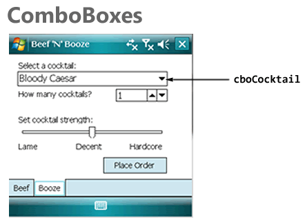
For the Booze page, I thought I’d use a different way to let the user select one item from a selection of many: a Combobox with its DropDownStyle property set to DropDownList and containing a number of cocktail names. The method below does the following:

  • Sets the Combobox’s DropDownStyle property to DropDownList, which means that the user cannot just type in any value into the list’s text portion, but can only select from items in the list.
  • Adds a number of cocktail names to the list.
  • Sets the list so that the first item is selected.

public void InitializeCocktailControls()
{
    cboCocktail.DropDownStyle = ComboBoxStyle.DropDownList;
    cboCocktail.Items.Add("Bloody Caesar");
    cboCocktail.Items.Add("Bloody Mary");
    cboCocktail.Items.Add("Martini");
    cboCocktail.Items.Add("Rye and Ginger");
    cboCocktail.Items.Add("Vodka Tonic");
    cboCocktail.SelectedIndex = 0;
}

If I wanted to, I could’ve set the DropDownStyle and the collection of items in the ComboBox in the Properties window.

I placed a call to InitializeCocktailControls() inside the form’s constructor:

public frmMain()
{
    InitializeComponent();
    InitializeCocktailControls();
}

And here’s my first iteration of OrderBooze(), which displays a message box showing which cocktail the user ordered. It makes use of the ComboBox’s SelectedItem property:

private void OrderBooze()
{
    StringBuilder order = new StringBuilder("Cocktail: " +
                            cboCocktail.SelectedItem.ToString() + 
                            "\n");

    MessageBox.Show(order.ToString());
}

Numeric Up/Downs

Numeric Up/Downs are useful when:

  • You want to restrict user input to numeric values only
  • You want to restrict those numeric values to a specific range
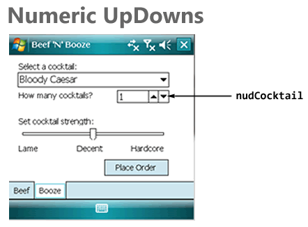
numeric_updowns

Here’s the second iteration of InitializeCocktailControls(), which adds code to initialize the numeric up/down nudCocktail in the following ways:

  • Restricting the possible values to the range of 1 through 10
  • Setting the up/down increment to 1 – if the user clicks the “up” button, the value contained within goes up by 1, if the user clicks the “down” button, the value contained within goes down by 1.
  • Setting the initial value to 1

public void InitializeCocktailControls()
{
    cboCocktail.DropDownStyle = ComboBoxStyle.DropDownList;
    cboCocktail.Items.Add("Bloody Caesar");
    cboCocktail.Items.Add("Bloody Mary");
    cboCocktail.Items.Add("Martini");
    cboCocktail.Items.Add("Rye and Ginger");
    cboCocktail.Items.Add("Vodka Tonic");
    cboCocktail.SelectedIndex = 0;

    nudCocktail.Minimum = 1;
    nudCocktail.Maximum = 10;
    nudCocktail.Increment = 1;
    nudCocktail.Value = 1;
}

Here’s the OrderBooze() method, featuring an additional line of code to display the number of drinks the user ordered. The value contained within nudCocktail is taken from its Value property:

private void OrderBooze()
{
    StringBuilder order = new StringBuilder("Cocktail: " +
                            cboCocktail.SelectedItem.ToString() + 
                            "\n");
    order.AppendLine("Quantity: " + nudCocktail.Value.ToString());

    MessageBox.Show(order.ToString());
}

Trackbars

Another way to get numeric value input from the user is to use a Trackbar control. While Trackbars don’t display their corresponding numeric values like Numeric Up/Downs, they have a couple of advantages:

  • They’re larger and more “finger-friendly” than Numeric Up/Downs
  • They give the user a visual cue of where the current value is in relation to the minimum and maximum values
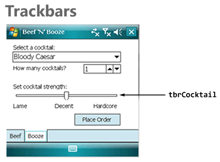
trackbars

In the screenshot above, you can see that I’ve augmented the Trackbar with by putting a couple of label controls just below it: Lame, Decent, and Hardcore.

Here’s another iteration of InitializeCocktailControls(), with code to initialize the Trackbar with the following properties:

  • The leftmost position on the Trackbar corresponds to the value 0
  • The rightmost position on the Trackbar corresponds to the value 10
  • The smallest step you can make in either direction, up or down, is 1
  • Large steps, which you get by clicking to the right or left of the current slider position, change the value in steps of 5
  • The initial value of the Trackbar is 5

public void InitializeCocktailControls()
{
    cboCocktail.DropDownStyle = ComboBoxStyle.d;
    cboCocktail.Items.Add("Bloody Caesar");
    cboCocktail.Items.Add("Bloody Mary");
    cboCocktail.Items.Add("Martini");
    cboCocktail.Items.Add("Rye and Ginger");
    cboCocktail.Items.Add("Vodka Tonic");
    cboCocktail.SelectedIndex = 0;

    nudCocktail.Minimum = 1;
    nudCocktail.Maximum = 10;
    nudCocktail.Increment = 1;
    nudCocktail.Value = 1;

    tbrCocktail.Minimum = 0;
    tbrCocktail.Maximum = 10;
    tbrCocktail.SmallChange = 1;
    tbrCocktail.LargeChange = 5;
    tbrCocktail.Value = 5;
}

Here’s OrderBooze(), with an additional line to display the user’s preferred drink strength, which is derived from the Trackbar’s Value property:

private void OrderBooze()
{
    StringBuilder order = new StringBuilder("Cocktail: " +
                            cboCocktail.SelectedItem.ToString() + 
                            "\n");
    order.AppendLine("Quantity: " + nudCocktail.Value.ToString());
    order.AppendLine("Strength: " + tbrCocktail.Value.ToString());

    MessageBox.Show(order.ToString());
}

Putting It All Together

Here’s the complete code behind the single form in Beef ‘N’ Booze:

using System;
using System.ComponentModel;
using System.Text;
using System.Windows.Forms;

namespace BeefNBooze
{
    public partial class frmMain : Form
    {
        public frmMain()
        {
            InitializeComponent();
            InitializeCocktailControls();
        }

        public void InitializeCocktailControls()
        {
            cboCocktail.DropDownStyle = ComboBoxStyle.DropDownList;
            cboCocktail.Items.Add("Bloody Caesar");
            cboCocktail.Items.Add("Bloody Mary");
            cboCocktail.Items.Add("Martini");
            cboCocktail.Items.Add("Rye and Ginger");
            cboCocktail.Items.Add("Vodka Tonic");
            cboCocktail.SelectedIndex = 0;

            nudCocktail.Minimum = 1;
            nudCocktail.Maximum = 10;
            nudCocktail.Increment = 1;
            nudCocktail.Value = 1;

            tbrCocktail.Minimum = 0;
            tbrCocktail.Maximum = 10;
            tbrCocktail.SmallChange = 1;
            tbrCocktail.LargeChange = 5;
            tbrCocktail.Value = 5;
        }

        private void btnBeef_Click(object sender, EventArgs e)
        {
            OrderBeef();
        }

        private void btnBooze_Click(object sender, EventArgs e)
        {
            OrderBooze();
        }

        private void OrderBeef()
        {
            StringBuilder order = new StringBuilder("Steak: ");
            int numSides = 0;

            if (rdoRare.Checked)
            {
                order.AppendLine("Rare");
            }
            else if (rdoMediumRare.Checked)
            {
                order.AppendLine("Medium Rare");
            }
            else if (rdoMedium.Checked)
            {
                order.AppendLine("Medium");
            }
            else if (rdoMediumWell.Checked)
            {
                order.AppendLine("Medium Well");
            }
            else if (rdoWellDone.Checked)
            {
                order.AppendLine("Well Done");
            }
            else
            {
                order.AppendLine("Chef's choice");
            }

            order.AppendLine("Sides:");

            if (chkCreamedSpinach.Checked)
            {
                order.AppendLine("Creamed Spinach");
                ++numSides;
            }

            if (chkFrites.Checked)
            {
                order.AppendLine("Frites");
                ++numSides;
            }

            if (chkMushrooms.Checked)
            {
                order.AppendLine("Mushrooms");
                ++numSides;
            }

            if (numSides == 0)
            {
                order.AppendLine("None");
            }

            MessageBox.Show(order.ToString());
        }

        private void OrderBooze()
        {
            StringBuilder order = new StringBuilder("Cocktail: " +
                                    cboCocktail.SelectedItem.ToString() + 
                                    "\n");
            order.AppendLine("Quantity: " + nudCocktail.Value.ToString());
            order.AppendLine("Strength: " + tbrCocktail.Value.ToString());

            MessageBox.Show(order.ToString());
        }

    }
}

Download, Go Forth and Noodle!

It’s one thing to read about Windows Mobile 6’s built-in user interface controls, but something else entirely to make use of them. If you’re feeling ambitious, start a new project and rebuild Beef ‘N’ Booze (or a similar app that lets you explore the controls) yourself. Or, if you’d like, download my project files by clicking the link below, play with the app, make changes and learn. No matter which route you take, the best way to learn to is fire up Visual Studio and get coding!

Download icon Download the Beef ‘N’ Booze project (Visual Studio 2008 SP1, 15K .zip file)
Categories
Uncategorized

Microsoft Canada and OCAD Announce a Surface Team-Up (or: OCAD Gets a Big-Ass Table)

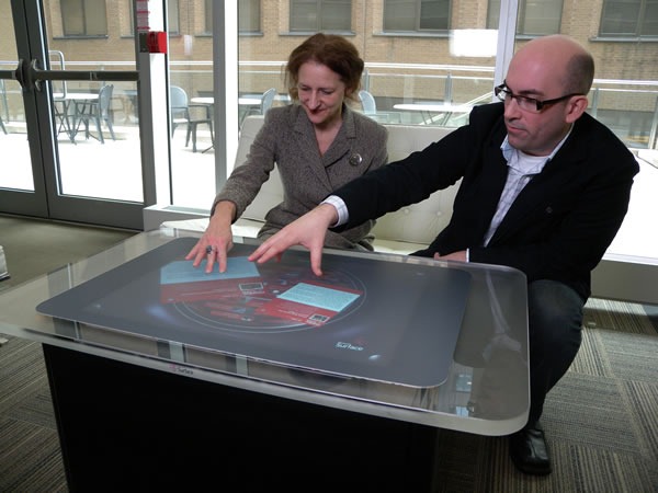
Sara Diamond and Mark Relph onstage at the Mesh Conference 2009

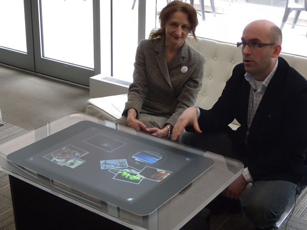
This morning at the Mesh 2009 Conference, Microsoft’s Mark Relph (my boss’ boss) and OCAD President Sara Diamond announced a Microsoft/OCAD partnership. Microsoft will provide OCAD with a Surface tabletop computer along with software and support (which includes training and courses by Infusion Development, who know a lot about developing software for the Surface).

sara_mark_surface_02

We’re providing OCAD with a Surface development unit along with Visual Studio and other developer tools related to building software for it. The Surface will be put in OCAD’s Digital Media Research + Innovation Institute, whose first phase is currently under construction. It’ll be used as a tool within the school’s -disciplinary Digital Futures Initiative (DFI) program, whose goals include establishing a research and innovation laboratory for interactive design, art and digital media.

Sara Diamond, Mark Relph and the Mesh 2009 audience

Mark Relph writes:

Microsoft Surface will help OCAD students, faculty and researchers to apply interactive technology to their work in digital media, art and design.  In conjunction with our partner Infusion Development, we will be directly engaged with teaching students how to harness the power of these new technologies.  This is only the start – in the years ahead we’ll be bringing in our technology and design experts to OCAD to help further strengthen this relationship. Our focus will not just be on the Surface technologies – as we move into a world where the interaction with software will depend on new user experiences like touch, speech and other capabilities it is critical that we prepare the next generation of software designers and experience experts.

sara_mark_surface_01

As programmers, engineers and techies, we at Microsoft can come up with all sorts of interesting uses and applications for Surface, but we can’t come up with all of them. We feel that the students at OCAD, who have a strong bent towards design, will come up with some interesting ideas and applications that would never occur to us whose bent is towards geekery. Having worked at a job where OCAD graduates were the majority, I can say from experience that there’s a certain “something” that you get from design-oriented minds that you don’t get from engineering-oriented minds. You can see that “something” in Apple’s products, and it’s something I’d like to see more of from The Empire.

Categories
Uncategorized

Some Thoughts on Interface Design

This article was originally published in Canadian Developer Connection.

Comments on “The Device/Desktop” Opportunity

The Device/Desktop Opportunity got a number of comments, both in the “Comments” section and sent directly to me via email. First, I’d like to say “please keep those comments coming!” One of my intentions was to start some discussion.

I got a number of comments whose essence was “Why don’t the users simply use a photo editing tool and bring their photos down to the right size and DPI themselves, then copy them to the device?” To a geek, this suggestion sounds very sensible; in fact, I did just that to confirm what I thought the application that came with the device did.

The problem is that most users don’t see it that way. A commenter named Joshua summed it up nicely when he wrote:

I think we geeks, being somewhat more familiar with the tools than the problems, find it relatively easy to tweak an existing tool to do the job, than to “suffer” with Yet Another Not-Quite-Adequate Problem-X-Solving Tool.

Conversely, non-geek users don’t want to have to be bothered with all that hoo-hah. They see the task as moving the pictures from their camera or computer to the device. Do they really have to learn about some other program and fiddle with their photos to do just that? Weren’t computers supposed to make their lives easier?

This isn’t laziness or pride in ignorance on the part of non-geeks. It’s just that they have different interests and priorities than we developers do. To put yourself in their shoes, think of how most of us would make spaghetti: probably with store-bought dried pasta, canned sauce and pre-grated cheese. Now imaging how chef Gordon Ramsay would scream at you in a stream of put-downs and curse words for doing so. In his mind, he’s justified; in your mind, he’s being an elitist jerk who just doesn’t get the fact that you just want some spaghetti.

In the same comment, Joshua also talked about an interesting idea: putting the necessary desktop/device interface software right on the device. He wrote that the Flip Mino camcorder (which looks like a pretty fun device; Toronto-based photoblogger Rannie “Photojunkie” Turingan seems to be getting a lot of mileage out of it) comes with the necessary software for Windows and Mac stored within it.

Should “Cheap” Sites Look Cheap?

Last week, while having a late-night post-party snack with a couple of Toronto-based tech entrepreneurs — Facebook Cookbook author Jay Goldman and CommandN co-host Will Patewe got to talking about sites that were successful in spite of their “pretty crappy” visual design. The site that got the discussion rolling was the dating site and Canadian ASP.NET success story Plenty of Fish (for a good general intro, see this New York Times article). From there, a number of examples came up, including Craigslist and a popular IIS-based site that lets you search for and book cheap airfare and travel packages. These sites all do their jobs quite well, but if you showed them to a web designer, you’d see a conniption fit within seconds.

“Travel sites all search the same data,” said Jay, “and many of them are running on the same back-end. They just use different design templates. Maybe people think that [the cheap-looking but successful travel site] gives you cheaper deals because they look cheap.”

He may have a point. Part of Craiglist’s charm is its stripped-down, not-even-trying-to-look-good design. Does that design send users the same subtle message in the same way that the no-frills “anti-design” of “big box” discount stores sends to their customers? It may be something to think about if you’re building a customer-facing site for a business whose main selling point is low prices or saving its customers money.

The New Look for Calculator in Windows 7

In the Coding Horror article If You Don’t Change the UI, Nobody Notices, Jeff Atwood makes an interesting point: if you want users to notice changes you’ve made to the functionality or back end of an application, they should be mirrored by appropriate corresponding changes to the front end or user interface. Along the way, he points to a Raymond Chen article I’d never seen before. As much as I view Raymond with the highest esteem – he’s probably forgotten more about coding that I’ll ever learn — at a certain point in his article, I did a facepalm. Can you guess when that point was?

Categories
Uncategorized

The Device/Desktop Opportunity

This article originally appeared in Canadian Developer Connection.

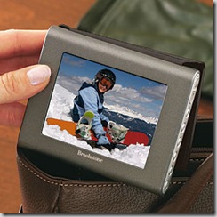
brookstone_my_life_photo_album

Why isn’t Brookstone in Canada yet?

For those of you who aren’t familiar with Brookstone, a good way to describe it is “lifestyle gadget store”. A good portion of their catalog is devoted to “lifestyle electronics”: things like

and an assortment of digital photo albums like the “My Life” digital photo album pictured here. It holds up to 4000 photos and sports a 3.5 inch screen with 320 by 240 pixel resolution and will fit into a purse or jacket pocket. Sure, you can show off photos using your mobile phone, PDA, netbook or laptop, but there’s a considerable market for simple, single-use devices like this.

Brookstone is a great store, and whenever I’m in the U.S. and in a mall or Logan Airport, I can’t resist taking a peek inside.

My mom is also a big fan of Brookstone stuff, so when I was down in the U.S. for American Thanksgiving, I made it a point to get her something from them for Christmas. She loves carrying printouts of photos of the grandkids, so I got her a “My Life” digital photo album. I figured I’d pre-load it with family photos before wrapping it up.

I told my mother-in-law about my purchase and she said “I have one of those. They’re really nice, but I can’t figure out how to use the software.”

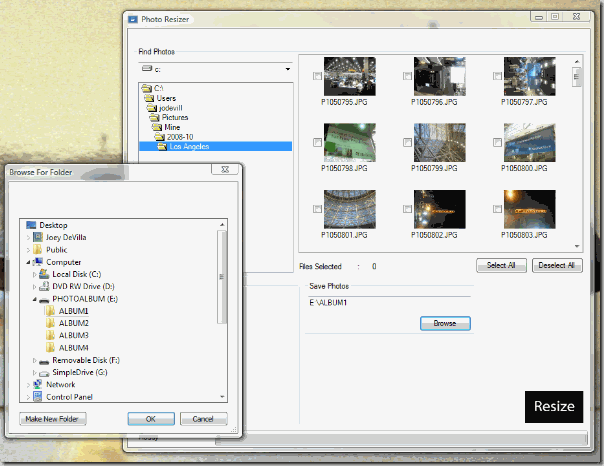
So, being the good son-in-law that I am, I decided to take a look at the software, which is called Photo Resizer. It worked just fine; the problem is that its interface could use some tweaking.

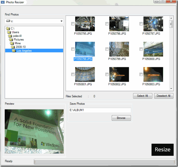
Here’s the first thing you see when you run the program:

Screenshot of Brookstone "My Life" photo frame software 

I’m no psychic, but I can say with near-100% certainty that you probably don’t store photos in your Windows/system32 directory. So I used the rather old-school directory navigator to get to my Pictures directory and then to where I’d stored my photos from PDC 2008:

Screenshot of Brookstone "My Life" photo frame software

From there, you check the boxes corresponding the photos you want to transfer.

Once you’ve done that, it’s time to select which album you want to move the photos to. The digital album contains 4 internal albums, so you can group your photos by criteria – perhaps album 1 will hold your vacation photos, album 2 will have family photos, and so on. There’s a physical button for each album, so switching between albums is pretty quick.

You select the album you want to move the photos to by clicking the Browse button (it’s in the Save Photos panel), which makes a modal directory selector window appear:

Screenshot of Brookstone "My Life" photo frame software

…at which point you’d select the directory corresponding to album you want to move your photos to. Fortunately for the user, the default directory in this directory selector is ALBUM1 in the volume named PHOTOALBUM rather than Windows/system32. I suppose if I really wanted to, I could use the app for more than just transferring photos to the album, but as a quick utility for downsizing photos to 320 by 240 and saving them in the directory of my choice.

Once that’s done, one step remains: clicking the Resize button, which is the one button in the entire interface that doesn’t look like a button.

If you’re a reader of this blog, you probably could take a look at the interface and immediately understand what the program does and know what to do to get the photos on your your drives and camera cards into your photo album. But I’m willing to bet that many people in the target market for the photo album would find Photo Resizer’s user interface confounding. My mother-in-law did, and she’s probably not the only one.

Now don’t get me wrong – I actually like the Brookstone “My Life” digital photo album. The device itself is easy to use, and I know a lot of people who’d love one of these, and I’m sure you do too. I just think that there’s an opportunity for developers of Windows desktop apps here, and probably with a lot of consumer goods that hook up to people’s PCs.

What would it take to build a user-friendlier version of Photo Resizer?

Fortunately, we’re in the USB age, which means that as far as your computer is concerned, many USB devices “look” just like hard drives. Such is the case with the “My Life” photo album, which looks like a drive with the volume name PHOTOALBUM containing four directories, ALBUM1 through ALBUM4. Reduced to its essence, Photo Resizer simply does the following:

  • It asks the user to specify a set of photos
  • For each photo in the set, it creates a version reduced to 320 by 240 pixels at 96 dpi
  • It saves each of those reduced photos in a specified directory

On one level, it’s a reasonable hobby project. User interface and user experience gurus could have a field day dreaming up a revised user interface, and developers could use this as an opportunity to try developing an app using WPF.

On another level, it’s an opportunity. How many times have you used a very nice device that came with software for your computer that seemed like an afterthought? I can think of a number of devices that I own or have owned that fall into that category. Perhaps there’s a market for improved applications with beautiful, intuitive user interfaces for devices like the “My Life” photo album. Maybe they could be sold online for some small fee – I’m think 5 or 10 dollars. It could be a nice side business for a developer; at the very least, it’s another “feather in your cap” for your resume.

I told my mother-in-law that I’d write an easier-to-use app that she could use to transfer photos to her album. While I’m at it, I’ll post some articles covering what I did and maybe solicit your input. Once it’s done, I’ll post both the app and its code online for you to peruse.

Here’s the challenge for you: can you think of any opportunities to write improved applications for devices that hook up to computers? Can you write a better app for the “My Life” digital photo frame?

Categories
Uncategorized

Enabling and Disabling the Mouse Wheel “Zoom” Feature on Map APIs

Microsoft Laser Mouse 7000 superimposed over a Live map of Toronto

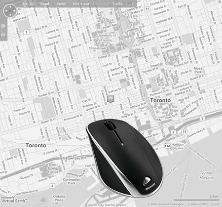
The major map APIs provide a “zoom” feature that lets you zoom the map in or out if you position the cursor over the map and use your mouse’s scroll wheel. Sometimes you want this function enabled, sometimes you don’t. David Janes, over at his Code Blog provides the JavaScript code for:

  • Enabling and disabling the mouse wheel zoom for Google Maps and Microsoft Virtual Earth
  • Disabling the mouse wheel zoom for Yahoo! Maps (it’s enabled by default, but there doesn’t seem to be a way to re-enable it once disabled.)

Links

Categories
Uncategorized

Why Don’t Browsers Have File Upload Progress Bars?

Michael Kimsal asks a very good question: Why do browsers still not have file upload progress bars?

Categories
Uncategorized

All HTML Form Control Elements Require Labels

UX Rule #1 – All HTML Form Control Elements Require Labels, and this rule is illustrated by showing the differences between Facebook’s and GMail’s login forms.