Categories
Uncategorized

Launchlist: A Checklist for Web Developers and Designers

checklist manifesto

Checklists

To put it into programmer-speak, checklists are unit tests for everyday life. Like unit tests, checklists appear to be additional make-work that take valuable time away from performing the task at hand. However, when done right, checklists save time by helping ensure you’re doing everything you need to do and can even function as a sort of specification for the task (in fact, like unit tests, checklists often end up being the “real” specification for all intents and purposes).

Checklists may seem to the be province of by-the-book, obey-all-rules-and-regulations slaves to procedure, but I think it’s one thing those Poindexters got right. I would argue that the structure and order that they provide free us to spend our energy on those less controllable, more chaotic parts of our lives, work and play. As I like to say, “preparedness enables spontaneity”.

I could go on about the power of checklists and how even a pretty random goofball such as Yours Truly has benefited from them (at least when I use them), but I’d serve you better by pointing you to Atul Gawande’s book, The Checklist Manifesto: How to Get Things Right. In it, Gawande writes about how checklists have improved the outcomes in his own surgical practice, as well as in other fields such as piloting, where bad outcomes are really bad.

Launchlist

01 launchlist logoIn spite of repeated threats from your client, the odds are that no one will get injured or die if something’s wrong with the web site or application that you’re working on. I hope that you still have enough pride in your work and your profession that you want to get things right. If you do – and I hope that’s why you’re reading this blog; you’re the sort of reader I’m going after – you’ll want to use tools like unit tests and checklists to ensure you’re getting things done properly.

One such tool is Launchlist, a simple-but-useful web application that acts as a checklist for web developers and designers. Built by Jay Hollywood (coincidentally my stage name should this computer fad blow over and I need to become an “exotic dancer” to pay the rent) and Lee Karolczak, it is:

…intended to help and encourage web designers and developers to check their work before exposing it to the world at large.

The product was born out of frustration. For too long we had been using archaic methods to conduct pre-launch testing and the web was an obvious choice to do it better.

Launchlist features a set of questions about the site you’re working on, based on Hollywood’s and Karolczak’s own experiences building sites. You should be able to answer “yes” to all of them before you unleash your site upon the world:

03 list

Launchlist could’ve been a simple site using checkboxes and bog-standard form elements, but in the age of modern web apps and increased appreciation of design that’s both functional and beautiful, I’m glad to see that they went the extra mile and worked some CSS magic. The “yes/no” toggle switches are beautiful, yet function quite well as checkboxes, and even the “Product Details” section, which would’ve functioned quite adequately as a bunch of ho-hum text fields, is pleasing to the eye:
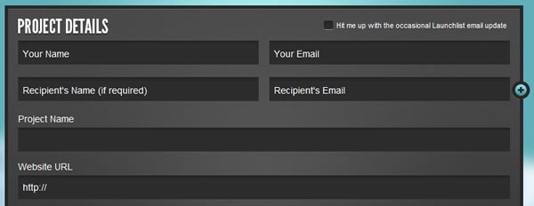
02 project details

Here’s a set of items on Launchlist’s checklist that shows what “checked” and “unchecked” items look like:

04 checked and unchecked items

Launchlist’s creators came up with a set of questions that should apply to most web sites. However, if some of them don’t apply to your site, you can simply mark them as “not applicable”:

05 not applicable

You can even add a comment to an item in Launchlists’s checklist, in case a simple “yes/no” answer isn’t sufficient:

06 comment

And knowing that you might have checklist items that are unique to your projects, they gave Launchlist the ability to house up to 10 custom ones, like the one I created, shown below:

07 custom item

The status report is at the bottom of the list, which is also where you can add your own custom items to the checklist. If any of the applicable items in the checklist remain unchecked, the status report will read “Launch not advisable” and report the number of unchecked items:

08 launch not advisable

If you checked all the applicable items in the checklist, Launchlist declares that your site is ready for launch:

09 go for launch

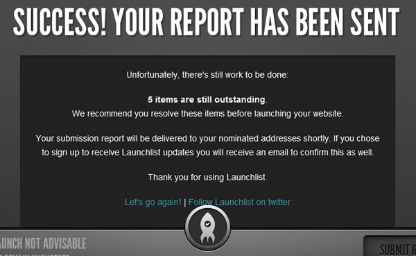
Once you’re done checking and unchecking items, you click the “Submit report” button at the bottom, after which you’ll see this:
10 report sent

…and as the text in the “Your report has been sent” message says, you and the intended recipient of the status report are emailed. Here’s the text of the report that Launchlist sent to me:

Launchlist Submission Report for Test (http://joeydevilla.com):

Status: Launch not advisable – 5 items are still outstanding.
We recommend you resolve these items before launching your website.

ITEMS OUTSTANDING (NOT CHECKED)
—————————————————————————-

– Required fields have been tested?
– Forms send to correct recipient?
– Web Statistics package installed and operational?
– 404 page exists and informative?

APPROVED ITEMS (CHECKED)
—————————————————————————-

– All text free from spelling errors?
– Page & Content formatting has been tested?
– Print stylesheet exists and tested?
– Meta data has been included and is appropriate?
– Page titles are descriptive and SEO friendly?
– Images have appropriate alt tags?
– Title tags are appropriate and SEO friendly?
– Favicon has been created and displays correctly?
– Footer includes copyright and link to site creator?
– HTML has passed validation?
– CSS has passed validation?
  Comment – Todd says he’ll have it fixed by Friday.

– There are no broken links?
– JavaScript is error free?
– Displays & functions correctly in ie7?
– Displays & functions correctly in ie8?
– Displays & functions correctly in Firefox (Mac & PC)?
– Displays & functions correctly in Chrome (Mac & PC)?
– Displays & functions correctly in Safari (Mac & PC)?
– Displays & functions correctly in Opera (Mac & PC)?
– Tested at 1024 x 768 resolution?
– Tested at larger resolutions?
– Forms have been tested and processed correctly?
– Picture of Sean Connery in "Zardoz" outfit on every page?

—————————————————————————-

This report has been crafted and delivered via Launchlist http://www.launchlist.net

Follow Launchlist on twitter – http://twitter.com/launchlistapp

Lessons from Launchlist

Here’s a quick run-down of what I think can be learned from Launchlist. I’m sure that I’ll think of more after I’ve published this article…

  • Design matters. Launchlist could’ve been built without all the stack we like to call "HTML5” (it’s really HTML5, CSS and JavaScript working together) and the gorgeous design, but without it, you wouldn’t be compelled to use it. And the design goes beyond its good looks; there’s also a great deal of usability and user experience design in Launchlist, from its clean layout to the controls that pop up only when they’re needed.
  • You can do HTML5 in Internet Explorer. Launchlist works just fine with Internet Explorer 8 (the screenshots I took for this article were taken from a Launchlist session in IE8) – a quick “View Source” reveals that they used the HTML5 Shim for IE. And of course, there’s IE9, which the Internet Explorer team is working furiously on.
  • Do one thing, and do it very, very well. I think that this is a good app philosophy, and I believe it applies doubly to those of you planning to build apps for mobile devices, whether they’re phones or tablets.
  • “Freemium” (or: Apps can be ads). Launchlist’s creators say that the version of Launchlist at Launchlist.net will always be free, but that they’re working on a paid subscription version with more features. I think this is a good approach – there’s no marketing like a “starter” version, especially when what you’re making is so nice.


This article also appears in Canadian Developer Connection.

Categories
Uncategorized

HTML5 and RIAs: Friends with Benefits!

Earlier this week, I was asked to make a short video that would be shown during a round table discussion on a hot topic: HTML5 vs. proprietary rich internet app technologies, such as Flash and Silverlight. My video was supposed to take the “RIAs complement HTML” side of the debate, while someone else would produce a video taking the “HTML5 trumps RIAs” side.

My own personal belief is that HTML5 – actually the stack of HTML5, CSS3 and Java/ECMAScript – has closed the interactivity gap between the web and desktop apps and will continue to close it. However, for the time being, there are still cases where HTML5 just can’t cut it – for various reasons, such as performance, browser compatibility or designer-friendliness – and that’s where RIAs shine. Hence I found it rather easy to put together an amusing little video titled HTML5 and RIAs: Friends with Benefits (5:47, YouTube).

I did the production work on Tuesday afternoon and evening using the following tools:

Enjoy the video!

This article also appears in Canadian Developer Connection.

Categories
Uncategorized

MIX10 Web/UX Conference: March 15 – 17 in Las Vegas

MIX10: The Next Web NowI’m going to be at Microsoft’s MIX10 conference, which takes place from Monday, March 15th through Wednesday, March 17th at the Mandalay Bay Hotel in Las Vegas, where I’ll be catching sessions and posting photos and reports. If you can spare a couple of days off work to attend Mix10, you should too – and soon, because the early bird discount is going to evaporate very soon!

What is MIX?

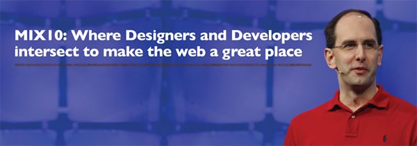
MIX10: Where designers and developers intersect to make the web a great place

The email sigs for people involved with MIX claim that it’s a “designer/developer lovefest for the web”, and I think it’s a pretty one-line summary of the event. It’s a conference for people who develop and design for the web, with particular attention paid to user interface and experience. This will be the 5th MIX conference, the first one having been held in 2006.

What Sort of Sessions Will There Be at MIX10?

The future of web design and user experience

Here’s a selection of some of the sessions and workshops at MIX10:

There are some other cool things happening at MIX10 that I can’t talk about until the conference. Be there, or if you can’t, watch this space!

You Get to Vote!

Open call for content voting is live. Vote now for your favortie session submissions.

You can help choose some of the content for MIX10! We took a number of submissions for presentations in an open call for content, and now it’s time to vote for them. You can see all the submissions here, and voting ends on Friday, January 15th.

Early-Bird Discount

Register by Jan. 15th and save: $600 on your pass and a free night at Mandalay Bay

If you register for MIX10 by January 15th, you’ll save US$600 off the admission and pay only US$795 – and you’ll also get a free night at the conference hotel, Mandalay Bay! After the 15th, the price goes up to a full US$1395, so if you want to go, register now!

This article also appears in Canadian Developer Connection.

Categories
Uncategorized

There’s Still Time to Register for “Make Web Not War”

Make Web Not War

If you’d like to know more, see yesterday’s article about Make Web Not War. If you’d like to register, visit the registration page.

Categories
Uncategorized

“Make Web Not War” in Vancouver and Toronto

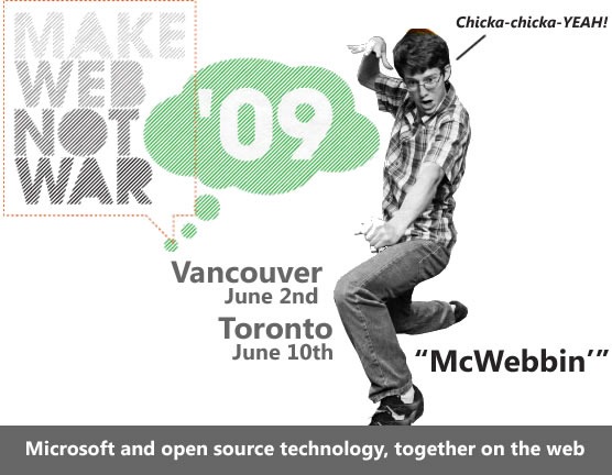
"Make Web Not War" - Vancouver, June 2nd / Toronto, June 10th - Microsoft and open source technology, together on the web

The “sea change” that’s been going on at Microsoft for the past little while is one of the things that convinced me to join the company and one of the factors in their even asking me to come in for a job interview. One of the most telling signs of this sea change is in Microsoft’s new approach to open source and web, with initiatives like the Open Source Lab, improved standards support in IE8, PHP on Windows, the Web Platform Installer and Open Source Initiative-approved MS-PL license, to name a few.

We know that the web is a big salad bar of various technologies put together by different vendors and organizations, and at long last, it seems that we’re cool with that. We’ve been reaching out to web developers of all stripes, from Microsoft “true believers” to people who don’t typically build their stuff with or on our stuff.

Make Web Not War is an event being held in Vancouver on June 2nd and Toronto on June 10th where we invite people building solutions on the web – whether you build on Microsoft tech or not – to get together and:

  • Hear from people who build on open source and Microsoft technologies
  • Network with other web developers living and working in your area
  • Learn about the latest Microsoft technologies and how they work with open source
  • Get technical training to build your web development portfolio
  • Win prizes and get your Web Warrior DVD featuring all the latest Microsoft Web Resources

The Vancouver event takes place today, June 2nd at Microsoft’s Vancouver office (1111 W. Georgia, 11th floor). It’s a half-day event featuring a presentation by Morten Rand-Hendriksen from Pink and Yellow Media as well as breakfast, a web partner community showcase and a lunch social.

The Toronto event takes place on Wednesday, June 10th at the Ted Rogers School of Management (use the entrance at 55 Dundas Street W.) and runs from 8:30 a.m. to 5:00 p.m.. It’s a full-day event with presentations by:

The Toronto event will feature breakfast, keynote, web partner community showcase, another keynote, lunch, breakout sessions, a Windows Server 2008 InstallFest, a web developer technical session and the FTW! competition final showdown. It’s be a very full day.

The registration fee for both the Vancouver and Toronto events is “donate what you want”, with a suggested donation of CAD$10. The money will go to a good cause: PREVnet.ca, the anti-bullying network.

Whether you’re a died-in-the-wool ASP.NET type, think in PHP or create new web applications by typing in rails mynewapp at the command prompt, Make Web Not War has something for you. For more details about Make Web Not War, check out the official site.

Categories
Uncategorized

Mental Models, Mantras and My Mission

Mental Models and Bill Buxton’s “Draw a Computer” Exercise

Bill Buxton

In the mid 1990s, well before he was Microsoft’s user interface guru, Bill Buxton often asked people to carry out a simple little exercise: draw a picture of a computer. Most, if not all, of the people he asked would draw something that fit the common mental model of the desktop computer of the era: cathode ray tube-type monitor, keyboard, mouse and that box housing the motherboard and drives that many people mistakenly refer to as “the CPU”.

If Buxton were to ask the question today, the drawings of computers might look like these:

Four computers from the 2000s - a laptop, a couple of all-in-one-desktops and a desktop with a "box" -- all with flat screens

If he asked the question in the mid-to-late 1980s, the drawings might’ve looked like these:

80s-era computers: Apple ][, Commodore 64, TRS-80 and IBM PC

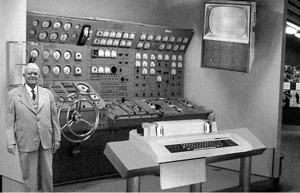
And had he asked the question in the mid-60s, the drawings might’ve looked like this:

The classic fake "home computer as envisioned by RAND" photo

Buxton likes to point out that the changes in computers from the 60s onwards are largely in the implementation technology, processing power and outward appearance. When most people draw computers, he said, they’re merely drawing their mental model, which is based on the outer packaging.

However, if you use the mental model of a technologist, computers have been essentially the same instruction/ALU/storage/input-output boxes whether they’ve occupied whole rooms or fit in your pocket. They’ve been pretty much the same at their core, in the same way that fancy tech and hybrid engine aside, there really isn’t too much that separates a present-day Toyota Prius from a Model T Ford.

If Bill Buxton could approach Microsoft Corporation as a person — and hey, that’s the way the law treats corporations, so why not? – and asked him/her to draw a computer, I suspect that s/he would draw something based on mental model of a souped-up circa 2000 computer: a desktop computer with a nice flatscreen monitor, running Windows XP and having a somewhat limited connection to the ‘net.

I think that this is a problem. I also think that the source of this problem is Microsoft’s success.

Microsoft’s Company Mantras

“A PC on every desk and in every home” was Microsoft’s longest-lived slogan and the company mantra for the first 24 years of existence. Like the best slogans, it succinctly summarized the company’s goal. The problem is that the goal has pretty much been reached. In most parts of the first world, a good chunk of the second world and even a sizeable fraction of the third world, you can easily find a desktop computer, and it’s quite likely that it’s running some sort of Microsoft software.

Since 1999, the company mantra – I really hesitate the use the phrase “vision statement” — has been a little more vague. The company’s been thrashing between them a little more frequently, as you can see in this list of mantras taken from chapter 1 of How We Test Software at Microsoft:

  • 1975 – 1999: “A PC on every desk and in every home.”
  • 1999 – 2002: “Empowering people through great software – any time, any place and on any device.”
  • 2002 – 2008: “To enable people and businesses throughout the world to realize their full potential.”
  • 2008 – present: “Create experiences that combine the magic of software with the power of internet services across the world of devices.”

The post-1999 mantra all seem a little limp in comparison to the original. Reading them, I cannot help but think of a quote attributed to web design guru Jeffrey Zeldman:

"…provide value added solutions" is not a mission. "Destroy All Monsters." That is a fucking mission statement.

Because the old mantra lasted for so long and the new mantras just don’t have the same straightforwardness and gravitas (How We test Sofware at Microsoft quotes Ballmer as saying that we may never again have a clear statement like the original to guide the company), the original remains quite firmly etched in the company culture and mindset.

I think it’s holding us back.

The Desktop as the Goose That Laid the Golden Egg

Altair 8800 computer on display at Microsoft's Building 92 gallery

The original mantra doesn’t just focus on the desktop, it actually mentions it by name. In 1975, when computers were room-filling behemoths that you could access either via batch or time-share, the concept of a desktop computer was downright radical. If you think the iPhone is impressive (and yes, it is), imagine how mind-blowing the Altair 8800, the first commercially-available desktop computer, must have been to a geek back in the Bad Old Days. It was the platform on which Microsoft’s first product – a little programming language called Altair BASIC – was launched, and it was BASIC that in turn launched the company.

In his book Outliers, Malcolm Gladwell talks about how the Altair 8800 was a golden opportunity for Bill Gates and his buddies at his fledgling company, then called “Micro-Soft”. Unlike a lot of other companies at the time, they took the desktop computer seriously. Even when IBM got into the desktop computer game in 1981, it was a product of their Entry-Level Systems division, a clear indication that they thought the PC was a machine you bought until you were ready to graduate to a real computer. I don’t think that this philosophy ended up serving them well.

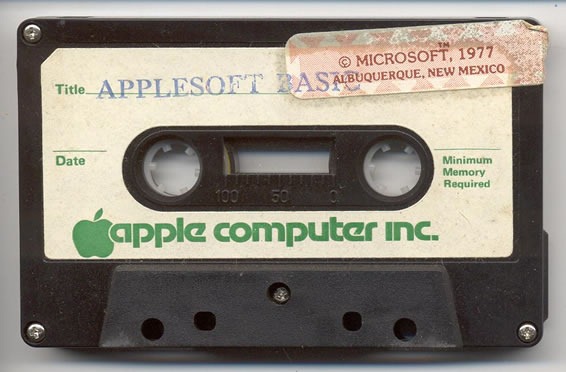
An Applesoft BASIC cassette featuring a sticker that says "Copyright Microsoft, 1977"

Since the big boys were paying no mind to the desktop computer, upstarts like Microsoft had a big empty field in which to play, and they thrived. Crack open just about any late 70s/early 80s computer that had BASIC built in – even Apple machines — and you’ll see a row of ROM chips with a Microsoft copyright notice. It was Microsoft that swooped in with PC-DOS when a deal with Digital Research for a PC version of CP/M was slow in coming (and this is despite the fact that Gates recommended that IBM go to Digital for an OS). A lot of people’s experience with desktop computers (and Microsoft revenue) is defined by circa-1995 Microsoft thanks to Windows 95 and the results of Bill Gates’ memo titled The Internet Tidal Wave, both of whose influences are still felt to this day.

Once upon a time, it used to be unusual to walk into someone’s home or office and see a computer. These days, it’s unusual to walk into someone’s home or office and not see a computer, and Microsoft’s focus on the desktop had a lot to do with that.

The Desktop as Albatross

Albatross, shot with a sucker-dart arrow, falls on the head of a Disney-esque cartoon character

When electric motors first became available, engineers envisioned factories and eventually houses being equipped with a single electric motor. They imagined that the central motor would, through a series of gears and drive belts, be connected to whatever machines in the house or factory had to be driven by it. What happened in the end is that rather than relying on some central motor, electric motors “disappeared” into the devices that used them. Here’s an exercise to try: go and count the electric motors in your house or apartment right now. The number should be a couple dozen, and if you can’t find them, this article might help.

When big, room-filling computers first became available, engineers envisioned businesses being equipped with a single computer in a manner roughly analogous to the aforementioned big central motor. We know what happened in the end – while many businesses do make use of big datacenters, a lot of the computing power got spread out into desktop computers.

I have a theory that comes in two parts:

  1. Just as electrical motors disappeared into the devices that needed their work, and just as computing power got spread out from big mainframes into desktop machines, computing power is now both disappearing and spreading out into mobile devices and the web/cloud.
  2. Microsoft, with its desktop-centric approach, at least outwardly appears to be missing out on this migration of computing power.

Most of the company’s attention, at least to an outside observer, seems to be focused on Windows 7. Yes, chances are that with computer sales being what they are, Windows 7 will probably end up on more of laptops and netbooks than desktops, but I consider those devices to simply be the desktop computer in a more portable form. It worries me that there have been more concrete announcements about Windows 7 on netbooks than upcoming versions of Windows Mobile, despite the iPhone and BlackBerry-driven evidence that the real mobile action is in smartphones.

(Tomorrow, I’ll post an article in which I argue that netbooks are a dangerous red herring pulling away our attention from devices like smartphones.)

Microsoft ASP.NET

Even when the company reaches out beyond desktop development, there’s no escaping the desktop “gravity well”. Consider ASP.NET (that is, the “traditional” ASP.NET, not the recently-released ASP.NET MVC). To my mind, as well as the minds of a lot of other web developers, it’s a web framework that tries really hard to pretend that the web doesn’t exist. It makes use of a whole lot of tomfoolery like ViewState to create a veneer of desktop app-like statefulness over the inherently stateless nature of the web and a programming model that tries to mimic the way you’d write a desktop application. It’s almost as if it were designed with the mantra “the web is like the desktop, but lamer” instead of “the web is like the desktop, but everywhere”. Although the framework works just fine and there are a number of great sites and web apps built on it, I think a lot of developers sensed this design philosophy and went elsewhere for web development.

(An aside: My old boss at OpenCola in late 2001 told me that he’d been meeting with Microsoft people and suspected that Internet Explorer 6 would be the final version of their browser. The expectation that web pages and web applications would be replaced by Windows client applications pushed over the net, a prediction similar to one made by the Java folks a few years prior.)

Windows Mobile logo

The same situation exists with Windows Mobile’s current user interface, which is basically a subset of Windows’ standard UI controls for the desktop, scaled down to fit smaller screens, and with a stylus standing in for the mouse. It’s almost as if it were designed with the mantra “mobile computing is like desktop computing, but lamer” instead of “mobile computing is like a mobile phone plus PDA and an MP3 player, but cooler.” If the ASP.NET design mantra is a whisper, the Windows Mobile mantra is a scream.

I suspect that the reason the XBox 360 didn’t fall into a similar kind of trap — “set-top boxes are like desktop computers, but lamer and only for games” – is that the XBox team is situated off the Microsoft Campus and less susceptible to the desktop influence.

My Mission

Stick figure, chained to desk, breaking the chain

At my most recent one-on-one meeting with my manager John Oxley, we talked about a need for each member of our Evangelism team to define his or her area of focus. The Microsoft platform is a vast, nerdy expanse spanning the range from embedded computing all the way to Cray supercomputers; no single person can hope to cover it all.

He already had a good idea of what I wanted to focus on, and by now, I guess you do as well. I feel that just as computing expanded beyond the big computer rooms and onto our desktops, computing is expanding beyond our desktops into all sorts of different places:

  • Invisibly, into the web and cloud in the form of web applications and services
  • Visibly, into our pockets and living rooms, and embedded into all sorts of real-world things

While I believe that Windows 7 is a necessary part of the Microsoft platform, I’m not too worried about focusing on it – there are more than enough people at the company to promote and evangelize it. I want to focus on the platforms that I feel that Microsoft hasn’t given enough love and attention: the non-desktop platforms of the web, mobile and gaming, as well where they intersect.

It’s a big area to cover, but I think Microsoft needs to be active in this area if it wants to be true to its forward-looking roots. I even have a mantra for it: “To help web, mobile and game developers using Microsoft tools go from zero to awesome in 60 minutes.” I want to give developers both that rush when getting started with a new technology as well as the sustained passion to keep working with it, in the same way that Ruby on Rails and the iPhone got developers with an initial flash of excitement and turned it into long-term passion. It’s an ambitious, audacious mission, but no more so than the one coined by a bunch of scruffy nerds in New Mexico in the the 1970s: “A PC on every desk and in every home.”

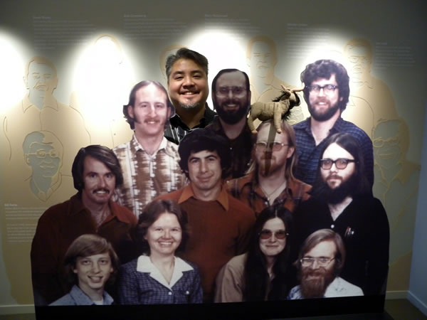
Joey deVilla with cardboard cutouts of Microsoft's 1978 team

Categories
Uncategorized

“Canada’s Next Top Model View Controller” Presentation at Metro Toronto .NET User Group Next Thursday

This article also appears in Canadian Developer Connection.

Canada's Next Top Model (moose) View (Lake Louise) Controller (beaver)

If you’re going to be in the area of downtown Toronto next Thursday, May 28th, you might want to check out my presentation, Canada’s Next Top Model View Controller at the next Metro Toronto .NET User Group meeting. I’ll be talking about the ASP.NET MVC Framework, Microsoft’s answer to MVC frameworks like Ruby on Rails, Django, CakePHP and Catalyst. As is my stock in trade with presentations, this will be informative, enlightening, entertaining and just might feature a rock and roll accordion performance.

The presentation takes place Thursday, May 28th at 6:00 p.m. at the Manulife Financial Building (200 Bloor Street East, Toronto, between Church and Jarvis – use the entrance on St. Paul Square). Admission for the presentation is free, but you have to register, and as of this writing, only 24 tickets remain.

For more details about the presentation, visit the Metro Toronto .NET user group site.