The Ads
Rather than tell you how great-looking and clever the new ads for Windows Phone 7 are, I thought I’d show them instead. Here’s the first one, which features Donovan’s song, Season of the Witch:
Here’s the other one, which asks this question: “Really?” (In case you were wondering, the tune is In the Hall of the Mountain King by Edvard Grieg.)
The Hint

The message in both these ads is pretty simple: Smartphones eat up a lot of your attention and time. Wouldn’t it be nice if there was one that didn’t do that?
There are lots of little goodies in Windows Phone 7 that address this issue. The ones I can think of off the top of my head include:
- The lock screen. You don’t have to unlock your phone just to find out what the next appointment on your calendar is. The lock screen displays it, along with the date, time and the number of voice and text messages you have.
- The Start page. The start page is where you pin your favourite and often-used items so you can access them quickly, so you don’t have to riffle through page after page of apps.
- What you can pin to the Start page. You can pin more than just apps to the Start page. Is there someone – a spouse, significant other, friend or family member – whom you phone, text, or email often? Pin that person to the Start page! Is there a website you hit many times a day? Pin it to the Start page!
- Communicating quickly with people. The People Hub on your phone makes looking up and reaching people fast and easy. Tap on a person for all the ways to reach him or her and tap on any of one of those ways to start communicating. A quick swipe shows you that person’s Facebook updates. Getting in touch and keeping up is pretty easy with this UI.
- Finding. The context-sensitive Search button is all about finding what you need, whether it’s some information on your phone, on the web or in the real world, and you get this all from a single button press.
In all these cases, it’s about getting what you need from the phone, as quickly as possible.You should ideally be able to “glance and go”: fire up your phone, get the information you need, then put it away and go do what you set out to do. The phone is supposed to augment your life; it’s not supposed to be your life.
And therein lies the hint for your app designs. If you’re designing an informational, non-game app for Windows Phone 7, take a cue from its “glance and go” philosophy and ask yourself this: What one question does my app answer for the user, and does it answer this question quickly?
Examples of questions that apps can answer include:
- Where’s the nearest Tim Hortons?
- Should I take an umbrella with me today?
- Am I getting a good deal from this store, or should I be shopping elsewhere?
- Given a choice of three different wines, which one should I buy?
- What interesting stuff is happening in this city tonight?
If you’re thinking of building a WP7 app, think of a question it can answer for the user, provide the answer and then get out of the way. Let that be your guide and you just might code up a winner.
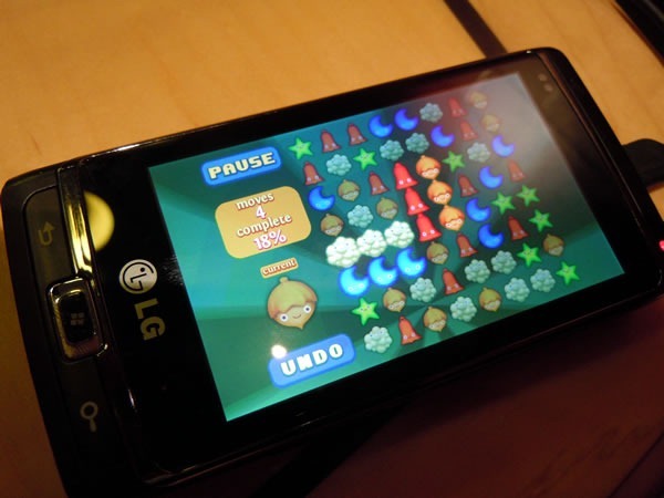 A test version of Smiles running on my WP7 device.
