Three Weeks to Go!
 We’re three weeks away from the day when a lot more about Windows Phone 7 will be revealed. On Monday, May 15th, the MIX10 conference in Las Vegas is expected to open with a bang as developers and designers will learn about “WP7’s” programming and design models as well as the opportunities that Microsoft’s reworked-from-the-ground-up mobile phone OS will provide. As part of a team of evangelists who were picked to champion WP7, I’m looking forward to getting my feet wet developing for this new platform and sharing what I learn with all of you.
As good as the early indications are – the demos are impressive, and this is likely the first time that anything made by The Empire been described as “soulful” – WP7’s introduction won’t be without some significant challenges. As far as current-generation smartphones go, WP7 is a late entry into a fiercely competitive market featuring a rival who can boast about having an impressive 100,000 applications in its store. There’s the matter of the wait; the 7 Series phones won’t hit the market until later this year, and in the meantime, the Esteemed Competition will be releasing new models. There will also be the cries of “Too little, too late,” from the people who observed Microsoft squander an early lead with smartphones (I can understand the argument for “late”, but having seen some advance inside info on what these babies can do, “little” is not a valid argument).
The Real Challenge
 I think that the biggest challenge is going to be creating a new Windows Phone culture. I believe that one of the problems with the developer culture surrounding the old Windows Mobile was that they treated the mobile phone as simply a shrunken-down version of the desktop. As I’ve written before, the desktop is what made Microsoft a successful company, but it’s also turned into an albatross that has impeded forward movement. The company built their mobile OS in a specific way with a specific design philosophy for a specific audience: “suits”. The developers took their cues from those decisions and built applications to match. The end result wasn’t pretty in any way: business-wise, functionally or aesthetically.
We – that’s both Microsoft as well as the development community that we want to gather around Windows Phone 7 — need to create a culture that “gets” the smartphone and cares about software craftsmanship, both in the underlying programming as well as in the user experience. I want to see a development culture that encourages both technical and design chops, the way that the iPhone community does, as well as that the way web app developers like 37signals do. I want Windows Phone to set the standard for mobile applications.
To that end, I decided to write this series – Counting Down to Seven – as a way to get developers to start thinking about mobile applications. I’ve been looking at applications written for the Esteemed Competition’s phones, books and articles on mobile development for other platforms and ideas from the world of user interface and user experience design as well as from science fiction (a long-standing source of ideas for neat-o devices that fit in your pocket). My hope is to convince you not just to write apps for Windows Phone 7, but also to write apps that redefine mobile computing, do interesting and useful stuff and delight our users.
Take a Walk on the Phone Side

There’s a mobile app that was designed by Lou Reed. Yes, that Lou Reed – the guitarist, vocalist and songwriter for the Velvet Underground, then Mr. Walk on the Wild Side and more recently, Mr. Laurie Anderson.
The app is called Lou Zoom, and although he didn’t implement it (that job went to Ben Syverson), he came up with the idea and co-designed it. That’s the sort of excitement that I’d like to see behind Windows Phone 7: so full of possibilities that even people who’d never think of designing applications start doing just that.
The idea behind Lou Zoom is quite simple: it’s a contact manager app, like the Contacts app that comes with the iPhone. The difference is that it has a couple of tweaks, no doubt born out of frustration with the current app. I’ve listed the tweaks below:
Tweak #1: Easy-to-Read Contact List
In the standard Contacts app, the list of contacts is shown as a standard list, with all entries the same size. In Lou Zoom, the list of contacts has variable-sized names: each name in Helvetica Neue, with the font size increased so that it is fills the width of the screen. Here’s a screen shot taken from the Lou Zoom page:
This design might make the sort of designers who prize uniformity cringe, but think about this: phones have small screens and are often used in less-than-ideal reading conditions. If you’re going to remain under 30 forever, are guaranteed to always have 20/20 vision and vow to always remain stationary and alone in a well-lit room, you don’t need this feature. For the rest of us – including me, a guy in his early forties with standard issue Asian myopia, who finds himself squinting more and more at small type, who often uses his phone from places like dimly-lit cabs going over potholes at breakneck speeds or in crowded, dimly-lit conference spaces and having had a couple of caesars – this user interface tweak is very helpful indeed.
Tweak #2: Easy-to-Read Contact Pages
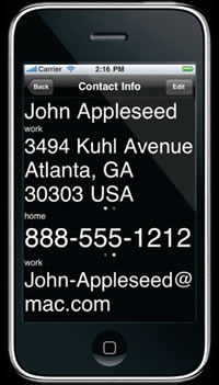
Just as the contacts are listed in nice big type, so is the info on each contact page:
As with the contact list, Lou Zoom goes for legibility and displays the information in large type. It goes one step further by displaying the text in high contrast. If the contact has multiple addresses, phone numbers or email address, a left or right swipe over the appropriate field will give you those alternates.
An Aside: Windows Phone 7’s People Profiles
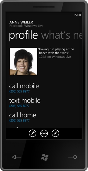
The “Profile” page in Windows Phone 7’s “People” hub takes an approach that is stylistically similar to the way Lou Zoom displays contact info:
…but it takes a markedly different approach to which items are displayed prominently. Windows Phone 7’s design is centered around what you want to do rather than with just throwing information at you. For example, the actions “call mobile”, “text mobile” and “call home” are in large type, while the person’s mobile and home numbers are in smaller text. This is a good idea — after all, what you really want to do is reach someone, not look up their phone number. The “address book” paradigm is a holdover from the days when phones weren’t smart enough to dial themselves.
Tweak #3: Search on Any Part of the Name
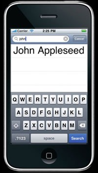
The standard Contacts app has a simple search function. Type in j and it will immediately present you with a list of all names in your contacts beginning with “j” (ignoring case, of course). If you expand that j to become john, you’ll get a list of all the names in your contacts beginning with “john”. The Contacts app will apply the search term you provide only to the leftmost end of the names in your contacts:
Lou Zoom improves on search by letting you search on any part of the name. Typing in john gives you a list of all the names in your contacts containing “john” in any part of the name, such as “John Smith”, “Alice Johnson” or “Olivia Newton-John”.
The Lou Zoom site provides its own example:
Has Kate Bell recently become Kate Appleseed-Bell? Searching for "Bell" will still bring up her name in Lou Zoom. From there, her full info is just a tap away.
It’s also great for searching for people by nickname. For instance, typing in mclovin into Lou Zoom’s search will give you the name of your buddy, who’s listed in your contacts as Christopher “McLovin’” Fogell.
What Can You Tweak?
It’s time to take a page from Lou Reed’s book and find apps that could benefit from a little tweaking. Look around at mobile apps and if you find yourself and other people saying “if only it did this”. Those are opportunities! The best applications aren’t always brand-new paradigm-shattering ideas; sometimes they’re old ones with a couple of tweaks.









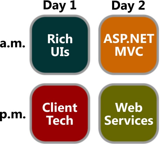
 Rich internet applications just got richer! Silverlight 3 is packed with new features and improvements that your users will notice, from pixel shaders to perspective 3D to animation enhancements to bitmap APIs to HD video. We think you’ll also be impressed by the features for developers, such as the updated style model, data binding improvements, better resource handling, and a tuned-up Web services stack. In this session, we’ll explore new features of Silverlight 3 as we build a Silverlight-based application using Expression Blend 3 and Visual Studio.
  Not a designer? Overwhelmed by Expression Blend? Not a problem! We’ll show you how to use Expression Blend to create advanced and polished user interfaces for business applications, consumer applications, multimedia projects, games or anything in between. We’ll cover features of Expression Blend from a developer’s perspective and show how it works in tandem with Visual Studio throughout the development process. You’ll learn how to create professional-looking user interfaces and visual elements – even if you don’t think of yourself as an interface designer.
 How do you build extensible and maintainable line-of-business applications in Silverlight and Windows Presentation Foundation (WPF)? How do you design and code to handle real-world complexity? Composite Application Guidance (a.k.a. "PRISM") offers guidance, libraries and examples – in small, free-standing, digestible chunks – that you can use to build applications with rich user interfaces that are also easier to maintain and extend. You’ll learn how to compose complex UIs from simpler views, integrate loosely coupled components with "EventAggregator" and "Commands", develop independent modules that can be loaded dynamically, and share code between Silverlight and WPF clients.
 This session will show you the Windows 7 APIs that will let your applications – and your users – get the full Windows 7 experience. Learn about new extensibility methods to surface your application’s key tasks. Discover how enhancements to the taskbar, Start Menu, thumbnails, desktop elements, the Scenic Ribbon, Federated Search and Internet Explorer 8 provide new ways for you to delight your users and help make them more productive. If you want to give your users the best Windows 7 experience, this session is for you!
 As a developer of .NET-based applications, you can extend your desktop software to the Windows Mobile-based platform using the tools available within Visual Studio®, the Windows Mobile SDK and the .NET Compact Framework. This session will give you an overview of how Windows Mobile lets you use your existing infrastructure, business logic, and desktop code on a mobile device to innovate and help solve business problems. We’ll show you how to use the familiar Microsoft .NET Framework and .NET-based programming languages like Visual C#® development tool. You will also learn about new features in Windows Mobile 6.5 such as the Gesture APIs and the Widget Framework and how to use them appropriately. With the launch of Windows Marketplace for Mobile upon us, this session will help you take the next step for application testing and submission.
 You’ve probably heard the buzz about Model-View-Controller (MVC) web frameworks. They’re all the rage because they combine speed, simplicity, control…and fun. ASP.NET MVC is Microsoft’s MVC web framework, and in this session, we’ll talk about the MVC pattern, explain the ideas behind ASP.NET MVC and walk through the process of building an application using this new web framework. We’ll also cover several techniques to get the most out of ASP.NET MVC and deliver web applications quickly and with style.
  Object-oriented programming makes it easier to manage complexity, but only if you do it right. The five SOLID principles of class design (one for each letter) help ensure that you’re writing applications that are flexible, comprehensible and maintainable, and we’ll explain and explore them in this session. We’ll start with a brittle ASP.NET MVC application that’s badly in need of refactoring and fix it by applying the SOLID principles. This session is a good follow-up for Introducing ASP.NET MVC, but it’s also good for developers of ASP.NET MVC looking to improve their code – or even if you’re not planning to use ASP.NET MVC. The SOLID principles apply to programming in any object-oriented language or framework.
  The world gets more service-oriented every day, and with that comes the demand to integrate all kinds of services, including those from SharePoint. This session introduces SharePoint as a developer platform and provides an overview of how you can build and deploy custom services with it. The focus will be on developing ASP.NET and Windows Communication Foundation services for SharePoint as well as building a Silverlight client to consume them.