Categories
Uncategorized

Windows Phone 7 Series: Now That’s More Like It!

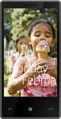
Windows Phone 7 Series generic phone

A New Windows for the Phone

Ever since joining The Empire, I’ve been saying that Windows Mobile needs to go back to the drawing board. While there was good technology lying in its innards – mobile versions of the .NET framework, SQL Server and Office – treating the mobile form factor as “the desktop, but much, much smaller”, was the wrong approach. In the meantime, the Esteemed Competition were doing the right thing: designing their phones’ OS features and interface from the ground up rather than attempting to force-fit the desktop UI into a pocket UI.

Today at Mobile World Congress in Barcelona, Microsoft previewed the latest in a series of steps forward – consider Xbox to Xbox 360, Windows Vista to Windows 7, Live Search to Bing – there’s now Windows Phone 7 Series.

(The name’s a bit long. Whoever does the naming at Microsoft corporate HQ must get paid by the syllable.)

A Quick Look at Windows Phone’s Experience

A good starting point is this video, which covers Windows Phone’s features in three minutes, thirty seconds:

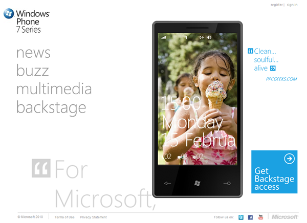
You can take an interactive tour of the UI at the Windows Phone 7 Series site:

Screenshot of the Windows Phone 7 Series site's home page

A Closer Look at the Windows Phone Experience

Over at Channel 9, Laura Foy has posted her interview with Joe Belfiore, VP Windows Phone 7 Program Management, who gave her a walkthrough of the goodies in Windows Phone (the video is 22 minutes, 18 seconds):

Get Microsoft Silverlight

Some quick notes from the video:

  • There are three mandatory hardware buttons, which are context-sensitive:
    • Back
    • Windows (the “Start” button)
    • Search
  • The screen is a capacitive touch-screen, capable of supporting multi-touch
  • The Start menu is built up of tiles: little block representing the information and features that you care most about
    • You can add your own custom tiles; Joe shows a “me” tile linked to his Facebook profile
  • A browser with:
    • Snappy performance
    • Support for multitouch actions such as pinch zoom, double-tap to zoom and finger drag
    • Very readable text, that to sub-pixel positioning in HTML
    • Phone number recognition in HTML documents; touch them to dial them
    • Street address recognition in HTML documents; touch them to get a map
    • Multiple tabs
  • The “People Hub”
    • Aggregates Exchange, Hotmail, Gmail, Yahoo! Mail and other mail contacts
    • Provides a live feed of your contacts
  • Context-sensitive search:
    • Press the “Search” button while in the People Hub, and you search your people list
    • Press the “Search” button while in the Start menu, and it runs a web search
      • Based on your query, it knows whether to give you a web search result or a local search result
      • In the demo, Joe does a search for pizza and gets a map and results for pizzerias near him, and a quick pan over to adjacent pages yield directions and reviews
      • A tap on “nearby” yield the locations of useful things like parking, ATMs and so on near the selected pizzeria
      • In another demo search, Joe does a search for “Avatar” and it returns a list of nearby theatres and times for the movie Avatar; a quick pan to an adjacent page yields the results for local business and places with “Avatar” in the name
  • Email:
    • Easy pivoting between unread, flagged and urgent emails
    • A caching system prevents you from seeing the dreaded “loading” screen
    • Press “Search” within email and you perform a search of your email messages, by subject, text and so on
  • Rotation: you can operate the phone in “portrait” or “landscape” mode
  • Calendar:
    • Support for both work and personal calendars
  • ActiveSync works in the background and keeps the phone synced with email, contacts and calendar
  • User-customizable UI colour schemes
  • The “Pictures Hub”
    • Gallery: Lets you browse all the pictures on your phone
    • Mosaic: Recent and favourite pictures
    • What’s New: New photos from your social networks
    • Camera roll: A folder for photos taken with your phone
    • Support for photo albums from Facebook and Windows Live, which you browse as if they lived right on your phone
  • Music and Video
    • History: Most recently played music and videos
    • New: New music and videos added since the last sync
    • Zune HD-style marketplace searching and support for Zune subscriptions with unlimited music plays
  • The “Me” tile
    • Lets you update your status on places like Facebook
    • Nice little typing features like auto-spelling-correction and a special soft keyboard for emoticons
  • The UI concept: Windows Phone is task-centric, not app-centric, with a hub associated with each: people, photos, media
  • There’s also a games hub, which ties into Xbox Live
  • Third-party applications and games? Wait…

Wait a Minute…What About Third-Party Apps and Games?

"MIX10: The Next Web Now" logo buttonCan you wait a month?

Here’s the deal: the announcement at Mobile World Congress was about showing what Windows Phone can do. As for what’s possible on the developer front, it’ll all be announced at the MIX10 Conference, which takes place from March 15th through 17th in Las Vegas.

There will be a dozen sessions at MIX10 for Windows Phone, and they promise to be quite interesting. I’ll be at MIX10, and will blog what I learn from these sessions when they take place.

You can save $200 off the price of MIX10 registration if you register before February 21st, so if you want to get in on the ground floor with Windows Phone and save some money, register now!

What the Tech Press is Saying

Pretty good stuff, actually. Rather than bury you with links to a zillion blog entries filed from Mobile World Congress, I thought I’d pick two of the big tech blogs, Gizmodo and Engadget:

Here’s what Gizmodo has to say about the new Windows Phone:

It’s different. The face of Windows Phone 7 is not a rectangular grid of thumbnail-sized glossy-looking icons, arranged in a pattern of 4×4 or so, like basically every other phone. No, instead, an oversized set of bright, superflat squares fill the screen. The pop of the primary colors and exaggerated flatness produces a kind of cutting-edge crispness that feels both incredibly modern and playful. Text is big, and beautiful. The result is a feat no phone has performed before: Making the iPhone’s interface feel staid.

If you want to know what it feels like, the Zune HD provides a taste: Interface elements that run off the screen; beautiful, oversized text and graphics; flipping, panning, scrolling, zooming from screen to screen; broken hearts. Some people might think it’s gratuitous, but I think it feels natural and just…fun. There’s an incredible sense of joie de vivre that’s just not in any other phone. It makes you wish that this was aesthetic direction all of Microsoft was going in.

Here are Engadget’s impressions, after having some hands-on time with Windows Phone:

The design and layout of 7 Series’ UI (internally called Metro) is really quite original, utilizing what one of the designers (Albert Shum, formerly of Nike) calls an "authentically digital" and "chromeless" experience. What does that mean? Well we can tell you what it doesn’t mean — no shaded icons, no faux 3D or drop shadows, no busy backgrounds (no backgrounds at all), and very little visual flair besides clean typography and transition animations. The whole look is strangely reminiscent of a terminal display (maybe Microsoft is recalling its DOS roots here) — almost Tron-like in its primary color simplicity. To us, it’s rather exciting. This OS looks nothing like anything else on the market, and we think that’s to its advantage. Admittedly, we could stand for a little more information available within single views, and we have yet to see how the phone will handle things like notifications, but the design of the interface is definitely in a class of its own.

(In another article, Engadget simply summed it up with “Microsoft is playing to win”.)

Watch this Space!
"Counting Down to Seven" badgeWe’ll have more announcements about Windows Phone over the next few weeks, so keep an eye on this blog!

This article also appears in Canadian Developer Connection.

Categories
Uncategorized

Qixing’s Big Move

Good Luck, Qixing!

QIxing Zheng in her TechDays 2009 orange speaker shirt

We may be losing a User Experience Evangelist, but I think we’ll get a great Windows 8 in return. Qixing Zheng, who’s been with Microsoft Canada’s Developer and Platform Evangelism team for the past three years, is leaving to join the Windows UX Team as a Program Manager. While I saw firsthand that she enjoyed her work as a UX Evangelist, talking to developers and designers about building usable, comprehensible and beautiful applications, joining the Windows UX Team is the opportunity of a lifetime. After all, how often are you given the chance to design something that will get used all the time by millions of people, all over the world, at work, play and in their day-to-day lives?

Qixing’s been the sole writer for the Canadian UX Connection blog during her tenure. She posted her farewell article, A New Year and a New Beginning, on January 1st, but don’t think that’s the last you’ve seen of her online. She promises that she’ll be blogging soon – she’ll let us know where, and I’ll let you know in turn. In the meantime, you can follow her on Twitter, where her handle is @hundredflavour.

What About User Experience?

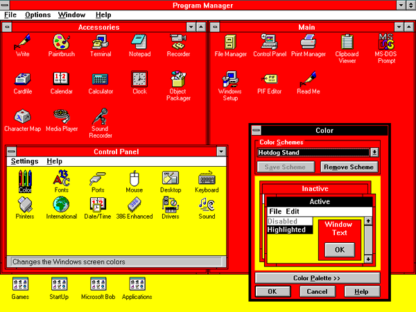
Windows 3.1, as seen using the garish yellow and red "Hot Dog Stand" colour scheme

While I’m glad that Qixing is going to be applying her skills and knowledge to Windows’ user interfaces, there remains the need for someone to help developers, designers and people who play both roles build useful, usable and beautiful interfaces, applications and experiences. This is becoming even more important as mainstream software development extends beyond the desktop OS to the web, mobile phones, tablets and even big-ass tables.

I’m planning to pick up some of the slack in the tech blogs where I write, Canadian Developer Connection and Global Nerdy. In addition to articles on programming, industry trends and reports from the field, I’ll also be posting articles about usability, user interface and user experience, as seen from the developer’s point of view. I’ve had some experience in this area, and where my skills and knowledge fall short, I can always call on my “friends in UI places” and bring their opinions and know-how to you.

Once again, congratulations Qixing, you’ve been a great teammate — and yes, we’ll keep evangelizing user experience!

This article also appears in Canadian Developer Connection.

Categories
Uncategorized

One-Handed Computing

Yes, you probably went here as soon as you saw the phrase “One-Handed Computing”:

"Successories" style poster featuring a woman gasping as a man shows her something on his computer: "Your Porn Collection. Probably best kept to yourself."

But in this case, I’m talking about what Jason Kottke is talking about — those times when you use mobile technology while your other hand isn’t free because you’re:

  • Eating
  • Drinking
  • Carrying or feeding a baby
  • Walking the dog
  • Carrying groceries
  • “Straphanging” on a train or bus
  • Getting by with a broken arm

In the cases above – and I’m sure you can think of many more – you’re accessing computing resources in a very undesktop-like way: with only one hand, and even then, a limited portion of that hand since most of your fingers are busy holding that phone. You’re likely using only your thumb, as shown below:

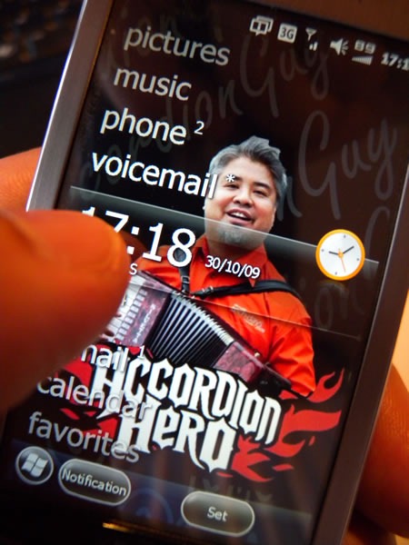
windows mobile 6.5 and thumb

There are lots of times when users are stuck in “one-thumb mode”. If you’re building mobile applications, you should keep that in mind and make sure you design your user interfaces accordingly. You might need to consider things like:

  • The size of touchscreen controls: make them too small and they’re not thumb-friendly.
  • The number of controls on the screen; the maximum number is dictated by their size.
  • Navigation in your app. Hierarchical arrangements make sense to developers, but lots of user experience people will tell you that ordinary people don’t get hierarchies.
  • Which functions will your users use most often? You should make those very easily accessible. Which functions will your users use less often? You might be able to put them on a secondary or tertiary screen.
  • Can you get information without making the user enter it? For example, can you infer information based on the user’s location, which you can grab from GPS instead of asking for him/her to enter it? Can your application remember your user’s most often-used data?
  • Can you get other kinds of one-handed input, such as from the camera, accelerometer, magnetometer or other sensors?

That’s a fair bit to think about, and I might have to present some ideas at the upcoming Toronto WinMoDevCamp (and yes, I’ll also blog them).

This article also appears in Canadian Developer Connection.

Categories
Uncategorized

Airport Signage and the Tab Control

While flying home from TechDays Vancouver, something on the sign pointing the way to the gates caught my eye. Note the screen on the right:

Gate signs at Vancouver airport, featuring a multilingual LCD sign using a tab control

Here’s a closer look:

Close-up of the LCD sign featuring the multilingual tab control

LOLcat: "I see what you did there"

It’s an interesting use for a tab control. The content of each tab page is the same, but each one shows that content in a different language: Japanese, Korean and Hindi (I have no idea why there’s no Chinese; there are lots of Chinese visitors at Vancouver airport). The sign cycles through each tab page, displaying each one for about 10 seconds before switching to the next one.

Is it an appropriate use for a tab control? My guess is that user interface/user experience types (Qixing, if you’re reading this, feel free to chime in) would say “no”. I say “no”, myself. It’s based mostly on a gut feeling, but a little thinking provides me with some rationale, which includes:

  • There’s so little information on each tab. The purpose of a tab control is to break down a large or complex set of controls into more manageable groups, which in the world of  .NET controls are called ”tab pages”. The current tab page, which shows something in Hindi, has no more than a line of tex,t, and the same is true for the Japanese and Korean tabs. They could’ve shown all three languages on a single screen.
  • Tab controls imply interactivity. The tabs in a tab control are for all intents and purposes buttons. Buttons imply interactivity: you click them and something happens. The same is true for tabs: you click a tab and its tab page becomes the frontmost one. These tabs aren’t clickable at all; they’re just being used to show you what languages the sign uses. Using a tab control in this fashion seems like using a button as a label. It gets the job done, but it is the best way?

What do you think? Feel free to opine in the comments.

This article also appears in Canadian Developer Connection.

Categories
Uncategorized

Lessons from an Air Pump

This article also appears in Canadian Developer Connection.

The Incident

I live in Toronto’s High Park neighbourhood, which puts me at that magical distance where biking downtown takes a half-hour, about as long as public transit. If weather isn’t downright terrible and I don’t have too much to carry – say, laptop, change of clothes and even an accordion — I tend to take my bike.

Cycling is much easier with a pair of properly-inflated tires, so I often make use of the air pump at the gas station near my house:

air_pump_1

Gas stations used to give you air for free, but these days, you have to pay to use an air pump – presumably to cover the cost of their upkeep. At the gas station near my house, a dollar gets you enough time to inflate all the tires on a car, which is plenty of time for a bike’s tires. You can use either a loonie (that’s “dollar coin” to you readers outside Canada) or four quarters.

Take a look at  the coin slots for the air pump at the gas station near my house:

air_pump_2

Although the left and right coin slots are identical in size and appearance, they are for different types of coins:

  • The left slot is marked “dollar coin” and is for loonies (that’s “dollar coins” to you non-Canadian readers) only.
  • The right slot is marked “4 quarters” and is for quarters only.

It’s the worst combination of usability factors: identical slots that serve different purposes.

I reached into my pocket and pulled out some quarters. Without thinking, I put quarter in the dollar coin slot, realizing my mistake a little too late. The machine accepted the coin and didn’t route it to the “coin return” compartment. In fact, the machine didn’t even have a coin return compartment.

I wondered what would happen if I put three more quarters in the dollar coin slot. After all, the sticker might be wrong.. It wasn’t – I put in the remaining quarters and the air pump remained off. Luckily, I had four more quarters. I put those in the quarter slot and the machine came to life, providing compressed air for my tires.

Out of principle, I went to the gas station attendant and asked for the dollar I’d lost to the air pump back. He was resistant at first, but as soon as I said “Geez, you guys are a rip-off. I should post that on Twitter,” he quickly capitulated and reimbursed me.

The Lessons

Because I am in the business of talking about software development and design, I was inspired to turn the experience into a blog article (eight years of blogging will do that). I took photos of the air pump and derived two lessons.

Lesson One: Interface Matters!

If two things expect different input, they should appear different. The coin slots on the air pump are the same size. Although the sticker on the machine has markings that say that the left slot is for loonies and the right slot is for quarters, those markings are almost identical. Possible solutions include:

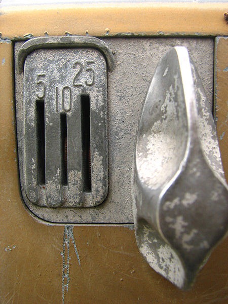
  • Differently-sized coin slots: a larger slot for loonies, a smaller slot for quarters. Older coin-operated machines made use of these:

old_school_coin_slot

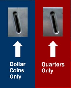
  • A new sticker, perhaps with some colour coding to make it very clear that each coin slot expects very different kinds of coins. 

    new_coin_slot_sticker

Be forgiving of user mistakes:

  • Both slots should accept either loonies or quarters. This solution is even better than differently-size coin slots or a new sticker. The constraint that one slot is for loonies and the other for quarters is a convenience for the manufacturer, not the user. Go the extra mile – after all, coin recognition technology isn’t anything new or hard to get.

    Most coin-operated machines that provide more than one coin slot, such as videogames and pinball machines at arcades, don’t “care” which one you use. Either coin slot will do, as long as you provide enough coins:

    arcade_coin_slot

  • There should be a coin return slot. The current design simply takes your money and doesn’t let you cancel the transaction.

Simplify! Once you put in a coin slot that accepts loonies and quarters, there’s no need for a second coin slot – a single one will do.

The lesson of “interface matters” doesn’t just apply to user interface; they’re just as applicable to application interfaces, from method signatures to whole APIs. It pays to be clear and comprehensible.

Lesson Two: Social Software Matters (at least to some people)

The second lesson? Never underestimate the power of social networking software. The gas station attendant wouldn’t budge, but I saw him constantly checking his smartphone and guessed that he might be into Twitter.

Categories
Uncategorized

Fast Food Apple Pies and Why Netbooks Suck

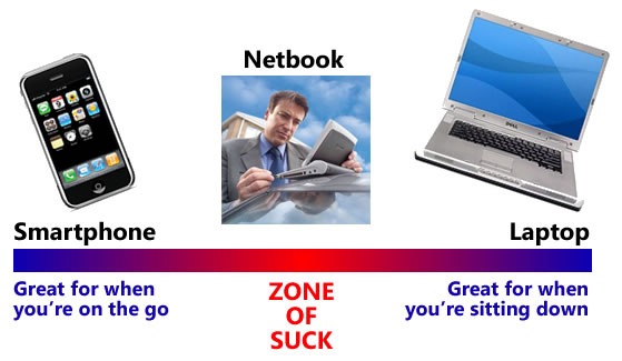
If you’re pressed for time, the graphic below – which takes its inspiration from these articles by Kathy “Creating Passionate Users” Sierra — captures the spirit of this article rather nicely:

Kathy Sierra-esque graph showing  the relative positions of the smartphone (great for when you're on the go), the laptop (great for when you're sitting down) and in between, the netbook (zone of suck)

If you have a little more time to spare, I’m going to explain my belief that while netbooks have a nifty form factor, they’re not where the mobile computing action is.

A Tale of Two Pies

When I was Crazy Go Nuts University’s second most notorious perma-student (back in the late ‘80s/early ‘90s), I took a handful of business courses at the recommendation of my engineering and computer science professors. “You’re going to have to learn to speak the suits’ language,” they said. Crazy Go Nuts University has a renowned business school and I thought it would be a waste not to take at least a couple of business courses. I especially liked the Marketing couse, and one lecture stands out in my mind: a case study comparing the dessert offerings of two major fast food chains.

In the interest of not attracting the attention of their lawyers, I’m going to refer to the chains as:

  • Monarch Burger, whose mascot is a mute monarch with a glazed-over face, wearing a crown and associated paraphernalia, and
  • Jester Burger, whose mascot is a clown in facepaint and a brightly-coloured jumpsuit who loves to sing and dance.

Both Monarch Burger and Jester Burger offered a dessert that went by the name “apple pie”. Let’s examine them.

Monarch Burger’s Pie

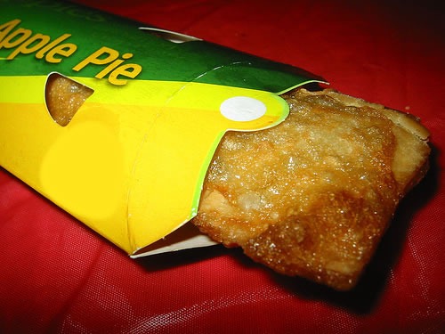
Monarch Burger's apple pie: a slice of pie served in a wedge-shaped box Monarch Burger went to the trouble of making their apple pie look like a slice of homemade apple pie. While it seems appealing in its photo on the menu, it sets up a false expectation. It may look like a slice of homemade apple pie, but it certainly doesn’t taste like one. Naturally, it flopped. Fast-food restaurants are set up to be run not by trained chefs, but by a low-wage, low-skill, disinterested staff. As a result, their food preparation procedures are designed to run on little thinking and no passion. They’re not set up to create delicious homemade apple pies.
Jester Burger’s Pie

Jester Burger's apple pie: a tube of pastry, whose skin is pocked from deep-frying

Jester Burger’s approach was quite different. Their dessert is called “apple pie”, but it’s one in the loosest sense. It’s apple pie filling inside a pastry shell shaped like the photon torpedo casings from Star Trek. In the 70s and 80s, the pastry shell had bubbles all over it because it wasn’t baked, but deep-fried. After all, their kitchens already had deep fryers aplenty – why not use them?

Unlike Monarch Burger’s offering, Jester Burger’s sold well because it gave their customers a dessert reminiscent of an apple pie without setting up any expectations for real apple pie.

Jester Burger’s pie had an added bonus: unlike Monarch Burger’s pie, which was best eaten with a fork, Jester Burger’s pie was meant to be held in your hand, just like their burgers and fries.

At this point, I am obliged to remind you that this isn’t an article about 1980s-era desserts at fast food burger chains. It’s about netbooks and smartphones, but keep those pies in mind…

Netbooks are from Monarch Burger…

Netbooks remind me of Monarch Burger’s apple pie. Just as Monarch Burger tried to take the standard apple pie form and attempt to fit it into a fast food menu, the netbook approach tries to take the standard laptop form and attempt to fit it into mobile computing. The end result, to my mind, is a device that occupies an uncomfortable, middle ground between laptops and smartphones that tries to please everyone and pleases no one. Consider the factors:

  • Size: A bit too large to go into your pocket; a bit too small for regular day-to-day work.
  • Power: Slightly more capable than a smartphone; slightly less capable than a laptop.
  • Price: Slightly higher than a higher-end smartphone but lacking a phone’s capability and portability; slightly lower than a lower-end notebook but lacking a notebook’s speed and storage.

To summarize: Slightly bigger and pricier than a phone, but can’t phone. Slightly smaller and cheaper than a laptop, but not that much smaller or cheaper. To adapt a phrase I used in an article I wrote yesterday, netbooks are like laptops, but lamer.

Network Computers and Red Herrings

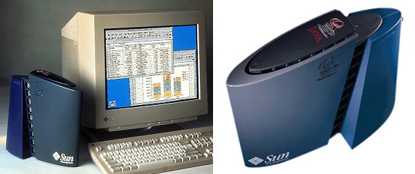
Sun's "JavaStation" network computer

The uncomfortable middle ground occupied by the netbook reminds me of another much-hyped device that flopped – the network computer, which also went by the name "thin client". In the late 90s, a number of people suggested that desktop computers, whose prices started at the mid-$1000 range in those days, would be replaced by inexpensive diskless workstations. These machines would essentially be the Java-era version of what used to be called "smart terminals", combining local processing power with network-accessed storage of programs and data.

A lot of the ideas behind the network computer ended up in today’s machines, even if the network computer itself didn’t. Part of the problem was the state of networking when the NC was introduced; back then, broadband internet access was generally the exception rather than the rule. Another major factor was price – desktop and even laptop computers prices fell to points even lower than those envisioned for NCs. Finally, there was the environment in which the applications would run. Everyone who was betting on the NC envisioned people running Java apps pushed across the network, but it turned out that the things they had dismissed as toys — the browser and JavaScript, combining to form the juggernaut known as Ajax — ended up being where applications "lived".

When I look at netbooks, I get network computer deja vu. I see a transitory category of technology that will eventually be eclipsed. I think that laptops will eventually do to netbooks what desktop machines did to network computers: evolve to fill their niche. Just as there are small-footprint desktop computers that offer all the functionality and price point of a network computer along with the benefits of local storage, I suspect that what we consider to be a netbook today will be just another category of laptop computer tomorrow.

A netbook displaying a picture of a red herring on its screen

I’m going to go a little farther, beyond stating that netbooks are merely the present-day version of the network computer. I’m going to go beyond saying that while their form factor is a little more convenient than that of a laptop, the attention they’re getting – there’s a lot of hoo-hah about who’s winning in the netbook space, Windows or Linux –  is out of proportion to their eventual negligible impact. I’m going to go out on a limb and declare them to be a dangerous red herring, a diversion from where the real mobile action is.  

…and Smartphones are from Jester Burger

Southern Chicken Place's apple pie, which looks a lot like Jester Burger's apple pie

A quick aside: The photo above is not of a Jester Burger fried apple pie. In response to their customers’ so-called health concerns (really, if those concerns were real, they’d stop eating there), they started phasing out the fried pies in 1992 in favour of the baked kind. There are still some branches of Jester Burger that carry the fried pies, but a more reliable source is a fast food chain that I’ll refer to as “Southern Chicken Place”, or SCP for short. Those pies in the photo above? They’re from SCP.

Jester Burger made no attempt to faithfully replicate a homemade apple pie when they made their dessert. Instead, they engineered something that was “just pie enough” and also matched the environment in which it would be prepared (a fast food kitchen, which didn’t have ovens but had deep fryers) and the environment in which it would be eaten (at a fast food restaurant table or in a car, where there isn’t any cutlery and everything is eaten with your hands). The Jester Burger pie fills a need without pretending to be something it’s not, and I think smartphones do the same thing.

Smartphones are truly portable. They really fit into your pocket or hang nicely off your belt, unlike netbooks:

Two Japanese models trying to stuff a Sony Vaio netbook into their pockets

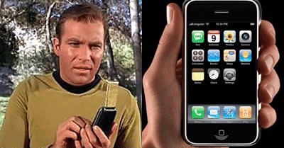
And smartphones are meant to be used while you’re holding them:

Captain Kirk, his communicator and the iPhone

Just try that with a netbook. In order to really use one, you’ve got to set it down on a flat surface:

Guy using his netbook, perched on the roof of his car...with a stylus, no less!

The best smartphones make no attempt to faithfully replicate the laptop computer experience in a smaller form. Instead, they’re “just computer enough” to be useful, yet better fit the on-the-go situations in which they will be used. They also incorporate mobile phones and MP3s – useful, popular and familiar devices — and the best smartphones borrow tricks from their user interfaces.

Smartphones, not netbooks, are where the real advances in mobile computing will be made.

Smartphone vs. Netbook: The People Have Chosen

One again, the thesis of this article, in graphic form:

Same graph as the earlier Kathy Sierra-esque one at the start of the article.

In the late 80s and early 90s, the people chose the fast food apple pie they wanted: the convenient, if not exactly apple pie-ish Jester Burger pie over Monarch Burger’s more-like-the-real-thing version.

When people buy a smartphone, which they’ve been doing like mad, they’re buying their primary mobile phone. It’s the mobile phone and computing platform that they’re using day in and day out and the device that they’re pulling out of their pockets, often to the point of interrupting conversations and crashing the trolley they’re operating.

When people buy a netbook, they’re often not buying their primary machine. It’s a second computer, a backup device that people take when their real machine – which is often a laptop computer that isn’t much larger or more expensive – seems like too much to carry. It’s a luxury that people might ditch if the current economic situation continues or worsens and as the differences between laptops and netbooks vanish. Netbooks, as a blend of the worst of both mobile and laptop worlds, will be a transitional technology; at best, they’ll enjoy a brief heyday similar to that of the fax machine.

The people are going with smartphones, and as developers, you should be following them.

Categories
Uncategorized

Joel Spolsky: Learning from StackOverflow.com

This article also appears in Canadian Developer Connection.

Just in case there’s nothing good on TV and you’re having a “lazy Sunday”, here’s a video of Joel Spolsky’s recent presentation at Google, Learning from StackOverflow.com, in which he talks about the design decisions that went into and the lessons learned from the Stack Overflow site. It runs for about 52 minutes, so you might want to get yourself a nice beverage before you watch it: